Tag: Data Analysis

Rick Wicklin 4
How to interpret a residual-fit spread plot

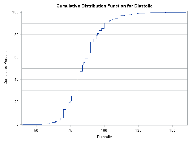
In a previous blog post, I described how to use a spread plot to compare the distributions of several variables. Each spread plot is a graph of centered data values plotted against the estimated cumulative probability. Thus, spread plots are similar to a (rotated) plot of the empirical cumulative distribution

Rick Wicklin 4
New heat maps in the REG procedure

Has anyone noticed that the REG procedure in SAS/STAT 12.1 produces heat maps instead of scatter plots for fit plots and residual plots when the regression involves more than 5,000 observations? I wasn't aware of the change until a colleague informed me, although the change is discussed in the "Details"

Rick Wicklin 12
Compute confidence intervals for percentiles in SAS

PROC UNIVARIATE has provided confidence intervals for standard percentiles (quartiles) for eons. However, in SAS 9.3M2 (featuring the 12.1 analytical procedures) you can use a new feature in PROC UNIVARIATE to compute confidence intervals for a specified list of percentiles. To be clear, percentiles and quantiles are essentially the same

1 33 34 35 36 37 46