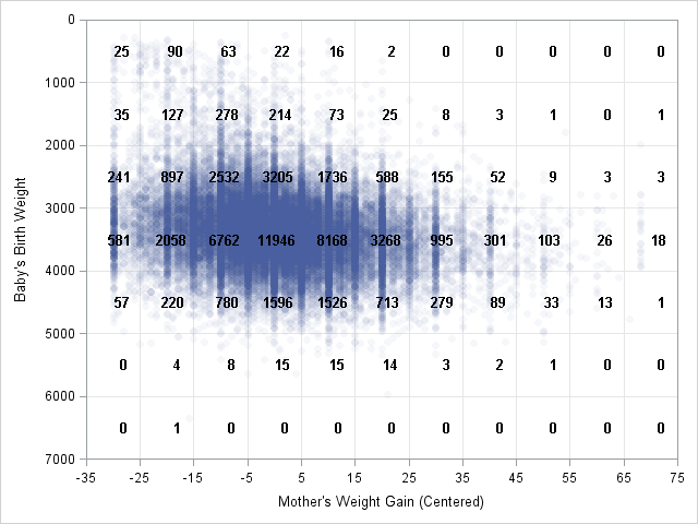
Earlier this week I posted a "guest blog" in which my 8th grade son described a visualization of data for the 2013 ASA Poster Competition. The purpose of today's blog post is to present a higher-level statistical analysis of the same data. I will use a t test and a
Tag: Data Analysis
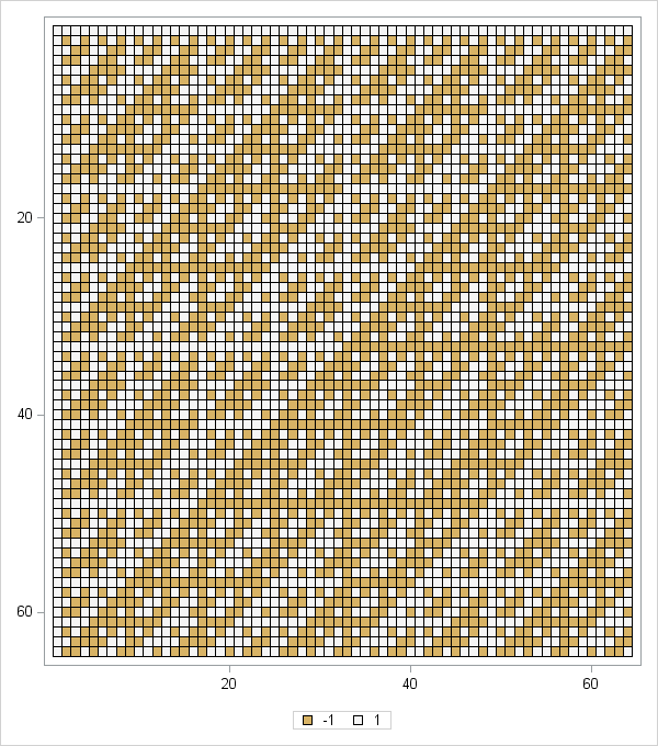
Editor's Note: My 8th grade son, David, created a poster that he submitted to the 2013 ASA Poster Competition. The competition encourages students to display "two or more related graphics that summarize a set of data, look at the data from different points of view, and answer specific questions about
Do you have dozens (or even hundreds) of SAS data sets that you want to read into SAS/IML matrices? In a previous blog post, I showed how to iterate over a series of data sets and analyze each one. Inside the loop, I read each data set into a matrix
In a previous article I discussed how to bin univariate observations by using the BIN function, which was added to the SAS/IML language in SAS/IML 9.3. You can generalize that example and bin bivariate or multivariate data. Over two years ago I wrote a blog post on 2D binning in
It is often useful to partition observations for a continuous variable into a small number of intervals, called bins. This familiar process occurs every time that you create a histogram, such as the one on the left. In SAS you can create this histogram by calling the UNIVARIATE procedure. Optionally,
The CLUSTER procedure in SAS/STAT software creates a dendrogram automatically. The black-and-white dendrogram is nice, but plain. A SAS customer wanted to know whether it is possible to add color to the dendrogram to emphasize certain clusters. For example, the plot at the left emphasizes a four-cluster scenario for clustering
A regular reader noticed my post on initializing vectors by using repetition factors and asked whether that technique would be useful to expand data that are given in value-frequency pairs. The short answer is "no." Repetition factors are useful for defining (static) matrix literals. However, if you want to expand
In a previous blog post, I described how to use a spread plot to compare the distributions of several variables. Each spread plot is a graph of centered data values plotted against the estimated cumulative probability. Thus, spread plots are similar to a (rotated) plot of the empirical cumulative distribution
Suppose that you have several data distributions that you want to compare. Questions you might ask include "Which variable has the largest spread?" and "Which variables exhibit skewness?" More generally, you might be interested in visualizing how the distribution of one variable differs from the distribution of other variables. The
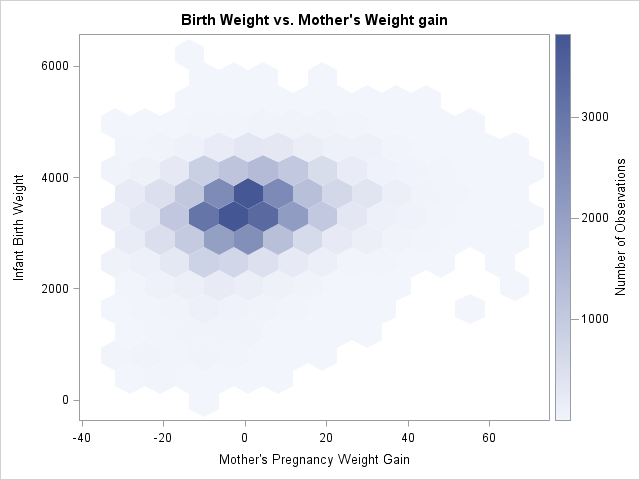
Has anyone noticed that the REG procedure in SAS/STAT 12.1 produces heat maps instead of scatter plots for fit plots and residual plots when the regression involves more than 5,000 observations? I wasn't aware of the change until a colleague informed me, although the change is discussed in the "Details"