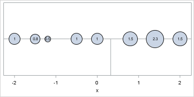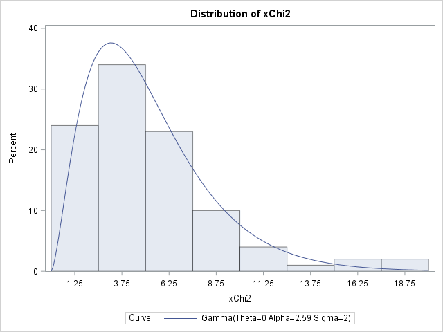
The skewness of a distribution indicates whether a distribution is symmetric or not. A distribution that is symmetric about its mean has zero skewness. In contrast, if the right tail of a unimodal distribution has more mass than the left tail, then the distribution is said to be "right skewed"
Tag: Data Analysis
It's time for another blog post about ciphers. As I indicated in my previous blog post about substitution ciphers, the classical substitution cipher is no longer used to encrypt ultra-secret messages because the enciphered text is prone to a type of statistical attack known as frequency analysis. At the root
In a previous blog post I showed how to order a set of variables by a statistic. After reshaping data, you can create a graph that contains box plots for many variables. Ordering the variables by some statistic (mean, median, variance,...) helps to differentiate and distinguish the variables. You can
While I was working on my recent blog post about two-dimensional binning, a colleague asked whether I would be discussing "the new hexagonal binning method that was added to the SURVEYREG procedure in SAS/STAT 13.2." I was intrigued: I was not aware that hexagonal binning had been added to a
Last Monday I discussed how to choose the bin width and location for a histogram in SAS. The height of each histogram bar shows the number of observations in each bin. Although my recent article didn't mention it, you can also use the IML procedure to count the number of
When you create a histogram with statistical software, the software uses the data (including the sample size) to automatically choose the width and location of the histogram bins. The resulting histogram is an attempt to balance statistical considerations, such as estimating the underlying density, and "human considerations," such as choosing
My wife got one of those electronic activity trackers a few months ago and has been diligently walking every day since then. At the end of the day she sometimes reads off how many steps she walked, as measured by her activity tracker. I am always impressed at how many
In a previous blog post, I showed how to use the graph template language (GTL) in SAS to create heat maps with a continuous color ramp. SAS/IML 13.1 includes the HEATMAPCONT subroutine, which makes it easy to create heat maps with continuous color ramps from SAS/IML matrices. Typical usage includes
In a previous blog post, I showed how to overlay a prediction ellipse on a scatter plot in SAS by using the ELLIPSE statement in PROC SGPLOT. The ELLIPSE statement draws the ellipse by using a standard technique that assumes the sample is bivariate normal. Today's article describes the technique
It is common in statistical graphics to overlay a prediction ellipse on a scatter plot. This article describes two easy ways to overlay prediction ellipses on a scatter plot by using SAS software. It also describes how to overlay multiple prediction ellipses for subpopulations. What is a prediction ellipse? A