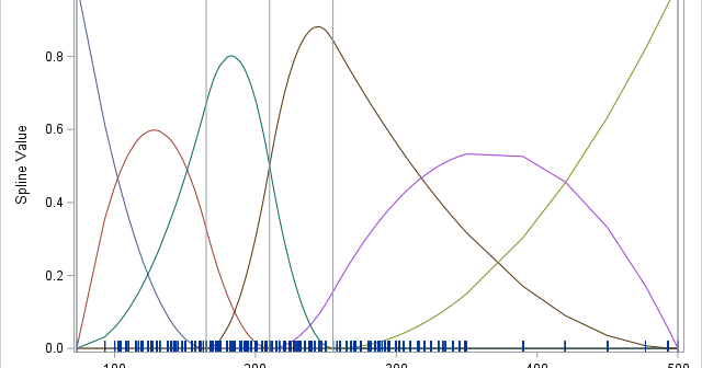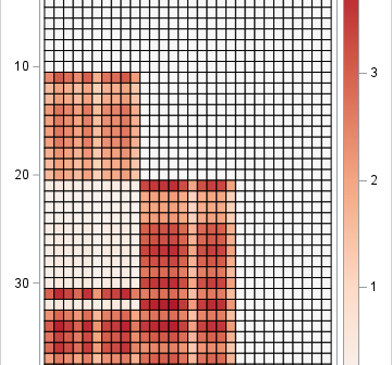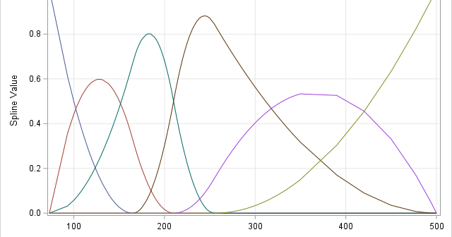
A previous article discusses regression splines and how to use the EFFECT statement in SAS regression procedures to specify the location of knots for a regressor variable, X. Knots are breakpoints that partition the range of X into subintervals. The splines are defined on a set of adjacent subintervals. The

