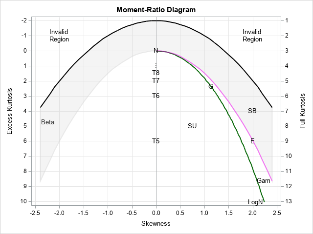
I have previously written about the moment-ratio diagram as a graphical tool for modeling univariate distributions and also as a tool for examining the distribution of the skewness and kurtosis statistics for distributions. The simple moment-ratio (M-R) diagram from my book (Wicklin, 2013, Simulating Data with SAS, Chapter 16) is shown to the right. The SAS program for creating the diagram is described in Appendix E, which is available for free online. The simple M-R diagram shows the possible skewness and kurtosis values for a few distributions, including normal (N), t (T5, T6, T7, ...), Gumbel (G), exponential (E), gamma (Gam), lognormal (LogN), beta, and the flexible Johnson system of unbounded (SU) and bounded (SB) distributions.
A SAS programmer reached out because he wanted to model univariate data by using a probability distribution that is not shown on the diagram. He wondered if it is possible to add additional curves to the moment-ratio diagram? The answer is yes! This article shows how to add a skewness-kurtosis curve for the Weibull distribution to an M-R diagram. Curves for other distributions can be created similarly.
Get the SAS program to create a moment-ratio diagram
You can download the SAS code to create a moment-ratio diagram from GitHub. If you want to follow along, download that file and run it. For example, if you download it to the file define_moment_ratio.sas, you can run the program by using the %INCLUDE statement, as follows:
%include "define_moment_ratio.sas"; /* specify a full path, such as "C:/<path>/define_moment_ratio.sas" */ |
When you run the program, it creates a data set and a macro:
- It creates an SG annotation data set named "Anno", which contains the curves, points, regions, and labels for the moment-ratio diagram.
- It defines a macro called %PlotMRDiagram. You can call the macro as
%PlotMRDiagram(DS, Anno, Transparency=0)
to overlay points in the skewness-kurtosis plane on a moment-ratio diagram. In the macro call, the input data set (DS) must contain a variable named Skew and a variable named Kurt. The Anno argument is the SG annotation data set that is created by running the program.
In this article, you will learn how to modify the annotation data set for the M-R diagram. Specifically, I'll show how to add a curve for the Weibull distribution.
Why use the moment-ratio diagram?
There are several applications of the moment-ratio diagram, but a popular one is to help you to choose a distribution to model your data. To do this, you plot the sample skewness and kurtosis of data on the diagram. For example, suppose you have some data for which the sample skewness and (excess) kurtosis is computed as Skewness = 1.0704 and Kurtosis = 1.3983. The following DATA step creates a data set with these sample moments, then overlays the values on an M-R diagram:
/* Display a moment-ratio diagram */ data SK; Skew = 1.0704; Kurt = 1.3983; run; title "Moment-Ratio Diagram for Sample"; %PlotMRDiagram(SK, Anno); |
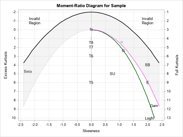
The sample moments are indicated by a marker near (1.1, 1.4). (Notice that the vertical axis, by convention, points DOWN in an M-R diagram.) The location of the marker indicates possible distributions that might be useful to model the data. In this case, the marker is close to the Gamma distribution (the magenta line), the lognormal curve (the green line), and the Gumbel distribution (the letter "G").
However, the simple M-R diagram does not contain every possible distribution. The SAS programmer who wrote to me indicated that these data are often modeled by using a Weibull distribution, which is not shown on the M-R diagram. The next sections show how to add a curve for the Weibull distribution to the M-R diagram.
A peek under the hood: How the M-R diagram is constructed
The Appendix E and the define_moment_ratio.sas file show how the M-R diagram is constructed. If you look at the define_moment_ratio.sas file, you'll see that the M-R diagram is drawn by using an annotation data set. The Anno data set is the concatenation of several smaller data sets: one for the beta region, one for the lognormal curve, one for the gamma curve, and so forth. The code that constructs the Anno data set looks like this:
data Anno; set Beta Boundary LogNormal GammaCurve MRPoints; run; |
Consequently, if we want to add more curves, we can mimic the existing code and add a new data set on the SET statement. The next section creates an annotation data set called WeibullCurve that contains the locus of moments for the Weibull distribution.
Create a Weibull curve on the M-R diagram
How do you add a Weibull curve to the M-R diagram? I discuss how to do it in Appendix E of (Wicklin, 2013).
Each curve is the image of a parametric function that maps a parameter value to a point in the skewness-kurtosis plane. There is not a single symbol for the shape parameter for the Weibull distribution. The Wikipedia article calls it k, whereas PROC UNIVARIATE calls it C and the documentation for the PDF function in SAS calls it a. I will use the Wikipedia notation because the Wikipedia article includes formulas for the skewness and kurtosis as a function of the shape parameter. Note: The Wikipedia article also includes a scale parameter, λ, but the skewness and kurtosis are invariant to scaling. Accordingly, you can set λ = 1 in the Wikipedia formulas.
The following macro copies the Wikipedia formulas into the SAS language. You can use the macro in a DATA step that steps through values of the k parameter in the range [0.9, 10]. Technically, you should map the entire interval {k | k ∈ (0, ∞)} into the skewness-kurtosis plane, but experimentation indicates that k < 0.9 leads to extreme values. Furthermore, as k approaches infinity, the skewness-kurtosis curve approaches a limit point.
/* Formulas for skewness and kurtosis of Weibull distribution from Wikipedia: https://en.wikipedia.org/wiki/Weibull_distribution */ %macro SkewExKurt(k); mu = Gamma(1 + 1/k); /* mean (lambda=1) */ var = (Gamma(1 + 2/k) - Gamma(1 + 1/k)**2); /* variance */ sigma = sqrt(var); /* std dev */ skew = ( Gamma(1 + 3/k) - 3*mu*var - mu**3 ) / sigma**3; y1 = ( Gamma(1 + 4/k) - 4*mu*sigma**3*skew - 6*mu**2*var - mu**4 ) / var**2; x1 = skew; y1 = y1 - 3; /* excess kurtosis */ %mend; /* Compute the skewness-kurtosis curve for the Weibull distribution for various values of k. Experiments show that k < 0.9 results in the (skew,kurt) curve being too extreme. The image of the function for k in [0.9, 1000] traces nearly the full curve. */ data WeibullCurve1; keep k x1 y1; label x1="Skewness" y1="Excess Kurtosis"; k0 = 0.9; k_infin = 1000; do k = k0 to 10 by 0.2, 50, 100, k_infin; %SkewExKurt(k); output; end; run; title "Skewness and Excess Kurtosis Curve for Weibull Distribution"; title2 "k in [0.9, 1000]"; proc sgplot data=WeibullCurve1; scatter x=x1 y=y1 / datalabel=k; xaxis grid; yaxis grid reverse; run; |
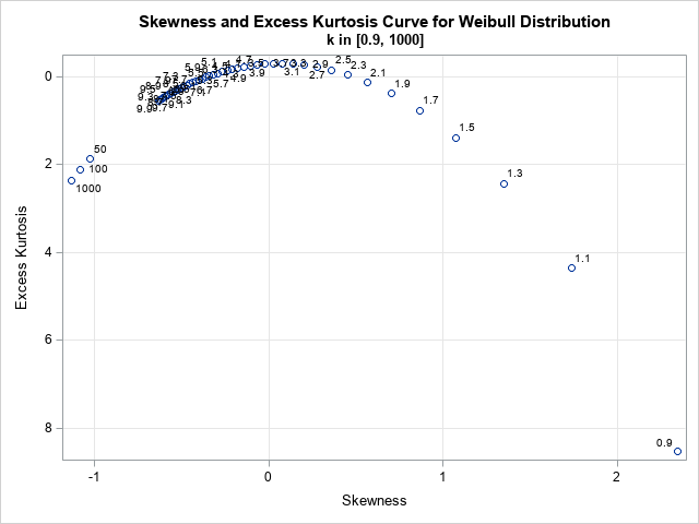
Instead of connecting the points, I have plotted them separately so that you can see that some points are widely separated whereas others are close together. I have labeled each point by using the parameter value, k. For simplicity, I initially generated the points by using a regular grid on the interval k ∈ [0.9, 10]. However, in the next program I use a fine grid of points for small values of k and a larger step size for larger values of k.
Now that we know how to draw the curve of skewness-kurtosis values for the Weibull distribution, let's modify the previous M-R diagram to include the new curve. To do this, use the POLYLINE and POLYCONT statements to draw the curve. The following program is a modification of the examples in the define_moment_ratio.sas. By studying the existing examples, you can figure out how to draw the Weibull curve even if you are not familiar with the SG annotation facility. Here is one implementation:
/* create an annotation data set */ data WeibullCurve; length function $12 Label $24 Curve $12 LineColor $20 ; retain DrawSpace "DataValue" LineColor "Brown" Curve "Weibull"; drop k0 k_infin k mu var sigma skew; k0 = 0.9; k_infin = 1000; k = k0; %SkewExKurt(k); function = "POLYLINE"; Anchor=" "; output; function = "POLYCONT"; do k = 1 to 1.9 by 0.1, /* use different step sizes for different intervals */ 2 to 5 by 0.25, 6 to 12, 15, 20, 25, 50, 100, k_infin; %SkewExKurt(k); output; end; label = "Weibull"; function = "TEXT"; Anchor="Left "; output; run; |
With this annotation data set defined, you can re-create the annotation data set that includes all elements of the M-R diagram, as follows:
/* Add the new WeibullCurve data to the existing set of curves and regions: */ data Anno; set Beta Boundary LogNormal GammaCurve WeibullCurve MRPoints; run; /* Draw the new moment-ratio diagram with the Weibull curve */ title "Moment-Ratio Diagram with Weibull Curve"; %PlotMRDiagram(SK, Anno); |
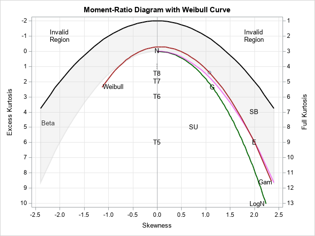
The brown curve is the set of skewness-kurtosis values that correspond to the Weibull distribution with various values of the parameter, k. The marker for the sample moments sits exactly on the Weibull curve, which indicates that the Weibull distribution is an appropriate choice for a model.
Does the sample moment always land on a curve?
I must confess, when I specified the moments for the "sample," I used the exact moments for a Weibull distribution that has k=1.5. Thus, the sample moment is on the Weibull curve.
Usually, the sample statistics are not exactly on the curve for the parent distribution. In fact, an application of the M-R diagram is to visualize the joint sampling distribution of the skewness and kurtosis statistics. The following DATA step simulates 100 samples of size N=200 from the Weibull(k=1.5) distribution. For each sample, you can compute the sample moments and overlay them on the M-R diagram:
/* simulate 100 samples of size N=250 from a Weibull(k=1.5) distribution (lambda=1) */ %let N = 200; %let NumSamples = 100; data Weibull(keep=x SampleID); call streaminit(12345); do SampleID = 1 to &NumSamples; do i = 1 to &N; x = rand("Weibull", 1.5, 1); output; end; end; run; /* compute the skewness and kurtosis of each sample */ proc means data=Weibull noprint; by SampleID; var x; output out=MomentsWeibull skew=Skew kurt=Kurt; run; /* Display a moment-ratio diagram with a scatter plot in the background of of the sample skewness and kurtosis for simulated samples. */ title "Moment-Ratio Diagram and Sample Moments for Weibull(k=1.5)"; %PlotMRDiagram(MomentsWeibull, Anno); |
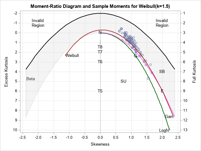
The M-R diagram shows that the higher-order sample moments are quite variable, even for moderately large samples with 200 observations. Yes, most of them are near the brown Weibull curve, but a few are quite close to the Gamma curve (magenta) or the lognormal curve (green). This shows that sample moments are often insufficient for deciding the best model. You should augment the M-R diagram by using domain-specific knowledge, when it exists, and other statistics such as maximum likelihood estimates.
Summary
Appendix E of Simulating Data with SAS shows how to construct a simple moment-ratio diagram. This article describes how to add a new curve to the M-R diagram. This article adds the curve for the skewness-kurtosis curve for the Weibull distribution, but the same ideas apply to other distributions whose shape depends on one parameter. You can download from GitHub the complete SAS program that creates the graphs in this article.
