When you fit a regression model, it is useful to check diagnostic plots to assess the quality of the fit. SAS, like most statistical software, makes it easy to generate regression diagnostics plots. Most SAS regression procedures support the PLOTS= option, which you can use to generate a panel of diagnostic plots. Some procedures (most notably PROC REG and PROC LOGISTIC) support dozens of graphs that help you to evaluate the fit of the model, to determine whether the data satisfy various assumptions, and to identify outliers and high-leverage points. Diagnostic plots are most useful when the size of the data is not too large, such as less than 5,000 observations.
This article shows how to interpret diagnostic plots for a model that does not fit the data. For an ill-fitting model, the diagnostic plots should indicate the lack of fit.
This article discusses the eight plots in the DiagnosticsPanel plot, which is produced by several SAS regression procedures. To make the discussion as simple as possible, this article uses PROC REG to fit an ordinary least squares model to the data.
The eight plots can be classified into five groups:
- A plot of the observed versus predicted responses. (Center of panel.)
- Two graphs of residual values versus the predicted responses. (Upper left of panel.)
- Two graphs that indicate outliers, high-leverage observations, and influential observations. (Upper right of panel.)
- Two graphs that assess the normality of the residuals. (Lower left of panel.)
- A plot that compares the cumulative distributions of the centered predicted values and the residuals. (Bottom of panel.)
This article also includes graphs of the residuals plotted against the explanatory variables.
Create a model that does not fit the data
This section creates a regression model that (intentionally) does NOT fit the data. The data are 75 locations and measurements of the thickness of a coal seam. A naive model might attempt to fit the thickness of the coal seam as a linear function of the East-West position (the East variable) and the South-North position (the North variable). However, even a cursory glance at the data (see Figure 2 in the documentation for the VARIOGRAM procedure) indicates that the thickness is not linear in the North-South direction, so the following DATA step creates a quadratic effect. The subsequent call to PROC REG fits the model to the data and uses the PLOT= option to create a panel of diagnostic plots. By default, PROC REG creates a diagnostic panel and a panel of residual plots. If you want to add a loess smoother to the residual plots, you can use the SMOOTH suboption to the RESIDUALPLOT option, as follows:
data Thick2; set Sashelp.Thick; North2 = North**2; /* add quadratic effect */ run; proc reg data=Thick2 plots =(DiagnosticsPanel ResidualPlot(smooth)); model Thick = North North2 East; quit; |
The panel of diagnostic plots is shown. The panel of residual plots is shown later in this article. To guide the discussion, I have overlaid colored boxes around certain graphs. You can look at the graphs in any order, but I tend to look at them in the order indicated by the numbers in the panel.
1. The predicted versus observed response
The graph in the center (orange box) shows the quality of the predictive model. The graph plots the observed response versus the predicted response for each observation. For a model that fits the data well, the markers will be close to the diagonal line. Markers that are far from the line indicate observations for which the predicted response is far from the observed response. That is, the residual is large.
For this model, the cloud of markers is not close to the diagonal, which indicates that the model does not fit the data. You can see several markers that are far below the diagonal. These observations will have large negative residuals, as shown in the next section.
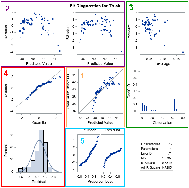
2. The residual and studentized residual plots
Two residual plots in the first row (purple box) show the raw residuals and the (externally) studentized residuals for the observations.
The first graph is a plot of the raw residuals versus the predicted values. Ideally, the graph should not show any pattern. Rather, it should look like a set of independent and identically distributed random variables. You can use this graph for several purposes:
- If the residuals seem to follow a curve (as in this example), it indicates that the model is not capturing all the "signal" in the response variable. You can try to add additional effects to the model to see if you can eliminate the pattern.
- If the residuals are "fan shaped," it indicates that the residuals do not have constant variance. Fan-shaped residuals are an example of heteroscedasticity. The canonical example of a fan-shaped graph is when small (in magnitude) residuals are associated with observations that have small predicted values. Similarly, large residuals are associated with observations that have large predicted values. Heteroscedasticity does not invalidate the model's ability to make predictions, but it violates the assumptions behind inferential statistics such as p-values, confidence intervals, and significance tests.
- Detect autocorrelation. If the residuals are not randomly scattered, it might indicate that they are not independent. A time series can exhibit autocorrelation; spatial data can exhibit spatial correlations.
The second residual graph often looks similar to the plot of the raw residuals. The vertical coordinates in the second graph (labeled "RStudent") are externally studentized residuals. The PROC REG documentation includes the definition of a studentized residual. For a studentized residual, the variance for the i_th observation is estimated without including the i_th observation. If the magnitude of the studentized residual exceeds 2, you should examine the observation as a possible outlier. Thus, the graph includes horizontal lines at ±2. For these data, five observations have large negative residuals.
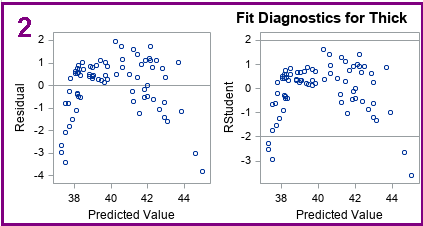
3. Influential observations and high-leverage points
The two graphs in the upper right box (green) enable you to investigate outliers, influential observations, and high-leverage points. One graph plots the studentized residuals versus the leverage value for each observation. As mentioned previously, the observations whose studentized residuals exceed ±2 can be considered outliers. The leverage statistic attempts to identify influential observations. The leverage statistic indicates how far an observation is from the centroid of the data in the space of the explanatory variables. Observations far from the centroid are potentially influential in fitting the regression model. "Influential" means that deleting that observation can result in a relatively large change in the parameter estimates.
Markers to the right of the vertical line are high-leverage points. Thus, the three lines in the graph separate the observations into four categories: (1) neither an outlier nor a high-leverage point; (2) an outlier, but not a high-leverage point; (3) a high-leverage point, but not an outlier; and (4) an outlier and a high-leverage point.
If there are high-leverage points in your data, you should be careful interpreting the model. Least squares models are not robust, so the parameter estimates are affected by high-leverage points.
The needle plot of Cook's D second graph (second row, last column) is another plot that indicates influential observations. Needles that are higher than the horizontal line are considered influential.
A subsequent article includes details about how to use the Cook's D plot to identify influential observations in your data.
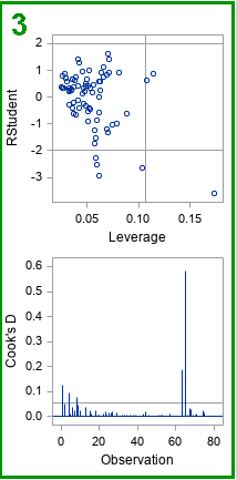
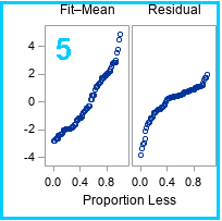
4. Normality of residuals
The graphs in the lower left (red box) indicate whether the residuals for the model are normally distributed. Normally distributed residuals are one of the assumptions of regression that are used to derive inferential statistics. The first plot is a normal quantile-quantile plot (Q-Q plot) of the residuals. If the residuals are approximately normal, the markers should be close to the diagonal line. The following table gives some guidance about how to interpret deviations from a straight line:
| Point Pattern | Interpretation |
|---|---|
| all but a few points fall on a line | outliers in the data |
| left end of pattern is below the line | long tail on the left |
| left end of pattern is above the line | short tail on the left |
| right end of pattern is below the line | short tail on the right |
| right end of pattern is above the line | long tail on the right |
For the Q-Q plot of these residuals, the markers are below the diagonal line at both ends of the pattern. That means that the distribution of residuals is negatively skewed: it has a long tail on the left and a short tail on the right. This is confirmed by looking at the histogram of residuals. For this model, the residuals are not normal; the overlay of the normal density curve does not fit the histogram well.
The spread plot
The last graph (blue box) is the residual-fit spread plot, which I have covered in a separate article. For these data, you can conclude that the three explanatory variables account for a significant portion of the variation in the model.
Residual plots with smoothers
Lastly, the PLOTS=RESIDUALPLOT(SMOOTH) option on the PROC REG statement creates a panel that includes the residuals plotted against the value of each explanatory variable. The SMOOTH suboption overlays a loess smoother, which is often helpful in determining whether the residuals contain a signal or are randomly distributed. The panel for these data and model is shown below:
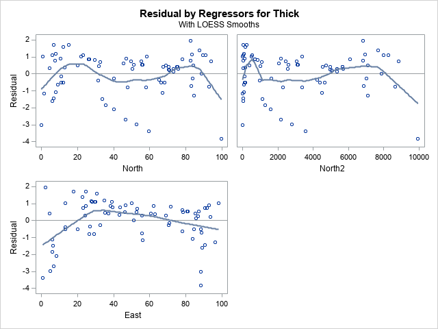
The residuals plotted again the East variable shows a systematic pattern. It indicates that the model does not adequately capture the dependence of the response on the East variable. An analyst who looks at this plot might decide to add a quadratic effect in the East direction, or perhaps to model a fully quadratic response surface by including the North*East interaction term.
Summary
This article created a regression model that does not fit the data. The regression diagnostic panel detects the shortcomings in the regression model. The diagnostic panel also shows you important information about the data, such as outliers and high-leverage points. The diagnostic plot can help you evaluate whether the data and model satisfy the assumptions of linear regression, including normality and independence of errors.
A subsequent article describes how to use the diagnostic plots to identify influential observations.
WANT MORE GREAT INSIGHTS MONTHLY? | SUBSCRIBE TO THE SAS TECH REPORT

3 Comments
Pingback: Identify influential observations in regression models - The DO Loop
Pingback: Top 10 posts from The DO Loop in 2021 - The DO Loop
Amazing explanations. Thank you so much Sir! This is very helpful for my final project.