This article shows how to compute a confidence band for a Q-Q plot in SAS.
A previous article shows how to construct confidence bands for the CDF of continuous univariate data. The bands can be added to a plot of the empirical CDF (ECDF) for the data. One of the drawbacks of an ECDF plot is that the cumulative distribution is an S-shaped curve. If you display two S-shaped curves that represent cumulative distributions, it is difficult for the human eye to detect differences between them, which is why statisticians plot histograms (estimates of the probability density) more often than ECDF curves (estimates of the cumulative distribution).
If you want to compare the data distribution to a theoretical parametric distribution (such as normal or Weibull), the quantile-quantile (Q-Q) plot is a useful alternative to the CDF plot. A Q-Q plot is a visual representation of a statistical goodness-of-fit test: it helps you assess whether the data are a random sample from a theoretical distribution. Data that are sampled from the specified parametric distribution appear to be linear in a Q-Q plot.
More correctly, they appear to be linear for most random samples. As discussed in a previous article, a Q-Q plot might look nonlinear due to random variation, especially for a small sample. Consequently, it can be useful to add a confidence band to the Q-Q plot.
The relationship between the CDF plot and the Q-Q plot
It turns out that you can transform the ECDF and confidence bands from the previous article to "straighten out" the cumulative distributions. The result is a Q-Q plot with a confidence band.
Recall that if X is distributed according to some distribution, F, then F(X) is uniformly distributed. And if U is uniformly distributed, then F-1 is distributed according to F. Details and an example are discussed in a previous article on the probability integral transformation. You can use this result to "straighten out" the ECDF and the confidence bands, provided that you choose a distribution to use for the transformation. I will transform the simple Kolmogorov band from the previous article, but you can apply this technique to any other confidence band.
The most familiar distribution is the standard normal distribution. The standard cumulative distribution function is usually denoted as
F = Φ. In SAS, you can apply Φ by calling the function CDF("Normal", x).
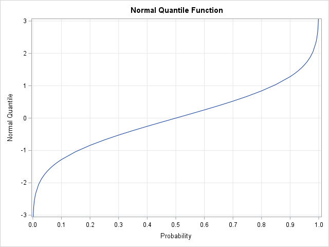
You can apply the inverse transformation, Φ-1, by calling the SAS function QUANTILE("Normal", p).
The inverse normal CDF transformation is shown to the right. Notice that the function is very steep when the probability is near 0 or 1.
This means that a small change in probability results in a very large change in the associated quantiles.
Constructing the Q-Q Plot Confidence Bands in SAS IML
For data, let's analyze the breaking strength data of fiber-optic cords from previous posts.
A previous article shows how to construct a normal Q-Q plot in SAS by using the following steps:
- Sort the data.
- Compute n evenly spaced points in the interval (0,1), where n is the number of data points in your sample. SAS procedures often use Blom's formula, where the i_th point is vi = (i - 0.375) / (n + 0.25).
- Compute the quantiles (inverse CDF) of the evenly spaced points. This gives you quantiles of the standard normal distribution.
- Create a scatter plot of the sorted data versus the standard quantiles computed in Step 3. It is traditional to put the data on the vertical axis and the theoretical quantiles on the horizontal axis. This is in contrast to histograms and ECDF plots, which place the data on the horizontal axis. If you want to add confidence bands to the Q-Q plot, you can transform confidence bands for the CDF. The transformation maps probabilities in (0,1) into standardized quantiles.
The following SAS IML program uses the ECDF and ECDF_KSCL modules
from earlier articles.
For your convenience, you can download these functions from GitHub.
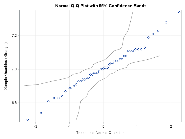
The program compute Kolmogorov bands for the ECDF, transforms them into quantile scale, and writes the results to a data set for graphing.
/* Before running this program, STORE the ECDF and ECDF_KSCL modules and define the Cord data set. See https://blogs.sas.com/content/iml/2026/05/26/create-ecdf.html https://blogs.sas.com/content/iml/2026/06/08/confidence-bands-ecdf.html */ proc iml; /* In SAS Viya, the ECDF function is built into SAS IML and does not need to be loaded. */ load module=(ECDF ECDF_KSCL); /* Read and sort the data */ use Cord; read all var "Strength" into x; close; call sort(x); n = countn(x); /* Compute theoretical plotting positions and map to standardized quantiles (Blom, 1958) */ v = ((1:n) - 0.375) / (n + 0.25); q = quantile("Normal", v); /* Compute the ECDF and the Kolmogorov probability bands */ y = ECDF(x); KS_band = ECDF_KSCL(y); /* 95% CL */ /* Optionally, transform probability bands to quantile bounds. The domain of the QUANTILE function is the open interval (0,1), so clip the band values. */ F_Lower = choose(KS_band[,1] > 0, KS_band[,1], .); F_Upper = choose(KS_band[,2] < 1, KS_band[,2], .); /* For a normal Q-Q plot, use the quantile of the normal distribution. Use the quantile function for other distributions (e.g., "Exponential") to construct confidence intervals for other Q-Q plots. */ Q_Lower = quantile("Normal", F_Lower); Q_Upper = quantile("Normal", F_Upper); /* Create a dataset for plotting */ create QQ_Bands var {"x" "q" "Q_Lower" "Q_Upper"}; append; close; QUIT; /* Create the Q-Q plot. The data is plotted on the vertical axis. The theoretical quantiles are plotted on the horizontal axis. */ title "Normal Q-Q Plot with 95% Confidence Bands"; proc sgplot data=QQ_Bands noautolegend; /* Draw the confidence bands */ series x=Q_Lower y=x / lineattrs=(color=gray); series x=Q_Upper y=x / lineattrs=(color=gray); /* Overlay a scatter plot of the quantiles of the data vs the standard normal quantiles. */ scatter x=q y=x; xaxis label="Theoretical Normal Quantiles" grid; yaxis label="Sample Quantiles (Strength)" grid; run; |
For your convenience, I have also written an IML function (QQ_KSCL) that encapsulates the statements that generate the Q-Q plot and confidence bands.
Interpreting the Q-Q Plot Bands
Intuitively, the Q-Q plot and its confidence bands are a visual depiction of a hypothesis test. The Q-Q plot indicates whether the data might be a random sample from a normal distribution. If the scatter plot is approximately linear, then the assumption of normality seems reasonable.
But what does "approximately linear" mean? By how much can a Q-Q plot deviate from linearity without rejecting the assumption of normality? The confidence bands indicate that the scatter plot can bend a little bit in the center of the distribution and can bend more severely in the tails. It is said that George Box used to place a fat pencil on a Q-Q plot. If he could adjust the pencil so that it covered all points, then he assumed that the data were approximately normal. The confidence band provides a similar visual indicator. If you can draw a straight line that sits entirely within the confidence bands, the data might be approximately normal. You can run a more formal analysis to test that hypothesis.
The widening of the confidence bands in the extreme quantiles explains why points in the tails of a Q-Q plot often deviate from the linear reference line or exhibit a slight bend. Without confidence bands, you might mistakenly conclude that these deviations are evidence of skewness, heavy tails, or non-normality. The confidence bands indicate that deviations in the tail are expected due to natural sampling variability. If the scatter points are inside the bands, there is insufficient evidence to reject the null hypothesis that the data comes from a normal distribution.
A normal Q-Q plot for non-normal data
Before concluding, let's take a quick look at a similar graph for data that are not normal. I generated a random sample of 50 data from an exponential distribution and ran the same SAS code. The Q-Q plot for the exponential data looks like the following graph:
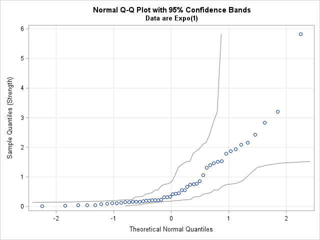
If you apply Box's "fat pencil" test, it is clear that you cannot cover the scatter points with a pencil. You should conclude that the normal distribution is not a good fit for these data.
The Kolmogorov bands in this plot are so wide that you might actually be able to draw a line that stays inside these confidence bands. However, the scatter points are not near that line. A weakness of the Kolmogorov-Smirnov test for normality (and the Kolmogorov confidence bands) is low statistical power for small samples. The Kolmogorov bounds themselves do not rule out the possibility of fitting a normal distribution to these data, but the nonlinear shape of the data points suggest that the fit is not good.
Summary
The standard normal quantile function is a transformation that maps probabilities onto quantiles. By transforming the non-parametric Kolmogorov bands from an ECDF, you can generate simultaneous confidence bands for a normal Q-Q plot. You could use a different quantile function to obtain Q-Q plots for other distributions.
For moderately sized samples, if you can draw a straight line that stays inside the bands, you might want to perform a formal test for the hypothesis that the data are normally distributed. The Kolmogorov bands have low power, so be careful using them for small samples.
You can download all functions from the ECDF and Q-Q plot articles. You can also download a program that creates all tables and graphs in this series of blog posts.
