In SAS, range attribute maps enable you to specify the range of values that determine the colors used for graphical elements. There are various examples that use the GTL to define a range attribute map, but fewer examples that show how to use a range attribute map with PROC SGPLOT. The documentation for the SAS ODS Graphics: Procedures Guide contains two examples:
- How to use a range attribute map to assign colors to markers in a scatter plot, where the colors depend on values of a continuous variable.
- How to define a three-color ramp to define a gradient ramp of colors for a bar chart.
Unfortunately, the examples are not typical. Each example assigns a single color to a range of values. In practice, a range attribute map is often used to assign a gradient color ramp so that each value in a range is assigned a unique color.
This article shows two simpler examples of using a range attribute map in PROC SGPLOT. The first example is a scatter plot. The markers are assigned a color according to the value of a response variable within a specified range. The second example is a heat map of a correlation matrix. The cells are assigned colors according to a color ramp defined on the interval [-1, 1]. Both examples use a linear mapping from a specified data range to the color model.
For a more advanced example, see Kuhfeld's article (2017, "Advanced ODS graphics: Range attribute maps"), which uses a range attribute map to display a heat map for a frequency table, along with marginal distributions for the row and column sums.
A simple color ramp without a range attribute map
Let me be clear: You do not have to use a range attribute map if you want to use a color model that is defined on the range of the data. By default, PROC SGPLOT will display colors that vary in the range [min, max], where min is the minimum value of a variable and max is the maximum value. For example, the following example is taken from an article that shows how to color-code markers in a scatter plot according to a response variable:
/* example from https://blogs.sas.com/content/iml/2016/07/18/color-markers-third-variable-sas.html */ title "Markers Colored by Age"; title2 "No Range Attribute Map"; proc sgplot data=sashelp.class; scatter x=height y=weight / colorresponse=age colormodel=(CX3288BD CX99D594 CXE6F598 CXFEE08B CXFC8D59 CXD53E4F) markerattrs=(symbol=CircleFilled size=14) filledoutlinedmarkers; xaxis grid; yaxis grid; run; |
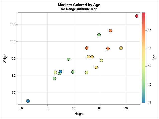
This plot shows the heights and weights for 19 students. The COLORRESPONSE= option specifies that the markers be assigned colors according to the value of the AGE variable. The ages of the students in this data set range from 11 to 16. The markers are assigned colors according to the AGE value and the color model. In this example, I used the COLORMODEL= statement to define a custom color ramp, but you can skip that option to use a default color model. This example shows that you do not need to use a range attribute map if you want the colors to map to the data range [min(AGE), max(AGE)].
A range attribute map for a scatter plot
So, when is a range attribute map useful? In the previous section, there was one sample of 19 students. But suppose you obtain two more samples of students. In one sample, the age of the students range from 10 to 15. In another sample, the age of the students range from 12 to 18. If you want to create scatter plots for the three samples, it would be helpful if they all used a common color scale that goes from 10 to 18, which represents the range of all ages. When you use a common color scale, a yellow marker in one plot represents the same age as a yellow marker in another plot.
A range attribute map is a SAS data set that has special variables and values. A range attribute map enables you to specify the range that is used to assign attributes. The documentation explains the names of the variables and their values, but it is important to realize that there are two different types of graphical elements in SAS ODS graphics:
- The ALTCOLOR variable assigns a color to the lines, markers, and text in a range. Similarly, the ALTCOLORMODEL1 – ALTCOLORMODELk variables create a linear gradient of colors across a range.
- The COLOR variable assigns a fill color to the bars, polygons, and other "area" elements. Similarly, the COLORMODEL1 – COLORMODELk variables create a linear gradient of colors across a range.
The scatter plot example in the previous section assigns colors to markers. A range attribute map for markers requires using the AltColorModel1 – AltColorModelk variables. Let's hard-code the color ramp values into a range attribute map, as follows:
/* First method: manually construct a range attribute map that has a custom color model. Markers use the ALTColorModeln variables */ data AgeRangeAttrMap; length ID $20; length min max $12; /* Note: Using CHARACTER vars for min/max */ array AltColorModel[6] $32; /* use ALTcolormodel array for MARKERS */ input ID min max AltColorModel1-AltColorModel6; datalines; AgeID 10.0 18.0 CX3288BD CX99D594 CXE6F598 CXFEE08B CXFC8D59 CXD53E4F ; proc print noobs; run; |

The AgeRangeAttrMap data set contains a map named AgeID. When you use this map, the colors are assigned according to the range [10,18]. The colors are assigned according to a linear interpolation that uses six colors, whose hexadecimal values are specified. (The mapping accepts other color names. For example, you could use five-color model with values DarkBlue, LightBlue, WhiteSmoke, LightRed, and DarkRed.) In this example, you could use numerical variables for MIN and MAX. However, I used character variables because the MIN and MAX variables accept certain text keywords. For the details, see the documentation.
You can use this range attribute map in a plot by making small modifications to the previous call to PROC SGPLOT:
- Add the RATTRMAP= option to the PROC SGPLOT statement and specify the name of the data set that contains the map.
- Add the RATTRID= option to the SCATTER statement and specify the name of the map.
- Remove the COLORMAP= option from the SCATTER statement because the color map is now specified in the map.
title "Scatter Plot with Colored Markers"; title2 "Range Attribute Map for [10, 18]"; proc sgplot data=sashelp.class rattrmap=AgeRangeAttrMap; /* <== add HERE */ scatter x=height y=weight / colorresponse=age rattrID=AgeID /* <== add HERE */ markerattrs=(symbol=CircleFilled size=14) filledoutlinedmarkers; xaxis grid; yaxis grid; run; |
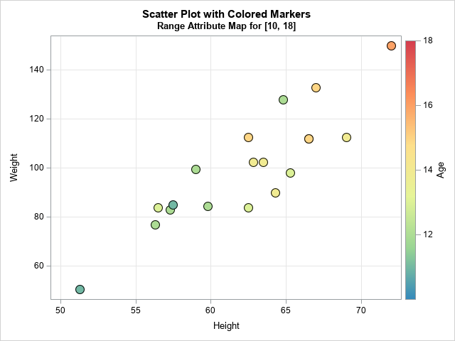
The graph now uses a color model that assigns colors based on the range 10 to 18. For these data, the ages are in the interval [11, 16]. Accordingly, there are not dark blue or dark red markers. The colors range from green to orange. If you use the AgeID map to plot other data samples, they will all use the same color scheme regardless of the ages that are in the data.
Before leaving this example, notice that sometimes the highest or lowest tick mark is not drawn on the gradient legend. You can force the extreme tick marks to display by extending the tick range by a tiny amount. For example, if you use 9.999 and 18.001 as the minimum and maximum values of the range, then the extreme tick marks are shown. The example in the next section uses this trick.
Automating the creation of a range attribute map
The manual specification of the range attribute map is straightforward, but we can add some SAS macro magic to make it more flexible and reusable. First, note that you can use the COUNTW function to count the number of colors in a space-separated list of colors, so you do not need to manually specify the length of the AltColorModel array. Furthermore, you can use the SCAN function to extract each color in a list, so you don't need the DATALINES statement. The following DATA step creates the same range attribute map as the previous section, but generates it from a space-separated list of colors:
/* Second method: create a range attr map that assigns colors in [10,18] Assume the colors are space-separated. */ %let ColorRamp = CX3288BD CX99D594 CXE6F598 CXFEE08B CXFC8D59 CXD53E4F; %let NumColors = %sysfunc(countw(&ColorRamp)); data AgeRangeAttrMap; length ID $20; length min max $12; /* Note: Using CHARACTER vars for min/max */ min = "10.0"; max = "18.0"; array AltColorModel[&NumColors] $32; /* use AltColorModel array for MARKERS */ do _i = 1 to &NumColors; AltColorModel[_i] = scan("&ColorRamp", _i); end; drop _i; run; proc print noobs; run; |
The output is not shown but is identical to the previous hard-coded map.
With a little effort, you can write a SAS macro that generates a range attribute map from a space-separated list of colors, a minimum and maximum value, and the names of the data set and map. So that the map can be used for both markers and areas, you can define an AltColorModel array and a ColorModel array, as follows:
/* Third and most flexible method: Create a range attribute map from the following parameters: ColorRamp : a space-separated list of colors, such as CX3288BD CX99D594 CXE6F598 or Red White Blue DSName : The name of the data set that contains the map. Use this value for RATTRMAP= option. MapName : The name of the range attribute map. Use this value for RATTRID= option. minRange: The minimum value of the range or a valid keyword. maxRange: The maximum value of the range or a valid keyword. */ %macro MakeRangeAttrMap(ColorRamp, DSName, MapName, minRange, maxRange); %let NumColors = %sysfunc(countw(&ColorRamp)); data &DSName; length ID $20; length min max $12; /* Note: Using CHARACTER vars for min/max */ retain ID "&MapName"; min = "&minRange"; max = "&maxRange"; array AltColorModel[&NumColors] $32; array ColorModel[&NumColors] $32; do _i = 1 to &NumColors; AltcolorModel[_i] = scan("&ColorRamp", _i); /* used for markers */ ColorModel[_i] = AltcolorModel[_i]; /* used for areas */ end; drop _i; run; %mend; %MakeRangeAttrMap(&ColorRamp, AgeRangeAttrMap, AgeID, 10, 18); |
The AgeID map in the AgeRangeAttrMap data set has the same values as before for the AltColorModeln variables, but the new data set also includes ColorModeln variables, which you can use to assign colors for bars, heat maps, polygons, and so forth.
Range attribute map for area elements
A good example that requires a range attribute map is the visualization of a correlation matrix. If you do not use a range attribute map, then colors are assign based on the sample correlations in the data. In many cases, it is better to set the range of colors to be [-1, 1] with a neutral color (white or gray) at 0. That way, it is easy to see at a glance which pairs of variables have negative correlation, approximately zero correlation, or positive correlation.
To demonstrate, the following call to PROC CORR estimates the pairwise correlations for 10 numeric variables in the Sashelp.cars data set. As shown in a previous article, you can use the FISHER option to output the pairwise correlations, as follows:
/* create data set that contains pairwise correlations in long form. See https://blogs.sas.com/content/iml/2022/09/26/correlations-to-list.html */ ods select none; proc corr data=Sashelp.Cars nomiss noprob FISHER; /* FISHER ==> list of Pearson correlations */ var _numeric_; ods output FisherPearsonCorr=CorrList( keep=Var WithVar Corr rename=(Var=Var1 WithVar=Var2)); /* Optional: Put the correlations in a data set */ run; ods select all; |
The output is not shown, but it is in the correct format to draw a heat map. The following statements specify a Brown-to-BlueGreen color model and create a range attribute map in which the color range is set to [-1, 1]. Actually, I defined the color range to be slightly WIDER so that the tick marks at -1 and +1 are displayed:
/* define Brown-to-BlueGreen color model and define range attribute map for range [-1, 1] */ %let BrBgRamp = CX8C510A CXD8B365 CXF6E8C3 CXF5F5F5 CXC7EAE5 CX5AB4AC CX01665E ; %MakeRangeAttrMap(&BrBgRamp, CorrRangeAttrMap, CorrID, -1.001, 1.001); title "Heat Map of Correlation Matrix"; title2 "Set Range of Color Ramp Range to [-1, 1]"; proc sgplot data=CorrList aspect=1 rattrmap=CorrRangeAttrMap; heatmapparm x=Var1 y=Var2 colorresponse=Corr / rattrID=CorrID outline outlineattrs=(color=grey); yaxis reverse display=(nolabel); xaxis display=(nolabel); run; |
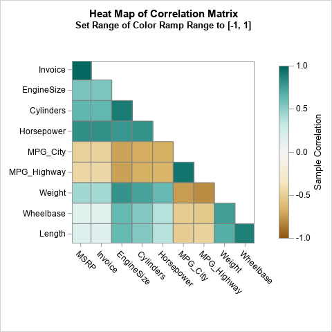
For this graph, the colors for the cells in the heat map are controlled by using the ColorModeln variables. Notice that I display only the lower triangular portion of the correlation matrix because the matrix is symmetric.
Summary
This article shows how to define a range attribute map in SAS. By default, colors are mapped to the range of the data that you are graphing. However, it can be useful to map colors to a range that is independent of the data. Two examples are shown. One is a scatter plot that maps the colors of markers to an interval that is independent of the data. The other is a heat map of a correlation matrix. The colors are mapped to the interval [-1, 1], which ensures that a consistent set of colors are used for very negative correlations, nearly zero correlations, and very positive correlations regardless of the statistics being displayed.

3 Comments
Nice post! In addition, SAS provides an autocall macro, paint, that can be used to generate ranges of colors with interpolation between 2 or more colors. It is illustrated here https://blogs.sas.com/content/graphicallyspeaking/2017/12/11/displaying-upper-lower-triangle-correlation-matrix/ (and a few other places as I recall).
I am always puzzled by the widespread popularity of continuous gradient color coding.
It is impossible to match the color in a graphic element (e.g., heat map cell) to that precise color on a gradient legend.
It is impossible to get a reasonably precise estimate in the difference in response value for any pair of color-coded cells in a heat map. At most, you might conjecture that their colors are different, but How Much is unknowable.
If hypothetically, the viewer could magically match the color in a cell to that color on the legend, the precise value is still unknowable because the gradient legend cannot fit a label for each of the legend colors.
(If you want to see examples of gradient legends that are more useful and/or that use purpose-specific distinguishable subgradients, I recommend Chapter 6 in Visual Data Insights Using SAS® ODS Graphics: A Guide to Communication-Effective Data Visualization.)
My Number 1 guideline for Data Visualization is: Visuals for Quick, Easy Inference, and Precise Numbers for Accurate Inference. Visuals are for Impression that is Immediate, Easy, and Memorable (“Sticky”). Precise Numbers are for Knowledge that is Clear, Certain, and Correct (“The Answer”).
ODS Graphics makes delivering precise numbers easy in several ways: data labels, axis tables, and, for heat maps, the TEXT statement.
When using the TEXT statement to annotate heat map cells, there are two ways to assure that the text is readable despite the cell color fill that is in its background. The BACKLIGHT option with value 1 puts a white halo around each character. The BACKFILL option (preferably with FILL color white for maximum readability) puts a white rectangle beneath each text string. The OUTLINE option creates a box around it (never harmful—its thin, IF default, line never subtracts much area from the surrounding color fill in a heat map cell). The PAD option is best set to 1pt to minimize the subtraction of area from the surrounding color fill.
For color coding, color distinguishability is optimized by maximizing the color mass: thick text, thick lines, big markers, big color swatches for a discrete legend, and sufficient area in a heat map cell.
In my experience, BACKFILL has always been a better choice than BACKLIGHT. For light background colors BACKLIGHT is satisfactory, but for dark backgrounds it, for me, can be visually irritating. I would use it in desperation only for very small cell sizes where backfill might be infeasible due to leaving insufficient distinguishable color fill in the cells.
Below is the code for my two recommended variations from the blog’s example.
I always use a uniform text size for all elements of a graph, unless space constraints dictate an exception for the troubled part(s) of the graph.
You can create an ODS style to impose uniform text characteristics (font or family, height or size, weight (bold or normal), etc. That can solve the problem mentioned below for text size of the gradient legend’s values.
%let TextSize = 7pt; /* Adequate with ODS graphics default dimensions for images.
Adjust it as desired. */
ods graphics / reset=all scale=off imagename=
'AnnotateWithBackLightForMaximumCellColorFill_DeliverTheNumbersNoGuessingNeeded';
title1 height=&TextSize "Heat Map of Correlation Matrix";
title2 height=&TextSize
"Read the Precise Correlation Values in the Cells";
title3 height=&TextSize
"Visually Approximately Compare Them Using the Color Coding and Legend";
proc sgplot data=CorrList aspect=1 rattrmap=CorrRangeAttrMap
noautolegend; /* suppress the legend triggered by the TEXT statement */
heatmapparm x=Var1 y=Var2 colorresponse=Corr / rattrID=CorrID
outline outlineattrs=(color=grey);
text x=Var1 y=Var2 text=Corr /
textattrs=(size=&TextSize)
backlight=1; /* brightest halo (white) */
yaxis reverse display=(nolabel) valueattrs=(size=&TextSize);
xaxis display=(nolabel) valueattrs=(size=&TextSize)
fitpolicy=stagger; /* prevent tilted axis values */
format Corr 5.2; /* trim it from four decimal positions */
gradlegend / position=bottom
/* ODS Graphics provides no direct control on legend value size */
title='Correlation' titleattrs=(size=&TextSize);
run;
imagename=
'AnnotateWithBackFillForMaximumReadability_DeliverTheNumbersNoGuessingNeeded';
text x=Var1 y=Var2 text=Corr /
textattrs=(size=&TextSize)
backfill pad=1pt fillattrs=(color=white) outline;
LeRoy Bessler, PhD, is a data artist, the world’s longest serving advisor to fellow SAS users on best practices for graphic design and use of color, and author of Visual Data Insights Using SAS ODS Graphics: A Guide to Communication-Effective Data Visualization. Since 1981 he has worked to get the best from SAS graphics software.
Thanks for writing. The short answer for the popularity of gradient color ramps is that, in most cases, we don't need to "match the color" to a value nor to obtain a "precise estimate in the difference." Heat maps provide an effective way to visualize when cells are different or similar to each other. You can also obtain an approximate magnitude of the value. We are often interested in whether variables are "not very correlated", "moderately correlated", or "strongly correlated," which you can see without displaying numbers.
Yes, for more precise information, I agree that tables are better. As you point out, you can use the TEXT statement to overlay approximate values if the cells are large enough to contain the text. I've used this technique in several blogs, including one (a visualization of the "Wind Chill Chart") that varies the color of the text in order to make the text visible on light- and on dark-colored cells. This avoids using backlighting.