Strengthen your programming skills with tips and techniques from the experts

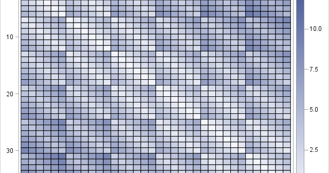
It is sometimes necessary for researchers to simulate data with thousands of variables. It is easy to simulate thousands of uncorrelated variables, but more difficult to simulate thousands of correlated variables. For that, you can generate a correlation matrix that has special properties, such as a Toeplitz matrix or a

