Data. To a statistician, data are the observed values. To a SAS programmer, analyzing data requires knowledge of the values and how the data are arranged in a data set.
Sometimes the data are in a "wide form" in which there are many variables. However, to perform a certain analysis requires that you reshape the data into a "long form" where there is one identifying (ID) variable and another variable that encodes the value. I have previously written about how to convert data from wide to long format by using PROC TRANSPOSE.
Recently I wanted to plot several time series in a single graph. Although PROC SGPLOT supports multiple SERIES statements, it is simpler to use the GROUP= option in a single SERIES statement. The GROUP= option makes it convenient to plot arbitrarily many lines on a single graph. This article describes how to reshape the data so that you can easily plot multiple series in a single plot or in a panel of plots.
Series plots for wide data
The Sashelp sample library includes a data set named Tourism that includes an index of the exchange rates for the British pound and the Spanish peseta versus the US dollar for the years 1966–1994. Each observation is a year. The year is stored in a variable named Year; the exchange rates are stored in separate variables named ExUK and ExSp, for the UK and Spanish exchange rates, respectively. You can use separate SERIES statements to visualize the exchange rates, as follows:
proc sgplot data=Sashelp.Tourism; series x=Year y=ExUK / legendlabel="UK Pound"; series x=Year y=ExSp / legendlabel="Spanish Pesetas"; yaxis label="Exchange Rate vs Dollar"; run; |
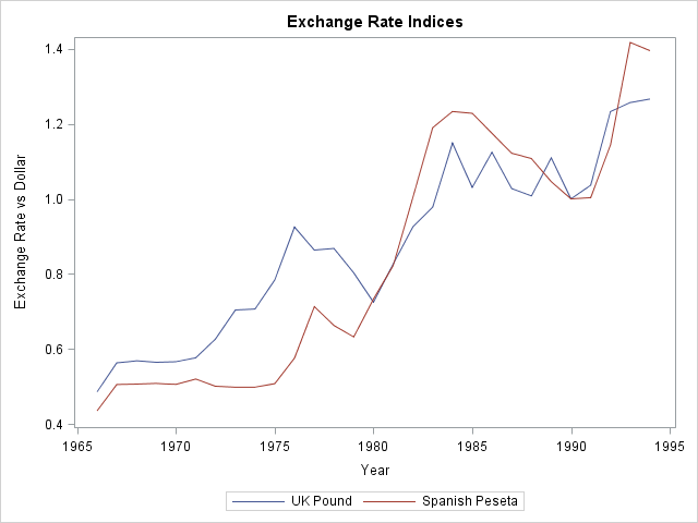
It is not difficult to specify two SERIES statements, but suppose that you want to plot 20 series. Or 100. (Plots with many time series are sometimes called "spaghetti plots.") It is tedious to specify many SERIES statements. Furthermore, if you want to change attributes of every line (thickness, transparency, labels, and so forth), you have to override the default options for each SERIES statement. Clearly, this becomes problematic for many variables. You could write a macro solution, but the next section shows how to reshape the data so that you can easily plot multiple series.
From wide to long in Base SAS
A simpler way to plot multiple series is to reshape the data. The following call to PROC TRANSPOSE converts the data from wide to long form. It manipulates the data as follows:
- Rename ExUK and ExSp variables to more descriptive names (UK and Spain). This step is optional.
- Transpose the data. Each value of the Year variable is replicated into two new rows. The values of the UK and Spain variables are interleaved into a new variable named ExchangeRate.
- A new column named Country identifies which exchange rate is associated with which of the original variables.
proc transpose data=Sashelp.Tourism(rename=(ExUK=UK ExSp=Spain)) /* 1 */ out=Long(drop=_LABEL_ rename=(Col1=ExchangeRate)) /* 2 */ name=Country; /* 3 */ by Year; /* original X var */ var UK Spain; /* original Y vars */ run; |
The original data set contained 29 rows, one X variable (Year) with unique values, and two response variables (ExUK and ExSp). The new data set contains 58 rows, one X variable (Year) with duplicated values, one response variable (ExchangeRate), and an discrete variable (Country) that identifies whether each exchange rate is for the British pound or for the Spanish Peseta. For the new data set, you can recreate the previous plot by using a single SERIES statement and specifying the GROUP=COUNTRY option:
proc sgplot data=Long; label ExchangeRate="Exchange Rate vs Dollar" Country="Country"; series x=Year y=ExchangeRate / group=Country; yaxis label="Exchange Rate"; run; |
The resulting graph is almost identical to the one that was created earlier. The difference is that now it is easier to change the attributes of the lines, such as their thickness or transparency.
Create a panel of plots
If you want to see each time series in its own plot, you can use the SGPANEL procedure, which also requires that the data be in the long form:
proc sgpanel data=Long; label ExchangeRate="Exchange Rate vs Dollar" Country="Country"; panelby Country; series x=Year y=ExchangeRate; run; |
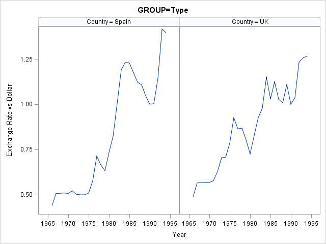
Notice that you do not need to sort the data by the Country variable in order to use the PANELBY statement. However, if you want to conduct a BY-group analysis of these data, then you can easily sort the data by using PROC SORT.
Which do you prefer: multiple SERIES statements or a single SERIES statement that has the GROUP= option? Or maybe you prefer paneled plots? There are advantages to each. Leave a comment.

5 Comments
Pingback: Plotting multiple time series in SAS/IML (Wide to Long, Part 2) - The DO Loop
I tried to make over 30,000 series graph in a chart with the code above, and it just failed with a thin histogram...
I'm not sure how to draw over 30,000 or 50,000 series graph in one chart...
The more important question is what you hope to see when you plot 30,000 time series? Most likely you will see nothing but a solid block of color. The following SAS code creates 5,000 time series (a fraction of what you are asking for). In this case, all series follow the same trend line, so you can make out the general trend, but in real data you are likely to see only a jumbled mess.
I tried to plot 27 time series graph (all having same time points) in a chart with the code
proc sgplot data= data1;
xaxis type=discrete;
series x=year y=Industry1 /;
series x=year y=Industry2 /
y2axis; /*.....an so on for 27 series*/
run;
All are jumbled up .I'm not sure how to plot those graphs in one chart...
As explained in this article, the best way to plot multiple time series is to use one SERIES statement and a GROUP= variable.
Regarding the results being all "jumbled," I am not surprised. Plots of many time series are often called "spaghetti plots" because they look like a jumbled plate of spaghetti noodles. For general tips about visualizing a spaghetti plot, see "Create spaghetti plots in SAS." For an alternative visualization, consider lasagna plots. For specific questions about your data, post to the SAS Support Communities.