At the beginning of 2011, I heard about the Dow Piano, which was created by CNNMoney.com. The Dow Piano visualizes the performance of the Dow Jones industrial average in 2010 with a line plot, but also adds an auditory component. As Bård Edlund, Art Director at CNNMoney.com, said, The daily
Tag: Data Analysis
In a previous blog post about computing confidence intervals for rankings, I inadvertently used the VAR function in SAS/IML 9.22, without providing equivalent functionality for those readers who are running an earlier version of SAS/IML software. (Thanks to Eric for pointing this out.) If you are using a version of
When comparing scores from different subjects, it is often useful to rank the subjects. A rank is the order of a subject when the associated score is listed in ascending order. I've written a few articles about the importance of including confidence intervals when you display rankings, but I haven't
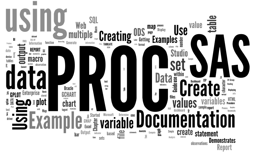
This week, I posted the 100th article to The DO Loop. To celebrate, I'm going to analyze the content of my first 100 articles. In December 2010, I compiled a list of The DO Loop's most-read posts, so I won't repeat that exercise. Instead, I thought it would be interesting
In a previous post, I described how to compute means and standard errors for data that I want to rank. The example data (which are available for download) are mean daily delays for 20 US airlines in 2007. The previous post carried out steps 1 and 2 of the method
I recently posted an article about representing uncertainty in rankings on the blog of the ASA Section for Statistical Programmers and Analysts (SSPA). The posting discusses the importance of including confidence intervals or other indicators of uncertainty when you display rankings. Today's article complements the SSPA post by showing how
Loony. Zany. Brilliant. Hysterical. Those are some of the adjectives I use to describe The Far Side® cartoons by Gary Larson from the 1980s and early '90s. I recently rediscovered an old book, The Far Side Gallery 2, which collects some of the best of Larson's wonderfully wacky cartoons. Every
Several times a year, I am contacted by a SAS account manager who tells me that a customer has asked whether it is possible to convert a MATLAB program to the SAS/IML language. Often the customer has an existing MATLAB program and wants to include the computation as part of
Do you have many points in your scatter plots that overlap each other? If so, your graph exhibits overplotting. Overplotting occurs when many points have similar coordinates. For example, the following scatter plot (which is produced by using the ODS statistical graphics procedure, SGPLOT) displays 12,000 points, many of which
I was inspired by Chris Hemedinger's blog posts about his daughter's science fair project. Explaining statistics to a pre-teenager can be a humbling experience. My 11-year-old son likes science. He recently set about trying to measure which of three projectile launchers is the most accurate. I think he wanted to