English

Rick Wicklin 1
Improving graphs of highly correlated data

If you create a scatter plot of highly correlated data, you will see little more than a thin cloud of points. Small-scale relationships in the data might be masked by the correlation. For example, Luke Miller recently posted a scatter plot that compares the body temperature of snails when they

Rick Wicklin 7
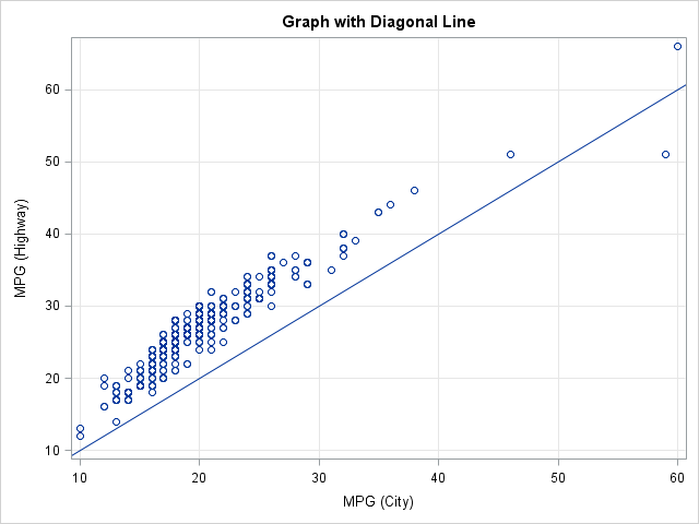
Add a diagonal line to a scatter plot

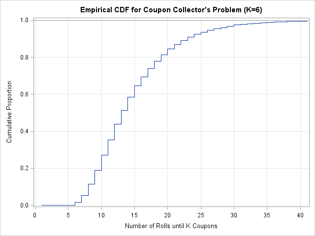
In my statistical analysis of coupons article, I presented a scatter plot that includes the identity line, y=x. This post describes how to write a general program that uses the SGPLOT procedure in SAS 9.2. By a "general program," I mean that the program produces the result based on the

Rick Wicklin 4
The area under a density estimate curve

Readers' comments indicate that my previous blog article about computing the area under an ROC curve was helpful. Great! There is another common application of numerical integration: finding the area under a density estimation curve. This article provides an overview of density estimation and computes an empirical cumulative density function.

1 142 143 144 145 146 158