Pareto charts are used by quality engineers to visually display a set of causes that produce defects in a manufacturing process. The chart is based on the famous Pareto Principle (the 80/20 rule), which states that 20% of the causes often produce 80% of the defects. If you focus on the most common causes, you can quickly reduce your defect count.
This article describes an alternative to the standard Pareto chart and shows how to create the alternative version in SAS.
A problem with the standard Pareto chart
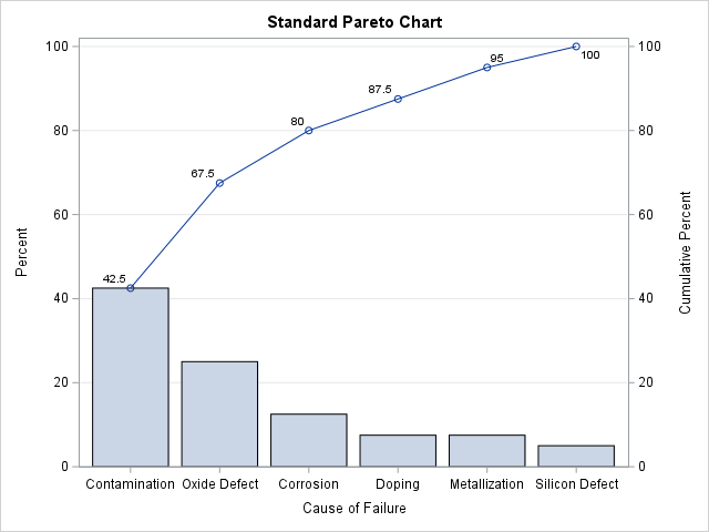
Not every situation obeys the 80-20 rule. For your process, you might find that 80% of the defects are produced by 33% of the causes. Or, maybe 75% of the defects are produced by 10% of the causes. If your process is modeled by a Pareto distribution (a specific power-law distribution), you can use SAS to fit your data to a Pareto distribution. However, most practitioners do not do that. They just display a bar chart of the causes where the bars are displayed in descending order and then try to address the most frequent causes. For example, if a quality engineer looks at the Pareto chart to the right, she might decide to address the "contamination" cause first, followed by the "oxide defect" issue. Together, these two categories account for 67.5% of the defects.
But there is a fundamental problem with this strategy. In small samples, the empirical frequencies in the data might be much different than the underlying probabilities for the process. Thus, the "most frequent" category in the data might not be the most probable cause of the defects. It would be nice to know whether the tall bars to the left just happen to be tall because of random variation or whether they are actually the most probable categories and warrant your attention.
In a short three-page paper, Wilkinson (2006, TAS, "Revising the Pareto Chart") proposes an alternative to the Pareto chart that uses the idea of statistical significance to give additional insight into the tallest bars. The Wilkinson Pareto chart provides acceptance intervals that indicate whether each category appears more often than would be expected if all categories are equally probable. This enables you to assess whether the tallest bars are "sufficiently tall" and are, in fact, more probable than the other bars.
A Pareto chart with acceptance intervals
If you have a license for SAS/QC software, you can create Wilkinson's alternative Pareto chart by using the CHARTTYPE=INTERVALS option on the VBAR statement in PROC PARETO. A previous article showed how to create two standard Pareto charts in SAS. Let's analyze the same data set, which contains the causes of 40 randomly selected defective components in a manufacturing process. The following DATA step defines the data. The call to PROC PARETO creates Wilkinson's acceptance-interval chart:
/* Modification of PROC PARETO example data */ data Failure; INFILE DATALINES delimiter=','; length Cause $ 16; label Cause = 'Cause of Failure'; input Cause @@; datalines; Corrosion, Oxide Defect, Contamination, Oxide Defect Oxide Defect, Oxide Defect, Contamination, Metallization Oxide Defect, Contamination, Contamination, Oxide Defect Contamination, Contamination, Contamination, Corrosion Silicon Defect, Contamination, Contamination, Contamination Contamination, Contamination, Doping, Oxide Defect Oxide Defect, Metallization, Contamination, Corrosion Silicon Defect, Contamination, Corrosion, Corrosion Metallization, Oxide Defect, Contamination, Contamination Oxide Defect, Doping, Doping, Contamination ; %let DSName = Failure; %let VarName = Cause; /* Wilkinson variant of Pareto chart. Which categories are significantly different from a uniform distribution of causes? */ proc pareto data=&DSName; vbar &VarName / charttype=intervals; run; |

What exactly are we looking at? The documentation for PROC PARETO states, "the most frequently occurring problem, Contamination, occurs more frequently than the first-ranked cause from a random sample of ... uniformly distributed causes. This result indicates that addressing contamination problems should be given a high priority."
The documentation does not explain the term "first-ranked cause" or the connection to "uniformly distributed causes."
Understanding the Pareto chart with acceptance intervals
The chart shows both the observed percentages and the expected percentages under the null hypothesis that all categories are equally likely to occur. However, the fact that a Pareto chart is sorted, introduces a complication into what would otherwise be a simple process.
This example has 6 categories. If the categories are equally likely, we would expect each bar in a bar chart to contain about 16.67% of the defects. In the observed sample, the most frequent category (Contamination) contains 42.5% of the defects. Intuitively, we suspect that 42.5% is so much greater than 16.67% that this number is unlikely to be observed by chance if the categories are equally likely. On the other hand, the second most frequent category (Oxide Defect) contains 25% of the defects, which is not too much larger than 16.67%. Perhaps that category is no more likely than any of the other remaining categories?
Wilkinson's chart visualizes the comparison between the observed percentages and the null hypothesis where every category is equally likely. For each category, the graph shows two features:
- The dots show the observed percentage of defects in each category. Thus, the first category (Contamination) shows a dot at 42.5%, the second shows a dot at 25%, the third shows a dot at 12.5%, and so forth.
- The bars represent 95% confidence intervals under the null hypothesis that all six causes are equally probable and under the assumption that the bars are being displayed in decreasing order of size. Wilkinson calls these the acceptance regions. If the observed percentage is outside and above the acceptance region (as it is for the Contamination category), it indicates that the most-frequent category is observed significantly more often than would be expected for the most-frequent category under the null scenario. If the observed percentage is inside the acceptance region (for example, Oxide Defect, Metallization, and Silicon Defect), it indicates that the observed frequency is not different from what would be expected under the null scenario. If the observed percentage is below the acceptance region (Corrosion and Doping), the observed frequency is less than what would be expected under the null scenario.
When I first saw this plot, I was a little confused because I expected the acceptance regions to be centered around 16.7%, which is the expected value for six equally probable categories. However, they are not! The reason for this discrepancy is that the acceptance regions represent the range of 95% of the ranked categories under the hypothesis that all categories are equally probable.
If all categories were equally probable, random variation causes some categories to have more observations than others. When you sort the categories, the first-ranked bar is almost always taller than 16.7%. Similarly, the last-ranked bar is almost always less than 16.7%. Thus, you must adjust the heights of the acceptance regions to account for the fact that the categories are shown in decreasing order.
Using simulation to create the acceptance intervals
You can use simulation to create the acceptance intervals, which are the ranges of the first-ranked, second-ranked, and third-ranked (etc.) categories when the categories are selected uniformly at random from a set of size N. In this example, N=40 and there are K=6 categories. You can use the RANDMULTINOMIAL function in SAS IML software to simulate a large number (B=5000) of samples. For each sample, sort the counts in descending order to mimic the method used by the Pareto chart. You can do these two steps efficiently by simulating all B samples into a matrix that has B rows and K columns. You then sort each row independently.
After this procedure, the first column of the sorted matrix contains the distribution of counts for the first-ranked category in each sample. In general, the i_th column contains the distribution of counts for the i_th-ranked category. You can therefore compute the 2.5th and 97.5 percentiles to form a 95% confidence interval for the counts. This procedure is implemented in the following IML program:
proc iml; call randseed(1234); N = 40; /* Total number of observations */ K = 6; /* Number of categories */ alpha = 0.05; /* Significance level */ B = 5000; /* Number of Monte Carlo iterations */ /* Monte Carlo simulation from the Null distribution, which assumes uniform probability */ prob = j(K, 1, 1/K); Y = RandMultinomial(B, N, prob); /* Sort each row. Columns contain frequencies for each rank (1st, 2nd, 3rd,...). You could also use the SortMat function; see https://blogs.sas.com/content/iml/2026/06/24/sort-rows-cols-matrix.html */ do i = 1 to nrow(Y); v = colvec(Y[i,]); call sort(v, 1, 1); /* sort descending */ Y[i, ] = rowvec(v); end; w = (alpha/2) // (1-alpha/2); call qntl(CL, Y, w); /* 95% CL of counts for ranked categories */ /* transpose CL to make it easier to visualize */ CL = CL`; print CL[c={'LowerCL' 'UpperCL'} r=('R1':'R6')]; QUIT; |

The output shows the confidence intervals for counts when a set of K=6 categories are chosen uniformly at random (with replacement) N=40 times. The first-ranked category (the most-frequent one) usually has 8-13 counts. This is larger than the 40/6 = 6.67 counts that you might have expected. Similarly, the second-ranked category usually has between 7-10 counts. The last two categories usually have 6 or fewer counts. Obviously, you can divide these counts by N=40 to get the corresponding percentages. You can then write the percentages to a SAS data set and use a HIGHLOW statement in PROC SGPLOT to reproduce Wilkinson's Pareto chart.
A SAS macro to create acceptance regions for a Pareto chart
If you have a license for SAS IML software, the following SAS macro computes the same alternative Pareto chart as the CHARTTYPE=INTERVALS option in PROC PARETO.
/* Plot the observed counts as a dot plot and overlay an acceptance band composed of the lower and upper 95% limits for the null distribution. This macro requires license for SAS IML. EXAMPLES: %AcceptancePareto(sashelp.cars, Type); * 95% acceptance regions; %AcceptancePareto(sashelp.cars, Cylinders, alpha=0.1); * 90% acceptance regions; */ %macro AcceptancePareto(DSName, VarName, alpha=0.05); %local conf; %let conf = %sysevalf(100*(1-&alpha)); proc freq data=&DSName order=Freq noprint; where not missing(&VarName); table &VarName / out=_FreqOut outcum; run; /* compute upper and lower CL */ proc iml; call randseed(1234); use _FreqOut; read all var "count"; close; N = sum(count); /* Total number of observations */ K = nrow(count); /* Number of categories */ alpha = α /* Significance level */ B = 5000; /* Number of Monte Carlo iterations */ /* Monte Carlo simulation from the Null distribution, which assumes uniform probability */ prob = j(K, 1, 1/K); /* H0: All categories are equally probable */ Y = RandMultinomial(B, N, prob); /* Sort each row. Columns contain frequencies for each rank (1st, 2nd, 3rd,...) */ do i = 1 to nrow(Y); v = colvec(Y[i,]); call sort(v, 1, 1); /* sort descending */ Y[i, ] = rowvec(v); end; w = (alpha/2) // (1-alpha/2); call qntl(CL, Y, w); /* 95% CL of counts for ranked categories */ /* transpose CL and convert to percentage */ CL = 100 * CL` / N; create _CL from CL[c={'_Lower' '_Upper'}]; append from CL; close; QUIT; data _AcceptancePareto; merge _FreqOut _CL; label _Lower = "Lower &conf.% Acceptance Percent" _Upper = "Upper &conf.% Acceptance Percent" Percent = "Observed Percent"; run; proc sgplot data=_AcceptancePareto; highlow x=&VarName low=_Lower high=_Upper / type=bar barwidth=0.8 legendlabel="&conf.% Acceptance Interval"; scatter x=&VarName y=Percent; yaxis min=0 offsetmin=0 grid label="Percent"; xaxis type=discrete discreteorder=data; keylegend / location=Inside position=NE opaque across=1; format Percent best4.; run; %mend; title "Revised Pareto Chart with 95% Acceptance Bands"; title2 "H0: Uniform Probability for Causes"; footnote J=L "Wilkinson (2006, TAS)"; %AcceptancePareto(Failure, Cause); |

I've added grid lines and a legend, but the information in this plot is the same as the one produced by PROC PARETO. The graph shows that the empirical probability of the Contamination defects is significantly different from what would be expected if the defect causes were equally probable. Thus, the quality engineer should strive to reduce the contamination defects. The observed count for Oxide Defect is not significantly higher than expected. It is on the boundary of the acceptance region, so the engineer might want to gather more data before dedicating resources to address the Oxide Defect.
Summary
This article shows how to create an alternative to the standard Pareto charts (Wilkinson, 2006). The alternative chart provides acceptance intervals that indicate whether each category appears more often than would be expected if all categories are equally probable. This enables you to assess whether the tallest bars are "sufficiently tall" and are, in fact, occurring more often than chance. If not, there is little reason to spend time and money trying to address that cause.