It can be frustrating to receive an error message from statistical software. In the early days of the SAS statistical graphics (SG) procedures, an error message that I dreaded was
ERROR: Attempting to overlay incompatible plot or chart types.
This error message appears when you attempt to use PROC SGPLOT to overlay two plots that have different properties. For example, you might be trying to overlay a bar chart, which requires a categorical variable, with a scatter plot or series plot, which often displays values of a continuous variable.
In SAS 9.4M3 and later, there is a simple way to avoid this error message. You can combine a bar chart with other plot types by using the VBARBASIC or HBARBASIC statements, which create a bar chart that is compatible with other "basic" plots.
Compatibility of plot types
The SAS documentation includes an explanation of chart types, and a table that shows which plots you can overlay when you use PROC SGPLOT or PROC SGPANEL. (The doc erroneously puts HBARBASIC and VBARBASIC in the "categorization" group, but they should be in the "basic group." I have contacted the doc writer to correct the mistake.) If you try to overlay plots from different chart types, you will get the dreaded ERROR: Attempting to overlay incompatible plot or chart types.
First, let me emphasize that this error message only appears when you use PROC SGPLOT or SGPANEL to overlay the plots. If you use the Graph Template Language (GTL) and PROC SGRENDER, you do not have this restriction.
I have previously written about two important cases for which it is necessary to overlay an empirical distribution (bar chart or histogram) and a theoretical distribution, which is visualized by using a scatter plot or series plot:
- How to overlay a custom density curve on a histogram in SAS: This article uses the GTL to overlay a curve on a histogram.
- Overlay a curve on a bar chart in SAS: This article uses the VBARBASIC statement to overlay a bar chart and a curve.
My previous article shows how to overlay a bar chart and a series plot, but the example is a little complicated. The examples in the next sections are much simpler. There are two ways to combine a bar chart and a line plot: You can use the HBAR and HLINE statements, or you can use the HBARBASIC and SERIES statements. By using HBARBASIC, you can overlay a bar chart with many other plots.
Overlay a bar chart and a line plot
Suppose you want to use a bar chart to display the average height (by age) of a sample of school children. You also want to add a line that shows the average heights in the population. Because you must use "compatible" plot types, the traditional approach is to combine the HBAR and HLINE statements, as follows. (For simplicity, I omit the legend on this graph.) The DATA step creates fake data, which are supposed to represent the national average and a range of values for the average heights.
data NationalAverage; /* fake data for demonstration purposes */ label Average = "National Average"; input Age Average Low High; datalines; 11 60 53 63 12 62 54 65 13 65 55 67 14 66 56 68 15 67 57 70 16 68 58 72 ; data All; set Sashelp.Class NationalAverage; run; title "Average Heights of Students in Class, by Age"; proc sgplot data=All noautolegend; hbar Age / response=height stat=mean; hline Age / response=Average markers datalabel; run; |
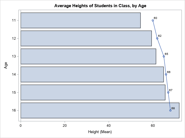
This is the "classic" bar chart and line plot. This syntax has been available in SAS since at least SAS 9.2. It enables you to combine multiple statements for discrete variables, such as HBAR/VBAR, HLINE/VLINE, and DOT. However, in some situations, you might need to overlay a bar chart and more complicated plots. In those situations, use the HBARBASIC or VBARBASIC graphs, as shown in the next section.
Overlay a bar chart and plots of continuous data
The VBARBASIC and HBARBASIC statements (introduced in SAS 9.4M3) enable you to combine bar charts with one or more other "basic" plots such as scatter plots, series plots, and box plots. Like the VBAR and HBAR statements, these statements can summarize raw data. They have almost the same syntax as the VBAR and HBAR statements.
Suppose you want to combine a bar chart, a series plot, and a high-low plot. You can't use the VBAR or HBAR statements because that leads to "incompatible plot or chart types." However, you can use the VBARBASIC and HBARBASIC statements, as follows:
proc sgplot data=All noautolegend; hbarbasic Age / response=height stat=mean name="S" legendlabel="Class"; series y=Age x=Average / markers datalabel=Average name="Avg" legendlabel="National Average"; highlow y=Age low=Low high=High; keylegend "S" "Avg"; run; |
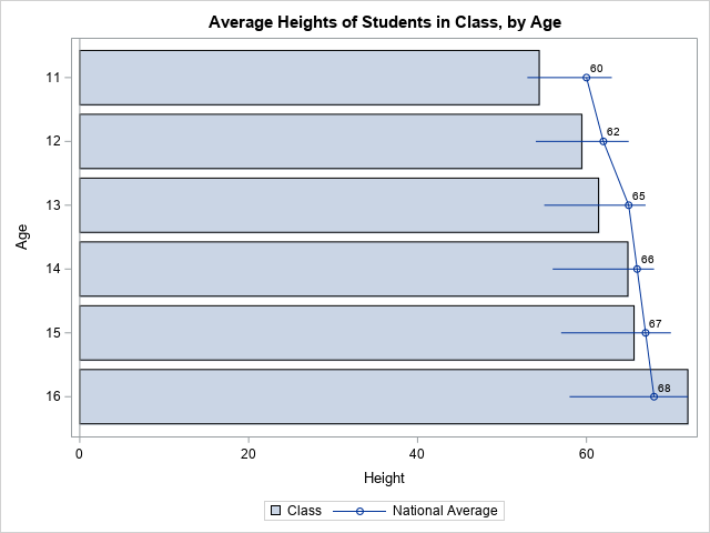
Notice that the SERIES and HIGHLOW statements create "basic" graphs. To overlay these on a bar chart, use the HBARBASIC statement. In a similar way, you can overlay many other graph types on a bar chart.
Summary
Sometimes you need to overlay a bar chart and another type of graph. If you aren't careful, you might get the error message: ERROR: Attempting to overlay incompatible plot or chart types. In SAS 9.4M3 and later, there is a simple way to avoid this error message. You can use the VBARBASIC or HBARBASIC statements to create a "basic" bar chart that is compatible with other "basic" plots.

8 Comments
Rick,
HBARPARM also can do that .
data NationalAverage; /* fake data for demonstration purposes */
label Average = "National Average";
input Age Average Low High mean;
datalines;
11 60 53 63 60
12 62 54 65 62
13 65 55 67 64
14 66 56 68 63
15 67 57 70 65
16 68 58 72 66
;
data All;
set Sashelp.Class NationalAverage;
run;
proc sgplot data=All noautolegend;
hbarparm category=Age response=mean / name="S" legendlabel="Class";
series y=Age x=Average / markers datalabel=Average name="Avg" legendlabel="National Average";
highlow y=Age low=Low high=High;
keylegend "S" "Avg";
run;
Correct. If you are using HBARPARM to graph pre-summarized data, you can overlay other "basic" graphs on the bar chart.
Pingback: Add reference lines to a bar chart in SAS - The DO Loop
Hi Rick, I have always been troubled by the question, what is the difference between sgplot and sgrender, because both of the two method can generate the same graph in most cases. Could you please give me your opinion on these two? Thanks a lot.
There are two ways to generate ODS statistical graphics in SAS. For many common graphs with one panel, you can use PROC SGPLOT, which supports bar charts, histograms, scatter plots, etc, with simple overlays. For more complex graphs, you can use PROC TEMPLATE and the Graph Template Language (GTL) to define different cells that contain graphical elements. When you do that, PROC SGRENDER is used to read the template and create the graphh.
Hi Rick, Thanks a lot for your quick reply! The explanation is very clear. On this basis, I am going to further explore the application and differences between the two. Thank you!
Yannick
Does this work with a stacked bar chart using the group= option? When I try it I get this note and the vline is not visible on the graph:
NOTE: Grouped line charts are not stacked. Overlaying them on a stacked bar chart might make the chart difficult to
interpret.
proc sgplot data = fullstack ;
vbar admitYr / response=total stat=sum group=name ;
vline admitYr / response=ncost markers y2axis group=name;
run;
Yes, it works, but the NOTE reminds you that you might want to adjust the VLINE values to represent cumulative values. In the code you sent, the bar shows the cumulative totals, but the lines show the individual NCOST values.
If that's what you want, fine. But it might be clearer to show the cumulative NCOST values instead.