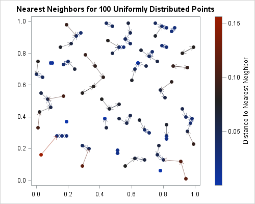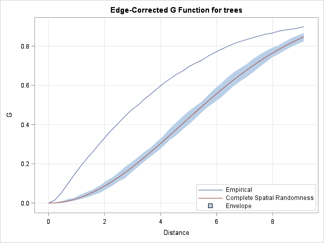
Last week I showed how to compute nearest-neighbor distances for a set of numerical observations. Nearest-neighbor distances are used in many statistical computations, including the analysis of spatial point patterns. This article describes how the distribution of nearest-neighbor distances can help you determine whether spatial data are uniformly distributed or

