A SAS programmer asked whether it is possible to add reference lines to the categorical axis of a bar chart. The answer is yes. You can use the VBAR statement, but I prefer to use the VBARBASIC (or VBARPARM) statement, which enables you to overlay a wide variety of graphs on a bar chart. I have previously written about using the VBARBASIC statement to overlay graphs on bar charts. The VBARBASIC chart is compatible with more graphs than the VBAR chart. See the documentation for a complete discussion of "compatible" plot types.
This article shows two ways to overlay a reference line on the categorical axis of a bar chart. But the SAS programmer wanted more. He wanted to create a bar for each day of the year. That is a lot of bars! For bar charts that have many bars, I recommend using the NEEDLE statement to create a needle plot. The second part of this article demonstrates a needle plot and overlays reference lines for certain holidays.
For simplicity, this article discusses only vertical bar charts, but all programs can be adapted to display horizontal bar charts.
Reference lines and bar charts that use the VBAR statement
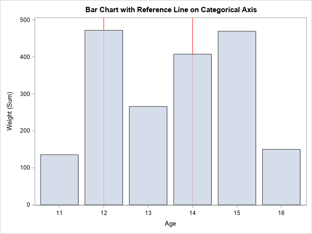
First, to be clear, you can easily add horizontal reference lines to a vertical bar chart. This is straightforward. The programmer wanted to add vertical reference lines to the categorical axis, as shown in the graph to the right. In this graph, reference lines are added behind the bars for Age=12 and Age=14. I made the bars semi-transparent so that the full reference lines are visible.
As the SAS programmer discovered, the following attempt to add reference lines does not display any reference lines:
title "Bar Chart with Reference Line on Categorical Axis"; proc sgplot data=Sashelp.Class; refline 12 14 / axis=x lineattrs=(color=red); /* DOES NOT WORK */ vbar Age / response=Weight transparency=0.2; run; |
Why don't the reference lines appear? As I have previously written, you must specify the formatted values for a categorical axis. This is mentioned in the documentation for the REFLINE statement, which states that "unformatted numeric values do not map to a formatted discrete axis. For example, if reference lines are drawn at points on a discrete X axis, the REFLINE values must be the formatted value that appears on the X axis." In other words, you must change the REFLINE values to be "the formatted values," which are '12' and '14'. The following call to PROC SGPLOT displays the vertical reference lines:
proc sgplot data=Sashelp.Class; refline '12' '14' / axis=x lineattrs=(color=red); /* YES! THIS WORKS! */ vbar Age / response=Weight transparency=0.2; run; |
The reference lines are shown in the graph at the beginning of this section.
Reference lines and the VBARBASIC statement
I prefer to use the VBARBASIC statement for most bar charts. If you use the VBARBASIC statement, you can specify the raw reference values. To be honest, I am not sure why it works, but, in general, the VBARBASIC statement is better when you need to overlay a bar chart and other graphical elements. If you use the VBARBASIC statement, the natural syntax works as expected:
proc sgplot data=Sashelp.Class; refline 12 14 / axis=x lineattrs=(color=red); /* THIS WORKS, TOO! */ vbarbasic Age / response=Weight transparency=0.2; run; |
The graph is the same as shown in the previous section.
Reference lines for holidays on a graph of sales by date
This section discusses an example that has hundreds of bars. Suppose you want to display a bar chart for sales by date for an entire year. For data like these, I have two recommendations:
- Do not use a vertical bar chart. Even if each bar requires only three pixels, the chart will be more than 3*365 ≈ 1,100 pixels wide. On a monitor that displays 72 pixels per inch, this graph would be about 40 cm (15.3 inches) wide. A better choice is to use a needle plot, which is essentially a bar chart where each bar is represented as a vertical line.
- The horizontal axis cannot be discrete. If it is, you will get 365 dates printed along the axis. Instead, you want to use the XAXIS TYPE=TIME option to display the bars along an axis where tick marks are placed according to months, not days. (If the categories are not dates but are "days since the beginning," you can use the XAXIS TYPE=LINEAR option instead.)
Recall that the SAS programmer wanted to display holidays on the graph of sales for each day. Rather than specify the holidays on the REFLINE statement (for example, '01JAN2003'd '25DEC2003'd), it is more convenient to put the reference line values into a SAS data set and specify the name of the You can use the HOLIDAY function in SAS to get the date associated with major government holidays.
The following SAS DATA step extracts a year's worth of data for the sale of potato chips (in 2003) from the Sashelp.Snacks data set. These data are concatenated with a separate data set that contains the holidays that you want to display by using reference lines. A needle plot shows the daily sales and the reference lines.
data Snacks; /* sales of potato chips for each date in 2003 */ set Sashelp.Snacks; where '01JAN2003'd <= Date <= '31DEC2003'd AND Product="Classic potato chips"; run; data Reflines; /* holidays to overlay as reference lines */ format RefDate DATE9.; RefDate = holiday("Christmas", 2003); output; RefDate = holiday("Halloween", 2003); output; RefDate = holiday("Memorial", 2003); output; RefDate = holiday("NewYear", 2003); output; RefDate = holiday("Thanksgiving", 2003); output; RefDate = holiday("USIndependence", 2003); output; RefDate = holiday("Valentines", 2003); output; run; data All; /* concatentate the data and reference lines */ set Snacks RefLines; run; title "Sales and US Holidays"; title2 "Needle Plot"; proc sgplot data=All; refline RefDate / axis=x lineattrs=(color=red); needle x=Date y=QtySold; run; |
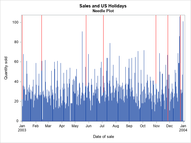
Notice that you do not have to use the XAXIS TYPE=TIME option with the NEEDLE statement. The SGPLOT procedure uses TYPE=TIME option by default when the X variable has a time, date, or datetime format. If you decide to use the VBARBASIC statement, you should include the XAXIS TYPE=TIME statement.
Summary
In summary, this article shows how to add vertical reference lines to a vertical bar chart. You can use the VBAR statement and specify the formatted reference values, but I prefer to use the VBARBASIC statement whenever I want to overlay a bar chart and other graphical elements. You can also use a needle plot, which is especially helpful when you need to display 100 or more bars.

7 Comments
Rick,
proc sgplot data=All;
refline 12 14 / axis=x lineattrs=(color=red); /* THIS WORKS, TOO! */
vbarbasic Age / response=Weight transparency=0.2;
run;
Should be
proc sgplot data=Sashelp.Class;
?
Thanks. Fixed.
Rick,
I think you could add this feather in it . I learned it from Reeza .
proc sgplot data=Sashelp.Class;
refline '99' / axis=x lineattrs=(color=red);
vbar Age / response=Weight transparency=0.2;
xaxis values=('11' '12' '13' '14' '99' '15' '16')
valuesdisplay=('11' '12' '13' '14' ' ' '15' '16') ;
run;
Thanks for the tip.
It may be worth mentioning that the documentation for the HOLIDAY() function in SAS states: Only certain common U.S. and Canadian holidays are defined for use with this function.
Here in Germany the holidays vary by state. In other parts of the world different calendars are used, so holidays are not on fixed dates in the Gregorian calendar.
Thanks for writing. Yes, different countries celebrate different holidays. Furthermore, new holidays can be created, as was done in 2021 in the US with the creation of the Juneteenth holiday. Furthermore, it can be a programming challenge to predict the future date of any non-fixed holidays such as Rosh Hashanah, Easter, and Eid, which are based on lunar calendars and can even vary from country to country.
However, if you can get the dates into a data set, the technique in this post can help you to plot them.
Pingback: Compatible plot types in SAS - The DO Loop