A cumulative curve shows the total amount of some quantity at multiple points in time. Examples include:
- Total sales of songs, movies, or books, beginning when the item is released.
- Total views of blog posts, beginning when the post is published.
- Total cases of a disease for different countries, beginning when the disease passes some threshold (such as the 100th case) in each country.
If you plot multiple cumulative curves on the same graph, you can compare the different songs, blog posts, or countries. How do the sales of one song compare with another song that was released last week? How does the spread of a disease in one country compare with the spread in a different country that experienced the same disease months ago?
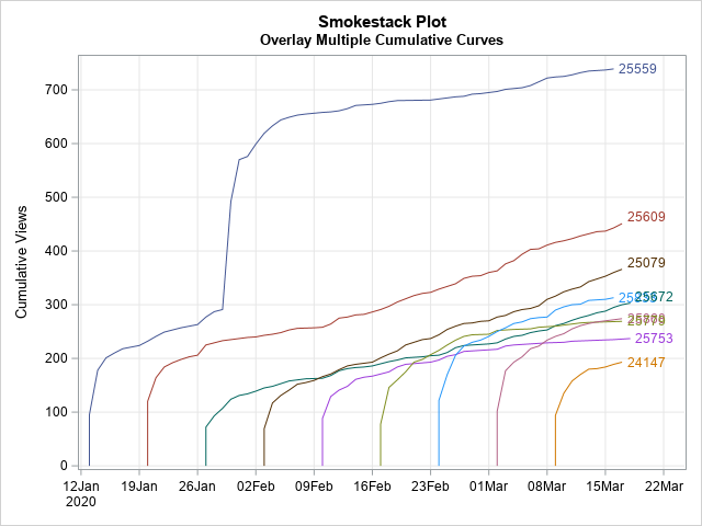
Robert Alison noticed that when you plot multiple cumulative curves on the same graph, the graph looks like a series of tall smokestacks, each billowing smoke. You can imagine a breeze is blowing from the left, which makes the smoke drift to the right. Therefore, he named this graph a "smokestack plot." A smokestack plot overlays several cumulative curves, which might start at different points in time. An example of a smokestack plot is shown to the right. (Click to enlarge.)
This article shows how to use SAS to create a smokestack plot like this one. It discusses how to get data in a suitable form, how to generate the cumulative quantities, and how to plot the cumulative curves. To illustrate the process, this article uses views of blog posts during early 2020.
You can download the data and SAS program for this article.
The form of the data
The data for a smokestack plot should be in "long form." That is, the data should contain three variables:
- An ID variable that identifies each subject. For these data, each post has a unique ID number.
- A date or time variable. For these data, the DATE variable identifies days that the blog post was viewed, beginning with the day it was published.
- A variable that records the number of events for each subject at each time point. For these data, the VALUE variable records the number of views for each blog post for each day.
The data should be sorted by the time variable within each value of the ID variable.
If you are interested in the frequency of views, you can plot the number of views versus time to obtain a frequency plot. For example, the following plot shows the number of views for each day for the blog post with ID=25559, which was published on 13JAN2020.
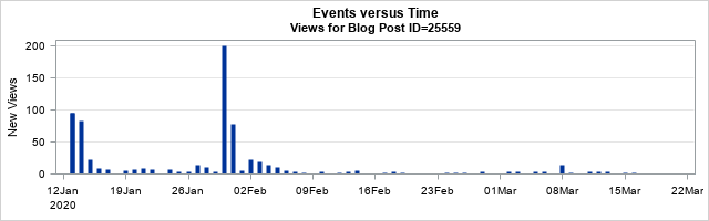
The frequency plot shows that the post received almost 100 views when it was first published, but the daily views quickly fell to about 10 per day until the end of January, when the blog post was mentioned in a newsletter. That caused a spike in views. The spike eventually faded, and the post settled into a steady state in which it receives a few (3 or 4) views per day. (Diseases and songs also experience spikes. A disease might spike when newly infected persons enter an area. Songs spike if they are featured in a movie or TV show.)
Other blog posts follow a similar trajectory. There is an initial spike in views after publication, and the daily views eventually settle into a steady state. For some posts, the daily views remain relatively high even long after they are published. Others attract only a few views per day after the initial spike.
Create a smokestack plot
You can use a smokestack plot of the cumulative views to monitor the steady-state behavior and to compare different subjects.
The first step is to compute the cumulative quantities for each ID. Assuming that the data are sorted by the Date variable within each value of the ID variable, the following DATA step computes the cumulative number of views for each value of the ID variable.
/* Compute cumulative quantities */ data Cumul; set Have; /* assume sorted by Date for each ID variable */ by ID notsorted; /* use NOTSORTED option if not sorted by ID */ if first.ID then do; Cumul=0; /* initialize the cumulative count */ output; /* Optional: to display 0, include the OUTPUT statements */ end; Cumul + Value; /* increment the cumulative count */ output; run; |
You can now plot the cumulative quantity versus time for each ID value. In SAS, you can use the SERIES statement and specify the GROUP= option to obtain a different curve for each ID value:
ods graphics / reset; title "Smokestack Plot"; title2 "Overlay Multiple Cumulative Curves"; proc sgplot data=Cumul; series x=Date y=Cumul / group=ID lineattrs=(pattern=solid) curvelabel; xaxis grid display=(nolabel); yaxis grid label="Cumulative Views"; run; |
The graph is shown at the top of this article. The graph shows that the posts are published at regular intervals (every Monday). They initially get a flurry of views, but after a week or two the views taper off to a rate that is different for each post. The slope of the cumulative curve indicates the rate at which a blog gets new views.
The blog posts in this data set get about 100 views on the first day. That's the "smokestack," which rises vertically. After that, new views look like smoke. During the first few days, the smoke rises quickly, which corresponds to a greater-than-average number of views. As time goes on, there are fewer views, so the trails of smoke become less steep. The long-term views are mostly generated from internet search engines at a post-specific rate. You can see in the graph that some slopes (smoke trails) are steeper than others.
On occasion, a post will be referenced in a newsletter, viral tweet, or subsequent blog post, which can result in a secondary spike in views. This is seen for the post that has ID=25559. In the smokestack plot, this looks like an updraft that lifts the smoke trail dramatically upward before it once again settles into a (possibly new) long-term slope.
Create a common origin
You can use a variant of the smokestack plot to compare multiple cumulative curves as if they all started on the same day. To do that, you can create a new variable (DAY), which is the number of days since publication. You can use that variable to plot the cumulative curves with a common origin, as follows:
data Origin; retain BaseDate; set Cumul; /* start with the cumulative data */ by ID notsorted; /* use the NOTSORTED option if not sorted by ID */ if first.ID then /* remember the first day for this ID */ BaseDate = Date; Day = Date - BaseDate; /* days since first day */ drop BaseDate; run; title2 "Cumulative Curves with a Common Origin"; proc sgplot data=Origin; series x=Day y=Cumul / group=ID lineattrs=(pattern=solid) curvelabel; xaxis grid label="Days Since Publication" values=(0 to 100 by 10) valueshint; yaxis grid label="Cumulative Views" values=(0 to 1000 by 100) valueshint; run; |
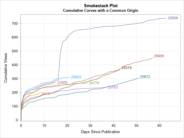
This graph enables you to compare the number of views for each post n days after publication. Notice that the older posts have longer smoke trails, whereas the more recent posts have shorter trails. The "common origin" smokestack plot provides several informative facts:
- ID=25559 (dark blue, top) was popular even before it got a big "updraft" about 15 days after publication.
- Although ID=25609 (dark red, middle) and ID=25079 (brown, middle) have fewer cumulative views than ID=25559. you can see that their long-term slope is steeper, which indicates that they get more daily views. If these trends hold, they may overtake ID-25559 in total views after a few more months.
- Although ID=25779 (olive green) and ID=25753 (magenta) started out somewhat strong, they are now generating only 1-2 views per day. In contrast, ID=25672 (teal, bottom) started out slowly but generate 4-5 views every day, so it might eventually surpass those other two posts in total views.
You can make other choices for a common origin. For example, if some posts have a slower start than others, you could let "Day 0" be the first day on which each post surpasses 200 views.
Log-scale smokestack plots
I intentionally omitted blog posts that have more than 1000 cumulative views because I wanted to be able to see the trajectories of the less popular items. However, in your data, you might have one or two subjects whose cumulative quantities are an order of magnitude larger than the others. In this case, you might want to plot the cumulative curves on a logarithmic scale, which is equivalent to plotting the logarithm of the cumulative counts.
The SGPLOT procedure makes it easy to plot data on the log scale: simply add TYPE=LOG to either the YAXIS or XAXIS statement. By default, the scale is the natural logarithm (base e), which is appropriate for most scientific applications. For social science and business applications, you can use LOGBASE=10 to plot log10 of the data. The data for a log-scale graph must be strictly positive, so the following call to PROC SGPLOT uses a WHERE Cumul>0 to drop any zeros in the cumulative counts. You can use a log scale for the original smokestack plot or for the version that has a common origin:
title2 "Cumulative Curves (log scale)"; proc sgplot data=Origin; where Cumul > 0; series x=Day y=Cumul / group=ID lineattrs=(pattern=solid) curvelabel; xaxis grid label="Days Since Publication" values=(0 to 100 by 10) valueshint; yaxis grid type=log logbase=10 /* LOG10 transformation of axis */ label="Cumulative Views" values=(100 to 1000 by 100) valueshint; run; |
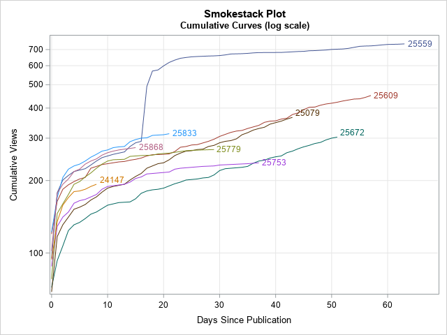
As I said, a log scale enables you to see very large values (such as 10,000 or more) and very small (such as 100 or less) in one plot. For these data, the main advantage of a log scale is that you can more easily see values for the curves near Day=0 where the cumulative counts are small (less than 200).
Summary
This article shows how to use SAS to create a smokestack plot, which is a graph that overlays multiple cumulative curves. Often, the cumulative curves will start at different points in time. However, you can translate the curves to a common origin by defining a new variable such as "the number of days since publication." This enables you to directly compare to curves at the same point in their evolution. Lastly, if one curve is much taller than the others, you can use a log-scale axis to visualize all curves on a common scale.
The smokestack plot can be used for many different applications. During the coronavirus pandemic of 2020, smokestack plots were a common way to compare the cumulative totals of infected persons for different countries.
