In a previous blog post, I showed how to use the graph template language (GTL) in SAS to create heat maps with a continuous color ramp. SAS/IML 13.1 includes the HEATMAPCONT subroutine, which makes it easy to create heat maps with continuous color ramps from SAS/IML matrices. Typical usage includes creating heat maps of data matrices, correlation matrices, or covariance matrices. A more advanced usage is using matrices to visualize the results of computational algorithms or computer experiments.
Data matrices
Heat maps provide a convenient way to visualize many variables and/or many variables in a single glance. For example, suppose that you want to compare and contrast the 24 trucks in the Sashelp.Cars data by using the 10 numerical variables in the data set. The following SAS/IML statements read the data into a matrix and sort the matrix according to the value of the Invoice variable (that is, by price). The Model variable, which identifies each truck, is sorted by using the same criterion:
proc iml; use Sashelp.Cars where(type="Truck"); read all var _NUM_ into Trucks[c=varNames r=Model]; close Sashelp.Cars; call sortndx(idx, Trucks[,"Invoice"]); /* find indices that sort the data */ Trucks = Trucks[idx,]; Model = Model[idx]; /* sort the data and the models */ |
The original variables are all measured on different scales. For example, the Invoice variable has a mean value of $23,000, whereas the EngineSize variable has a mean value of 4 liters. Most of the values in the matrix are less than 300. Consequently, a heat map of the raw values would not be illuminating: The price variables would be displayed as dark cells (high values) and the rest of the matrix would be almost uniformly light (small values, relative to the prices). Fortunately, the HEATMAPCONT subroutine supports the SCALE="Col" option to standardize each variable to have mean 0 and unit variance. With that option, a heat map reveals the high, middle, and low values of each variable:
call HeatmapCont(Trucks) scale="Col"; /* standardize cols */ |

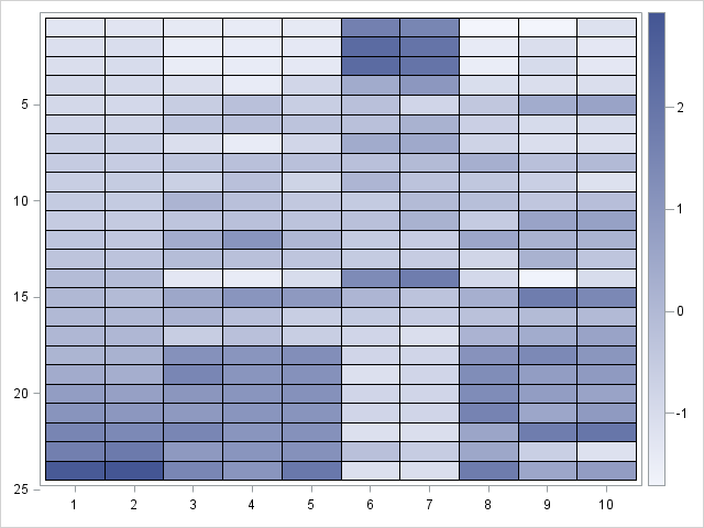
The HEATMAPCONT output shows the following default values:
- The default color ramp is the 'TwoColor' color ramp. With my ODS style, white is used to display small values and dark blue is used to display large values. The color ramp indicates that the standardized values are approximately in the range [-2, 3], which probably indicates that several variables have positive skewness.
- The axes are labeled by using the row numbers of the 24 x 10 matrix.
- The Y axes "points down." In other words, the heat map displays the matrix as it would be printed: the top of the heat map displays the first few rows and the bottom of the heat map displays the last few rows.
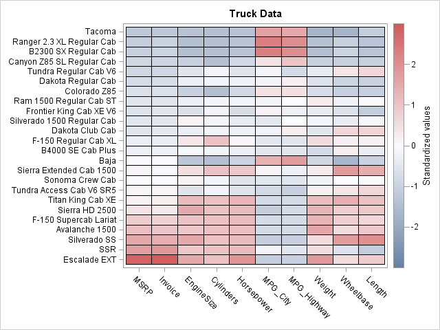
A problem with this initial heat map is that we don't know which trucks correspond to the rows, nor do we know which variables corresponds to the columns. You can use the XVALUES= and YVALUES= options to add that information to the heat map. Also, let's use a three-color color ramp and center the range of the color ramp so that white represents the mean value for each variable and red (blue) represents positive (negative) deviations from the mean. The resulting image is shown below (click to enlarge):
call HeatmapCont(Trucks) scale="Col"           /* standardize cols    */
     xvalues=varNames yvalues=Model            /* label rows and cols */
     colorramp="ThreeColor" range={-3 3}       /* color range [-3,3]  */
legendtitle = "Standardized values" title="Truck Data"; |

This visualization of the data enables us to draw several conclusions about the data. In general, expensive cars are powerful (large values of EngineSize/, Cylinders, and Horsepower), large in size (large values of Weight, Wheelbase, and Length), and get poor fuel economy (small values of MPG_City and MPG_Highway). However, two vehicles seem unusual. Compared with similarly priced trucks, the Baja is smaller and more fuel efficient. Compared with similarly priced trucks, the Tundra is more powerful and larger in size.
Correlation matrices
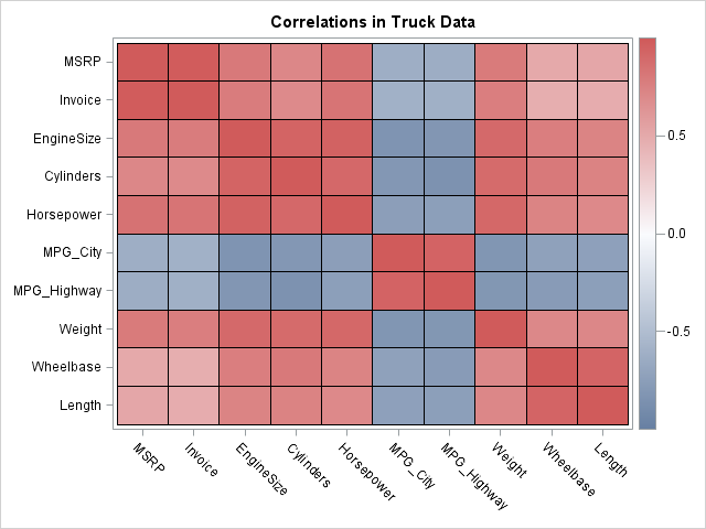
Because the data matrix is sorted by price, it looks like price variables are positively correlated with all variables except for the fuel economy variables. Let's see if that is the case by computing the correlation matrix and displaying it as a heat map:
corr = corr(Trucks);
call HeatmapCont(corr)
     xvalues=varNames yvalues=varNames
     colorramp="ThreeColor" range={-1 1}
title="Correlations in Truck Data"; |

The correlation matrix confirms our initial impression. The price variables are strongly correlated with the variables that indicate the power and size of the trucks. The price is negatively correlated with the fuel efficiency variables.
One of the advantages of computing correlation analysis in the SAS/IML language is that you can easily change the order of the variables. For example, the following statements move the fuel efficiency variables to the end, so that all of the positively correlated variables are grouped together:
newOrder = (1:5) || (8:10) || (6:7); corr = corr[newOrder, newOrder]; varNames = varNames[newOrder]; |
Can you think of other applications of visualizing matrices by using the HEATMAPCONT subroutine? Leave a comment.

17 Comments
The HeatmapCont subroutine is a gem! Thanks for the blog post.
And I like how you can change the order of the variables in the correlation matrix...
Cheers,
Michelle
Also discovered your YouTube presentation... great examples and detail! https://www.youtube.com/watch?v=GgBOfVcz0vE&feature=em-subs_digest
There is a neat way to change the order automatically, simply sort according to the first eigenvector of the correlation matrix. For example
.
newOrder = - eigvec(corr)[ , 1]`;
newOrder[ rank( newOrder ) ] = 1 : ncol(corr);
.
should have a similar effect to Rick's manual version. I think Michael Friendly used this method, and something else more complicated too, but memory fails me on the other method.
For readers interested in learning more about permuting the order of variables in order to group "similar" variables, I recommend reading Hurley (2004), "Clustering Visualizations of Multidimensional Data," JCGS.
Pingback: The frequency of bigrams in an English corpus - The DO Loop
Pingback: Counting observations in two-dimensional bins - The DO Loop
Pingback: Creating discrete heat maps in SAS/IML - The DO Loop
Pingback: Video: Using heat maps to visualize matrices - The DO Loop
Hi,
I have a question concerning heatmap. I have the former version of SAS, and the commands presented here are not taken into account. Nevertheless I will use proc template with heatmapparm as well as proc sgrender. Suppose that on the X-axis I've got eleven variables, and on the Y-axis, I have dates, say around 1000. Is there's a way to control the bins so for a variable the colors appear to be continuous ? rather than dicrete ? If not, is there just a way to control the bins ?
Best
Philippe
Yes, you can control the colors. Use the RANGEATTRMAP statement to define the color ramp.
Use the RANGEATTRMAP statement to associate the color ramp to a variable.
On the HEATMAPPARM statement, use the COLORRESPONSE= option to specify the range variable. It will look something like this (untested):
begingraph;
rangeattrmap name='Custom';
range -3-3 / rangecolormodel=(CXFFFFB2 CXFECC5C CXFD8D3C CXF03B20 CXBD0026);
endrangeattrmap;
rangeattrvar attrvar=rangevar var=Z attrmap='Custom';
layout overlay / ...;
heatmapparm x=X y=Y colorresponse=rangevar;
endlayout;
endgraph;
Pingback: Popular posts from The DO Loop in 2014 - The DO Loop
This is great! BUT,...is there a way to add the actual values in the cells. I know my supervisor will want to see them.
Yes, although I find that combining the two can result in a crowded graph. You could print the table of values in case he asks. If you decide that you want the labels displayed on the heat map, you need to write the GTL template. See the article "Designing a quantile bin plot." You can download the program that creates those plots. Although none of them are exactly what you need, they should get you started.
Pingback: Lasagna plots in SAS: When spaghetti plots don't suffice - The DO Loop
Pingback: How to build a correlations matrix heat map with SAS - The SAS Dummy
Pingback: Visualize a matrix in SAS by using a discrete heat map - The DO Loop
Pingback: Use a bar chart to visualize pairwise correlations - The DO Loop