In a previous article I introduced the HEATMAPCONT subroutine in SAS/IML 13.1, which makes it easy to visualize matrices by using heat maps with continuous color ramps. This article introduces a companion subroutine. The HEATMAPDISC subroutine, which also requires SAS/IML 13.1, is designed to visualize matrices that have a small number of unique values. This includes zero-one matrices, design matrices, and matrices of binned data.
I have previously described how to use the Graph Template Language (GTL) in SAS to construct a heat map with a discrete color ramp. The HEATMAPDISC subroutine simplifies this process by providing an easy-to-use interface for creating a heat map of a SAS/IML matrix. The HEATMAPDISC routine supports a subset of the features that the GTL provides.
A two-value matrix: The Hadamard design matrix
In my previous article about discrete heat maps, I used a Hadamard matrix as an example. The Hadamard matrix is used to make orthogonal array experimental designs. The following SAS/IML statement creates a 64 x 64 matrix that contains the values 1 and –1 and calls the HEATMAPDISC subroutine to visualize the matrix:
proc iml; h = hadamard(64); /* 64 x 64 Hadamard matrix */ ods graphics / width=600px height=600px; /* make heat map square */ run HeatmapDisc(h); |
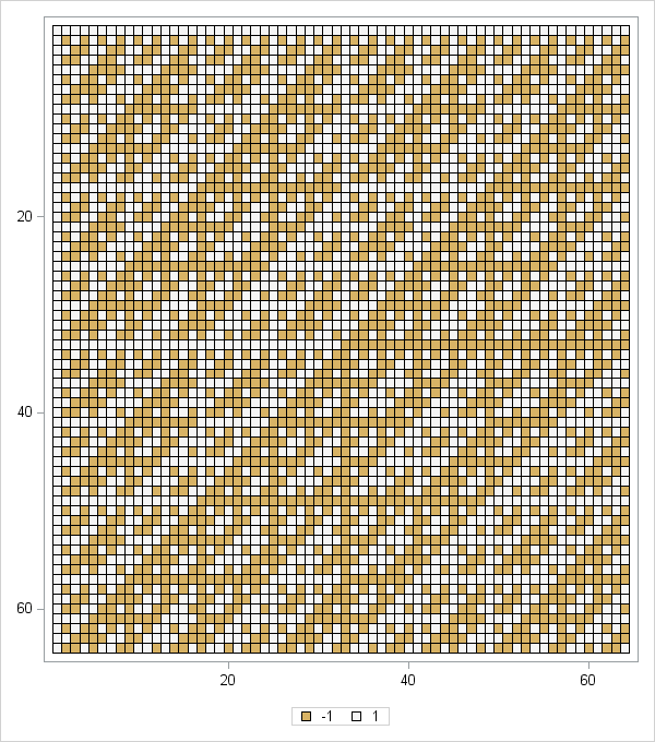
The resulting heat map is shown to the left. (Click to enlarge.) You can see by inspection that the matrix is symmetric. Furthermore, with the exception of the first row and column, all rows and columns have an equal number of +1 and –1 values. There are also certain rows and columns (related to powers of 2) whose structure is extremely regular: a repeating sequence of +1s followed by a sequence of the same number of –1s. Clearly the heat map enables you to examine the patterns in the Hadamard matrix better than staring at a printed array of numbers.
A binned correlation matrix
In my previous article about how to create a heat map, I used a correlation matrix as an example of a matrix that researchers might want to visualize by using a heat map with a continuous color ramp. However, sometimes the exact values in the matrix are unimportant. You might not care that one pair of variables has a correlation of 0.78 whereas another pair has a correlation of 0.82. Instead, you might want to know which variables are positively correlated, which are uncorrelated, and which are negatively correlated.
To accomplish this task, you can bin the correlations. Suppose that you decide to bin the correlations into the following five categories:
- Very Negative: Correlations in the range [–1, –0.6).
- Negative: Correlations in the range [–0.6, –0.2).
- Neutral: Correlations in the range [–0.2, 0.2).
- Postive: Correlations in the range [0.2, 0.6).
- Very Postive: Correlations in the range [0.6, 1].
You can use the BIN function in SAS/IML to discover which elements of a correlation matrix belong to each category. You can then create a new matrix whose values are the categories. The following statements create a binned matrix from the correlations of 10 numerical variables in the Sashelp.Cars data set. The HEATMAPDISC subroutines creates a heat map of the result:
use Sashelp.Cars;
read all var _NUM_ into Y[c=varNames];
close;
corr = corr(Y);

/* bin correlations into five categories */
Labl = {'1:V. Neg','2:Neg','3:Neutral','4:Pos','5:V. Pos'};        /* labels */
bins= bin(corr, {-1, -0.6, -0.2, 0.2, 0.6, 1});           /* BIN returns 1-5 */
disCorr = shape(Labl[bins], nrow(corr));               /* categorical matrix */
call HeatmapDisc(disCorr) title="Binned Correlations"
xvalues=varNames yvalues=varNames; |
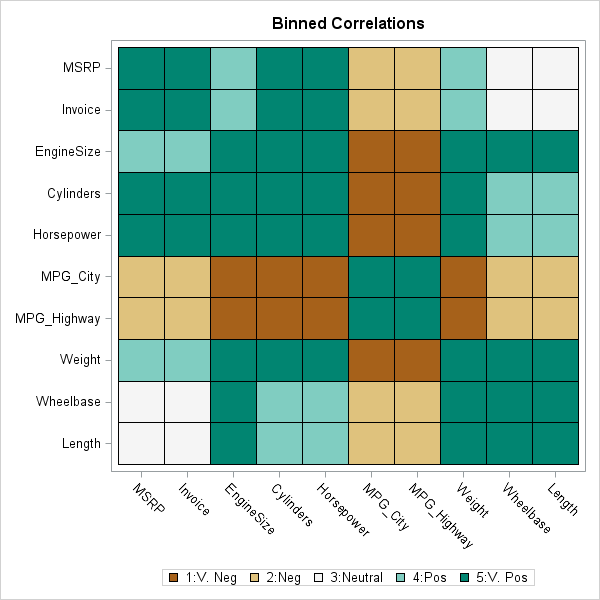
The heat map of the binned correlations is shown to the left. The fuel economy variables are very negatively correlated (dark brown) with the variables that represent the size and power of the engine. The fuel economy variables are moderately negatively correlated (light brown) with the vehicle price and the physical size of the vehicles. The size of the vehicles and the price are practically uncorrelated (white). The light and dark shades of blue-green indicate pairs of vehicles that are moderately and strongly positively correlated.
The HEATMAPDISC subroutine is a powerful tool because it enables you to easily create a heat map for matrices that contain a small number of values. Do you have an application in mind for creating a heat map with a discrete color ramp? Let me know your story in the comments.
You might be wondering how the colors in the heat maps were chosen and whether you can control the colors in the color ramp. My next blog post will discuss choosing colors for a discrete color ramp.

7 Comments
Pingback: How to choose colors for maps and heat maps - The DO Loop
Pingback: Wolfram’s Rule 30 in SAS - The DO Loop
Pingback: Video: Using heat maps to visualize matrices - The DO Loop
Pingback: Self-similar structures from Kronecker products - The DO Loop
Pingback: Visualize missing data in SAS - The DO Loop
Pingback: Visualize a matrix in SAS by using a discrete heat map - The DO Loop
Pingback: Visualize palettes of colors in SAS - The DO Loop