I've previously described how to overlay two or more density curves on a single plot. I've also written about how to use PROC SGPLOT to overlay custom curves on a graph. This article describes how to overlay a density curve on a histogram. For common distributions, you can overlay a density by using SAS procedures. However, this article shows how to use the Graphics Template Language (GTL) to overlay a custom density estimate. An example is shown in the figure to the left. The information in this article is adapted from Chapter 3 of my book Simulating Data with SAS.
Overlaying common densities
The UNIVARIATE procedure supports fitting about a dozen distributions to data, including the beta, exponential, gamma, lognormal, and Weibull distributions. There are several examples in the PROC UNIVARIATE documentation that demonstrate how to fit parametric densities to data.
For more complicated models, other SAS procedures are available. You can use the FMM procedure to fit finite mixtures of distributions. In SAS/ETS software, the SEVERITY procedure can fit many distributional models to data. For nonparametric models, the KDE procedure can fit one- and two-dimensional kernel density estimates.
These procedures enable you to overlay density curves for common distributions. For me, these procedures suffice 99% of the time. However, there are situations where you might want to do the following:
- Compute a probability density function (PDF) outside of any procedure. The density curve might come from a computation or from evaluating a formula.
- Add additional features to the graph. For example, you might want to add reference lines, modify the placement of tick marks, add legends, titles, and so forth.
The SGPLOT procedure does not enable you to use a HISTOGRAM statement and a SERIES statement in the same call. However, you can overlay a histogram and a curve by using the GTL.
Overlaying custom densities
The following template is a simplified version of a template that I used in my book. You can use it as is, or modify it to include additional features such as grid lines.
proc template; define statgraph ContPDF; dynamic _X _T _Y _Title _HAlign _binstart _binstop _binwidth; begingraph; entrytitle halign=center _Title; layout overlay /xaxisopts=(linearopts=(viewmax=_binstop)); histogram _X / name='hist' SCALE=DENSITY binaxis=true endlabels=true xvalues=leftpoints binstart=_binstart binwidth=_binwidth; seriesplot x=_T y=_Y / name='PDF' legendlabel="PDF" lineattrs=(thickness=2); discretelegend 'PDF' / opaque=true border=true halign=_HAlign valign=top across=1 location=inside; endlayout; endgraph; end; run; |
The template, which is called ContPDF, uses the LAYOUT OVERLAY statement to overlay a histogram and a series (a continuous curve). The name of the histogram variable is provided in the dynamic variable _X. The histogram is plotted on the density scale. The dynamic variables _binstart, _binstop, and _binstart are used to set the histogram bins to convenient values. The variables for the series plot are provided by the dynamic variables _T and _Y. The other two dynamic variables are _HAlign, which determines the location of an inset, and _Title, which specifies the title of the graph.
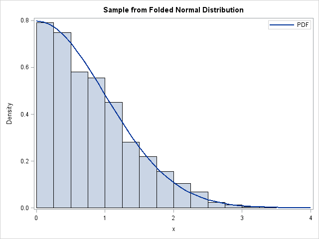
To see how this template might be used, recall that I have previously shown how to generate random values from the folded normal distribution. The following DATA step generates 1,000 values from the folded normal distribution:
data MyData(drop=i); call streaminit(1); do i = 1 to 1000; x = abs( rand("Normal") ); output; end; run; |
The PDF for a folded distribution is easy to compute: simply fold the distribution across zero and add the densities of each tail:
data PDFFolded; do t = 0 to 4 by 0.1; y = pdf("Normal", t) + pdf("Normal", -t); /* =2*PDF for the normal dist */ output; end; run; |
The goal is to construct a histogram of the MyData data set and overlay the curve in the PDFFolded data set. There is a standard technique that you can use to overlay a curve on data: concatenate the two data sets and call an SG procedure on the combined data.
data All; set MyData PDFFolded; run; proc sgrender data=All template=ContPDF; dynamic _X="X" _T="T" _Y="Y" _HAlign="right" _binstart=0 _binstop=4 _binwidth=0.25 _Title="Sample from Folded Normal Distribution"; run; |
The graph that results is shown at the beginning of this article. Notice that this graph cannot be produced without using the GTL, because the folded normal distribution is not one of the distributions that is supported by PROC UNIVARIATE or PROC SEVERITY.
I try to avoid using the GTL, but it is necessary in this case. Perhaps one day the SGPLOT procedure will enable overlaying a custom curve on a histogram, but until then the GTL provides a way to overlay a custom density estimate on a histogram.

15 Comments
Could you please provide the code used to create Figure 4.11 on page 65 in your book "Simulating Data with SAS"?
Thanks in advance!
See page 8 to find out how to download the code online. The figure that you are asking for is the solution for an exercise. However, if you look in the file Ch04_sim.sas, you will find some hints that will help you create the figure.
Pingback: Simulating from the inverse gamma distribution in SAS - The DO Loop
Hi
Than you for an informative blog. I want to overlay two custom densities on one histogram. I have managed to overlay both of the curves on the histogram but I can't adjust the legend to show the different densities. May you please help me with that? I adapted the program you gave above and ended up with this:
proc template;
define statgraph ContPDF;
dynamic _X _T _Y _Title _HAlign _binstart _binstop _binwidth;
begingraph;
entrytitle halign=center _Title;
layout overlay /xaxisopts=(linearopts=(viewmax=_binstop));
histogram _X / name='hist' SCALE=DENSITY binaxis=true
endlabels=true xvalues=leftpoints binstart=_binstart binwidth=_binwidth;
seriesplot x=_T y=_Y / name='PDF' legendlabel="PDF" lineattrs=(thickness=2);
discretelegend 'PDF' / opaque=true border=true halign=_HAlign valign=top
across=1 location=inside;
endlayout;
endgraph;
end;
run;
data bearings;
input x;
label x = 'number of revolutions(millions)';
datalines;
17.88
28.92
33.00
41.52
42.12
45.60
48.40
51.84
51.96
54.12
55.56
67.80
68.64
68.64
68.88
84.12
93.12
98.64
105.12
105.84
127.92
128.04
173.40
;
data ml;
sigma =63.872344;
c = 1.593999;
theta =14.878346;
do t = theta to 200 by 0.1;
y = (c/sigma)*((t-theta)/sigma)**(c-1)*exp(-((t-theta)/sigma)**c);
output;
end;
data ml1;
alpha = 4.559735;
beta = 31.846846;
lambda =4.203907;
do t = alpha to 200 by 0.1;
y = (lambda/beta)*(1-exp(-(t-alpha)/beta))**(lambda-1)*exp(-(t-alpha)/beta);
output;
end;
data All;
set bearings ml ml1;
run;
proc sgrender data=All template=ContPDF;
dynamic _X="X" _T="T" _Y="Y" _HAlign="right"
_binstart=0 _binstop=210 _binwidth=30
_Title="Fitted distributions to bearings data";
run;
Thank you in advance
You need to use two different variables for the two curves, such as Y1 and Y2.
Then use two SERIESPLOT statements in the template.
You can ask programming questions like this at the SAS Support Communities.
Pingback: A new method to simulate the triangular distribution - The DO Loop
Using the below m file coding as a starting point, write a MATLAB script which generates N
samples from a Rayleigh distribution, and compares the sample histogram with the
Rayleigh density function. can anybody tell how to write from this starting?
% GAUSSIANHIST
clear
%%%%% Initialisation %%%%%%%%%%%%%%%%%%%%%%%%%%%%%%%%%%%%%%
mu = 0; % mean (mu)
sig = 2; % standard deviation (sigma)
N = 1e5; % number of samples
%%%%% Sample from Gaussian distribution %%%%%%%%%%%%%%%%%%%
z = mu + sig*randn(1,N);
%%%%% Plot sample histogram, scaling vertical axis %%%%%%%%
%%%%% to ensure area under histogram is 1 %%%%%%%%%%%%%%%%%
dx = 0.5;
x = mu-5*sig:dx:mu+5*sig; % mean, and 5 standard
% deviations either side
H = hist(z,x);
area = sum(H*dx);
H = H/area;
bar(x,H)
xlim([-5*sig,5*sig])
%%%%% Overlay Gaussian density function %%%%%%%%%%%%%%%%%%%
hold on
f = exp(-(x-mu).^2/(2*sig^2))/sqrt(2*pi*sig^2);
plot(x,f,'r','LineWidth',3)
hold off
Yes. As I say in my book Simulating Data with SAS, "The Rayleigh distribution is a special case of the Weibull distribution. A Rayleigh random variable with scale parameter sigma is the same as a Weibull random variable with shape parameter 2 and scale parameter sqrt{2}*sigma." (Wicklin, 2013, p113). Therefore, the following statement generates a random variate from the Rayleigh distribution:
/* Rayleigh(threshold=theta, scale=sigma) */
X = theta + rand("Weibull", 2, sqrt(2)*sigma);
If you need more help, post your question to the SAS/IML Support Comunity
Pingback: Why doesn't PROC UNIVARIATE support certain common distributions? - The DO Loop
Pingback: Overlay a curve on a bar chart in SAS - The DO Loop
Pingback: Overlay other graphs on a bar chart with PROC SGPLOT - The DO Loop
Pingback: Nested bar charts in SAS - The DO Loop
Pingback: Compatible plot types in SAS - The DO Loop
Pingback: Overlay a curve on a histogram in SAS - The DO Loop
Pingback: Overlay multiple custom density curves on a histogram in SAS - The DO Loop