A previous article discusses the issue of a confounding variable and uses correlation to give an example. The example shows that the correlation between two variables might be affected by a third variable, which is called a confounding variable. The article mentions that you can use the PARTIAL statement in PROC CORR and other SAS procedures to account for the presence of the variable. Some problems have more than one confounding variable. The PARTIAL statement is an easy way to regress the original variables onto the confounding variable(s) and to compute a statistic on the residual values.
In the previous example, the correlation between the original variables (HEIGHT and WEIGHT) is 0.88. The partial correlation (which is the correlation between the residuals after regressing the variables on AGE) is 0.7, which is somewhat less. Remarkably, controlling for a confounding variable can not only affect the magnitude of a correlation, but it can also even change the SIGN of the correlation! This effect is known as Simpson's paradox. Simpson's paradox is that aggregated data can show relationships that are not present (or are even reversed!) in subpopulations of the data. It shows the importance of accounting for confounding variables when you do a statistical analysis. This article provides an example of Simpson's paradox.
Data for Simpson's paradox
Simpson's paradox always involves a confounding variable. (Which some people call a "lurking variable.) When you aggregate the data (ignoring the confounding variable), you get one result, and when you account for the confounding variable you obtain a completely different result. In many examples, the confounding variable is a categorical variable, but in the following example, the confounding variable is a continuous variable, age.
Consider the following experiment. Researchers are testing a herbicide that kills a particular weed. The experiment has multiple plots. Twelve plots contain weeds that are one week old, 12 plots contain weeds that are two weeks old, and so forth, up to weeds that are 10 weeks old. The young weeds are easier to kill and require less herbicide. The researchers want to know what proportion of the weeds are killed after being sprayed with various concentrations of the herbicide.
The following SAS DATA set defines the data and graphs the results of the experiment:
data Simpson; label Dose = "Concentration (g/L)" Prob = "Probability of Death"; input Dose Prob Age @@; Prob = Prob / 100; /* convert from percentage to proportion */ ID = _N_; datalines; 0.0225 54.5 1 0.0325 59.5 1 0.0275 61.0 1 0.0325 58.5 1 0.0200 57.5 1 0.0200 51.0 1 0.0250 55.5 1 0.0225 61.5 1 0.0325 58.5 1 0.0200 56.5 1 0.0225 56.0 1 0.0250 54.0 1 0.0300 57.0 2 0.0225 51.5 2 0.0275 47.0 2 0.0250 54.5 2 0.0375 53.5 2 0.0300 54.5 2 0.0350 55.0 2 0.0375 59.0 2 0.0275 53.5 2 0.0350 57.0 2 0.0325 53.5 2 0.0250 52.5 2 0.0275 48.5 3 0.0325 49.0 3 0.0350 47.5 3 0.0300 51.5 3 0.0325 53.5 3 0.0450 54.5 3 0.0350 53.5 3 0.0375 56.0 3 0.0350 51.5 3 0.0350 50.5 3 0.0300 46.5 3 0.0400 49.0 3 0.0375 48.0 4 0.0350 44.5 4 0.0375 43.5 4 0.0425 49.5 4 0.0375 51.5 4 0.0500 52.0 4 0.0350 48.0 4 0.0375 44.5 4 0.0425 51.0 4 0.0375 50.0 4 0.0475 48.0 4 0.0400 45.0 4 0.0400 40.5 5 0.0450 45.0 5 0.0400 49.5 5 0.0400 42.0 5 0.0425 42.5 5 0.0500 48.5 5 0.0425 42.0 5 0.0475 47.0 5 0.0400 44.0 5 0.0525 45.0 5 0.0500 48.5 5 0.0525 46.5 5 0.0475 38.0 6 0.0500 38.0 6 0.0525 46.5 6 0.0475 44.5 6 0.0425 40.0 6 0.0625 45.0 6 0.0525 41.5 6 0.0475 39.5 6 0.0525 44.0 6 0.0500 39.5 6 0.0475 44.0 6 0.0550 43.5 6 0.0550 38.5 7 0.0550 39.0 7 0.0500 36.0 7 0.0550 35.0 7 0.0475 35.0 7 0.0525 39.0 7 0.0625 40.0 7 0.0625 42.0 7 0.0600 44.5 7 0.0475 39.0 7 0.0575 37.0 7 0.0525 42.5 7 0.0550 36.0 8 0.0650 32.5 8 0.0675 38.5 8 0.0600 34.5 8 0.0625 35.0 8 0.0575 35.0 8 0.0550 39.0 8 0.0550 33.0 8 0.0550 33.0 8 0.0600 37.5 8 0.0600 34.5 8 0.0700 43.0 8 0.0650 35.0 9 0.0650 32.0 9 0.0600 32.0 9 0.0600 29.5 9 0.0600 30.5 9 0.0600 31.0 9 0.0700 40.0 9 0.0625 29.5 9 0.0625 34.5 9 0.0750 31.5 9 0.0700 34.0 9 0.0675 36.0 9 0.0700 30.0 10 0.0700 25.0 10 0.0700 30.5 10 0.0700 28.5 10 0.0725 32.0 10 0.0700 26.5 10 0.0625 30.5 10 0.0650 27.5 10 0.0775 32.0 10 0.0650 28.5 10 0.0725 35.0 10 0.0800 34.0 10 ; proc corr data=Simpson noprob plots=scatter; var Dose Prob; run; |
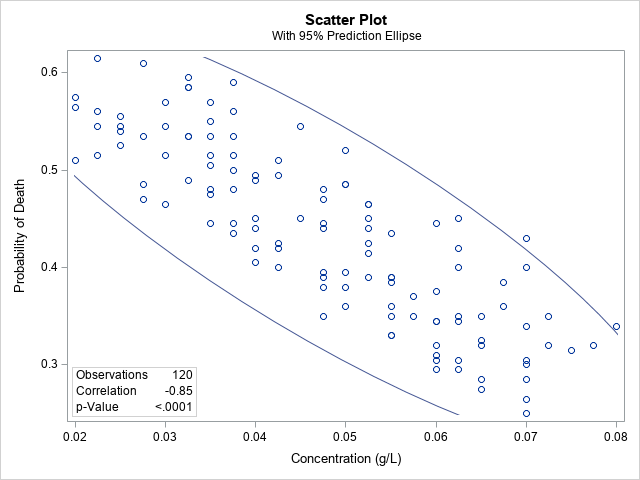
The graph shows a scatter plot of the proportion of weeds that are killed by the herbicide at various concentrations. The correlation between the concentration of the dose and the probability of death is -0.85, which demonstrates a strong negative correlation.
In other words, the more poison you use, the fewer weeds die.
What? Clearly, something is wrong! This conclusion does not make sense. How can applying MORE poison result in a smaller proportion of dead weeds?
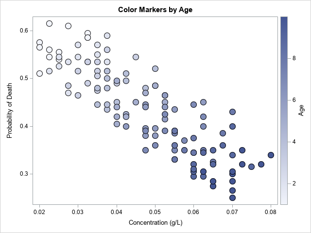
The problem is that we have aggregated data, ignoring the fact that some plots had young weeds (and low concentrations of herbicide) whereas other plots had older weeds (and higher concentrations). If you include the age of the weeds in the scatter plot by coloring the markers, you see that the young weeds are in the upper left corners and the older weeds are in the lower right corner:
title "Color Markers by Age"; proc sgplot data=Simpson; scatter x=Dose y=Prob / colorresponse=Age markerattrs=(symbol=CircleFilled size=14) FilledOutlinedMarkers colormodel=TwoColorRamp; run; |
Accounting for the confounding variable
If we account for the confounding variable by using the PARTIAL statement in PROC CORR to compute a partial correlation, we get the following graph and statistic:
proc corr data=Simpson noprob plots=scatter; var Dose Prob; partial Age; run; |

The scatter plot is the plot of the residuals of the original variables after being regressed onto age. If we account for the age of the weeds, the correlation between the dosage and the proportion of weeds that die is 0.52, which is positive, as expected. This positive relationship between the dose and the proportion of dead weeds makes intuitive sense.
If we revisit the original data, we can visualize what is happening in the subpopulations that have 1-week-old weeds, 2-week-old weeds, and so forth:
title "Regression by Age"; proc sgplot data=Simpson; reg x=Dose y=Prob / Group=Age; run; |
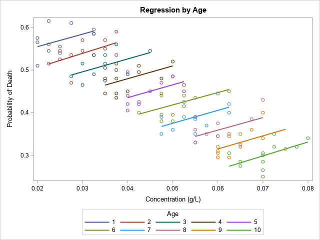
The graph shows that in each age group, the relationship between the dosage and the death rate is positive, as you would expect. A graph like this appears in the Wikipedia article about Simpson's paradox.
Summary
Simpson's paradox is well-known to statisticians. It occurs when the data contains a confounding variable. If you do not account for the confounding variable, the data appears to be related in one way, but when you account for the confounding variable, the relationship is very different. This article shows two variables are negatively correlated if you ignore age, but they are positively correlated if you account for age.

1 Comment
Rick,
I think this blog explain very well the paradox in building a scorecard.
https://communities.sas.com/t5/SAS-Data-Science/SAS-fitting-logistic-regression-how-to-make-all-parameters/m-p/860089