The REFLINE statement in PROC SGPLOT is one of my favorite ways to augment statistical graphics such as scatter plots, series plots, and histograms. The REFLINE statement overlays a vertical or horizontal reference line on a graph. You can specify the location of the reference lines on the REFLINE statement. For example, if you want reference lines at x=0, x=3.14, and x=7.2, you can specify those values as follows:
refline 0 3.14 7.2 / axis=x; |
But did you know that you can also specify the location of the reference lines by referring to a variable in the data? This enables you to automate the placement of reference lines. Of particular interest is visualizing statistics such as mean, medians, and percentiles on a graph.
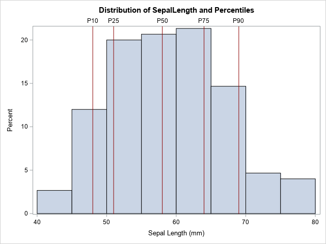
For example, suppose you want to create a histogram of a variable and overlay the 10th, 25th, 50th, 75th, and 90th percentiles, as shown on the histogram to the right. One way is to use PROC MEANS to display those statistics, then copy and paste them into the REFLINE statement. However, if this is a graph that you need to create for data that changes daily or weekly, cutting and pasting is not practical. It is better to automate the process.
The following list outlines the main steps in automating the placement of reference lines:
- Create a SAS data set in which each row contains a value at which to place a reference line. Optionally, the data set can contain a second column that contains labels for the reference lines.
- Merge the original data set and the data set that contains the locations of the reference lines.
- Plot the original data and use the REFLINE statement to overlay the reference lines.
The following sections show each step for overlaying the 10th, 25th, 50th, 75th, and 90th percentiles of a variable.
Step 1: Get the reference values in a data set
Although "get the reference values into a data set" is conceptually one step, in practice this might be a multi-step process, depending on what statistics you are computing and what procedure you use to compute them. The reference values need to be in "long form," so you might need to transpose the statistics if they are output in "wide form."
To demonstrate, suppose you want to output five percentiles of the SepalLength variable in the Sashelp.Iris data. You can use PROC MEANS to compute the percentiles, but the output is wide, so you will have to use PROC TRANSPOSE or another DATA step to transpose the data from wide to long, as follows:
%let DSName = sashelp.Iris; %let VarName = SepalLength; proc means data=&DSName; var &VarName; output out=RefWide P10=P10 P25=P25 median=P50 P75=P75 P90=P90; run; /* Transpose the data set so that each column becomes an observation. */ proc transpose data=RefWide(keep=P:) out=Ref(rename=(Col1=Value)) name=Label; run; |
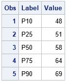
The transposed data are shown. Note that this example includes one column for the reference values and another column for a label. If you have multiple reference values, you will want to keep the labels short to avoid collisions when you display the labels. For this example, the reference values are stored in the Value variable and the labels are stored in the Label variable. (Note: You can actually generate percentiles in long form in one step by using PROC STDIZE. But for other computations, you might need a separate call to PROC TRANSPOSE.)
Step 2: Merge the original data and the reference values
You can use the MERGE or SET statements to concatenate the original data and the values for the statistics:
data All; set &DSName Ref(keep=Label Value); run; |
Step 3: Overlay the reference lines
The rest of the program is easy: merely specify the name of the variables (Value and Label) in the REFLINE statement. By default, the reference lines are a grey color, but you can use the LINEATTRS= option to change the attributes of the reference lines. For example, the following example displays dark red vertical reference lines.
title "Distribution of &VarName and Percentiles"; proc sgplot data=All; histogram &VarName; refline Value / axis=x label=Label lineattrs=(color=DarkRed); run; |
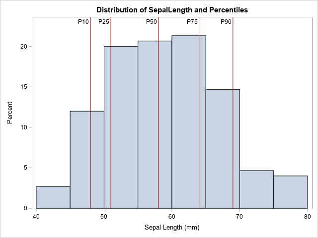
The graph is shown at the top of this article. By default, the labels appear outside the graph area and at the top of the plot. You can use the LABELPOS=MIN option to display the labels at the bottom of the graph. You can use the LABELLOC=INSIDE option to move the labels inside the graph area. If you moved them inside, you might also want to use the OFFSETMAX= option on the YAXIS statement to make room for the labels, as shown in the following statements:
proc sgplot data=All; histogram &VarName; refline Value / axis=x label=Label labelloc=inside lineattrs=(color=DarkRed); yaxis offsetmax=0.1; run; |
Summary
In summary, you can automate the placement of reference lines in PROC SGPLOT by writing the values of the reference lines to a SAS data set and merging that information with the original data. This article demonstrates the method by overlaying five percentile values onto a histogram.
Obviously, you can use statistics other than percentiles. For example, another common application is to plot the mean and ±1 or ±2 standard deviations from the mean. Writing the SAS code is left as an exercise.

2 Comments
Thank you Rick. I am wondering what would be equivalent SAS statements in PROC TEMPLATE using STATGRAPH and SGRENDER. Would you point me where I can find the information?
Here's a link to the GTL doc. The REFERENCELINE statement is what you want.