Have you ever looked as a statistical graph that uses bright garish colors and thought, "Why in the world did that guy choose those awful colors?" Don't be "that guy"! Your choice of colors for a graph can make a huge difference in how well your visualization is perceived by the reader. This is especially true for heat maps and choropleth maps in which the colors of small area elements must be distinguishable. This article describes how you can choose good color schemes for heat maps and choropleth maps. Most of the article is language-independent, but at the end I show how to create graphs with good color schemes in SAS.
All color schemes are not created equal
I first became aware of the importance of color design in statistical graphics when I looked at the incredibly beautiful Atlas of United States Mortality by Linda Pickle and her colleagues (1997).
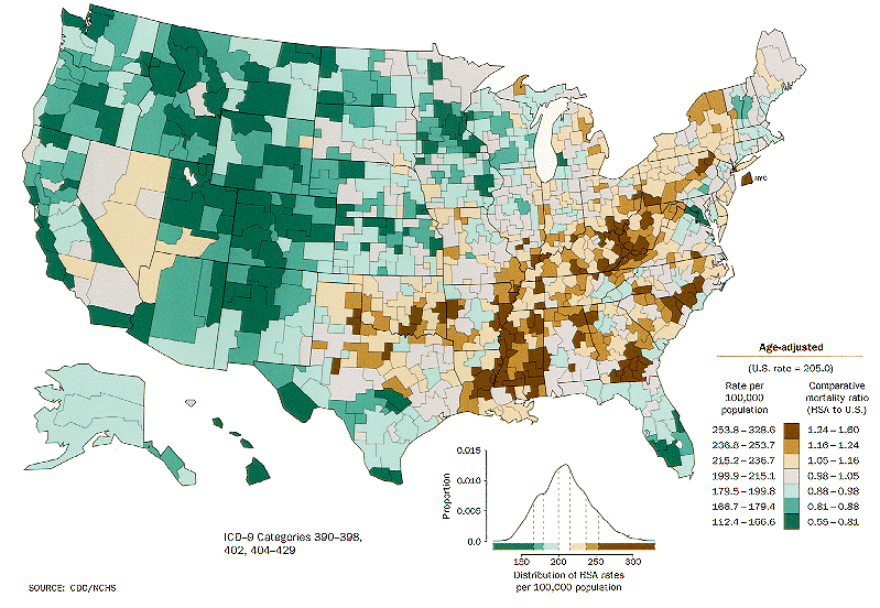 One of the reasons that the Atlas is so successful at conveying complex statistical data on maps is that it uses carefully designed color schemes and visualization strategies that were the result of pioneering research by Cynthia Brewer, Dan Carr, and many others. An example from the Atlas is shown to the left. The color schemes were designed so that one color does not visually dominate the others. Bright reds and yellows are nowhere to be found. Fully saturated colors are avoided in favor of slightly muted colors. The result is that graphs in the Atlas enable you to see variations in the data without being biased by visual artifacts that can result from poor color choices.
Choosing good colors for maps and graphs is not easy, which is why every statistician and graphics designer should know about Cynthia Brewer's ColorBrewer.org web site. The web site enables you to choose from dozens of color schemes that were carefully chosen to be aesthetically pleasing as well as statistically unbiased.
Sequential, diverging, and qualitative schemes
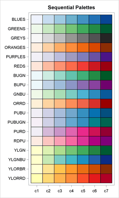
Brewer's color schemes are implemented in SAS/IML 13.1 software through the PALETTE function. (Other statistical languages also provide access to these schemes, such as via the RColorBrewer package in R.) The PALETTE function enables you to get an array of colors by knowing the name of a color scheme. Some of the available color schemes are shown at the left. Brewer's "BLUES" color scheme is single-hue progression that is similar to the two-color ramp in the SAS HTMLBlue ODS style. The "YLORRD" color scheme is a yellow-orange-red sequential color ramp that shows a blended progression from yellow to red.
The color ramps at the left are appropriate for visualizing data when it is important to differentiate high values from low values. For these so-called sequential color schemes, the reference level is the lowest value.
There are other possible color schemes. When the reference value is in the middle of the data range (such as zero or an average value), you should use a diverging color scheme, which uses a neutral color for the reference value. Low values are represented by using one hue and high values by using a different hue.
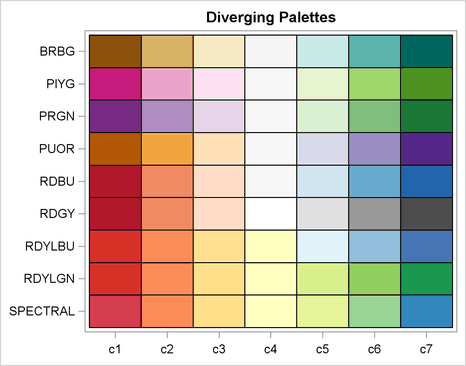
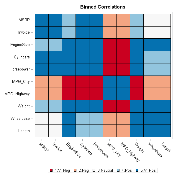
Examples of diverging color schemes are shown to the right. The first diverging color scheme ("BRBG" for brown-blue-green) is the default color ramp that is used to construct heat maps of discrete data in SAS/IML software. For example, a five-color version of that color ramp was used to visualize a binned correlation matrix in my recent article about how to create heat maps with a discrete color ramp. The "BDBU" scheme (a red-blue bipolar progression) is often used when one extreme is "good" (blue) and the other extreme is "bad" (red). The "SPECTRAL" color scheme is a useful alternative to the often-seen "rainbow" color ramp, which is notoriously bad for visualization and should be avoided. A spectral progression is often used for weather-related intensities, such as storm severity.
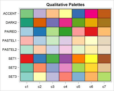
Finally, there are qualitative color schemes, as shown to the left. These schemes are useful for visualizing data that have no inherent ordering, such as ethnicities of people, different diseases, types of music, and other nominal categories.
Using color schemes with heat maps in SAS
Although these color schemes were designed for choropleth maps, the same principles are useful for designing heat maps with a small number of discrete categories. You can use the PALETTE function in SAS/IML software to choose effective colors for heat maps and other statistical graphics.
The PALETTE function is easy to use: Specify the name of the color scheme and the number of colors that you want to generate. These schemes are designed for a small number of discrete categories, so the schemes support between eight and 12 distinct and distinguishable colors.
As an example, suppose that you have computed a binned correlation matrix, but you want to override the default color scheme. For your application, you want negative values to be red and positive to be blue, so you decide on the bipolar "RDBU" color scheme. The following SAS/IML statements continue the example from my previous post:
/* The disCorr matrix is defined in the previous example. */
ramp = palette("RDBU", 5);                 /* create diverging 5-color ramp */
call HeatmapDisc(disCorr) colorramp=ramp   /* use COLORRAMP= option */
title="Binned Correlations" xvalues=varNames yvalues=varNames; |
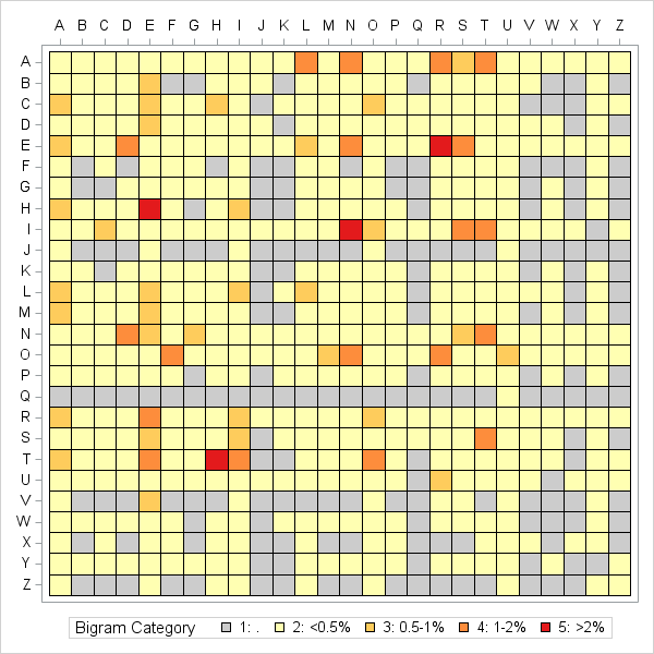
As a second example, the heat map at the left use a discrete set of colors to visualize the most frequently appearing bigrams (two-letter combinations) in an English corpus. The values of the matrix have been binned into five categories. Red cells indicate bigrms that appear more than 2% of the time. Dark orange cells indicate bigrams that appear between 1% and 2%. Light orange represents between 0.5% and 1%; light yellow represents less than 0.5% of the time. Gray cells represent bigrams that appear rarely or not at all. You can download the SAS program that computes this discrete heat map of bigram frequency.
Incidentally, you can also use the PALETTE function as an easy way to generate a continuous color ramp. You can use the PALETTE function to obtain three or five anchor colors and interpolate between those colors to visualize intermediate values. In my article about hexagonal bin plots, the continuous color map used for the density map of ZIP codes was created by using the colors from the call palette("YLORRD",5).
What method do you use to choose colors for maps or heat maps that display categories? Do you have a favorite color scheme? Leave a comment.

9 Comments
Pingback: Video: Using heat maps to visualize matrices - The DO Loop
Pingback: Create discrete heat maps in SAS/IML - The DO Loop
Pingback: Overlay categories on a histogram - The DO Loop
Pingback: Lasagna plots in SAS: When spaghetti plots don't suffice - The DO Loop
Pingback: Color markers in a scatter plot by a third variable in SAS - The DO Loop
Pingback: Tip for coding your color values in SAS Enterprise Guide - The SAS Dummy
Pingback: Visualize palettes of colors in SAS - The DO Loop
Pingback: 10 tips for creating effective statistical graphics - The DO Loop
Pingback: Two new visualizations of a principal component analysis - The DO Loop