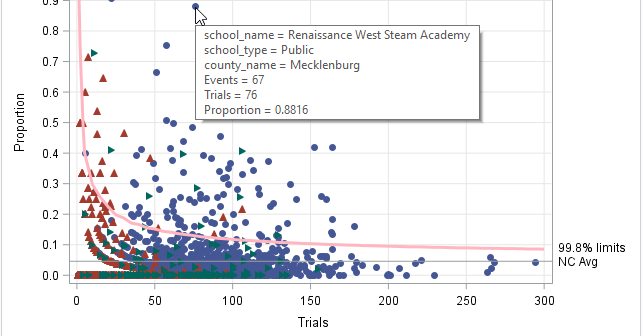
A funnel plot for immunization rates
Last week my colleague, Robert Allison, visualized data regarding immunization rates for kindergarten classes in North Carolina. One of his graphs was a scatter plot that displayed the proportion of unimmunized students versus the size of the class for 1,885 kindergarten classes in NC. This scatter plot is the basis
