With the US presidential election looming, all eyes are on the Electoral College. In the presidential election, each state gets as many votes in the Electoral College as it has representatives in both congressional houses. (The District of Columbia also gets three electors.) Because every state has two senators, it is the number of representatives in the House that determines how many electors are awarded to each state.
The 2012 election is the first presidential election since the 2010 census and subsequent reapportionment of representatives. Usually the apportionment of the Electoral College is represented as a static choropleth map that show the number of electors by state at any instance in time. Recently, however, the US Census Bureau's Data Visualization Gallery published a visualization of "Ranks of States by Congressional Representation" over time. This graphic is reproduced below (click to enlarge):
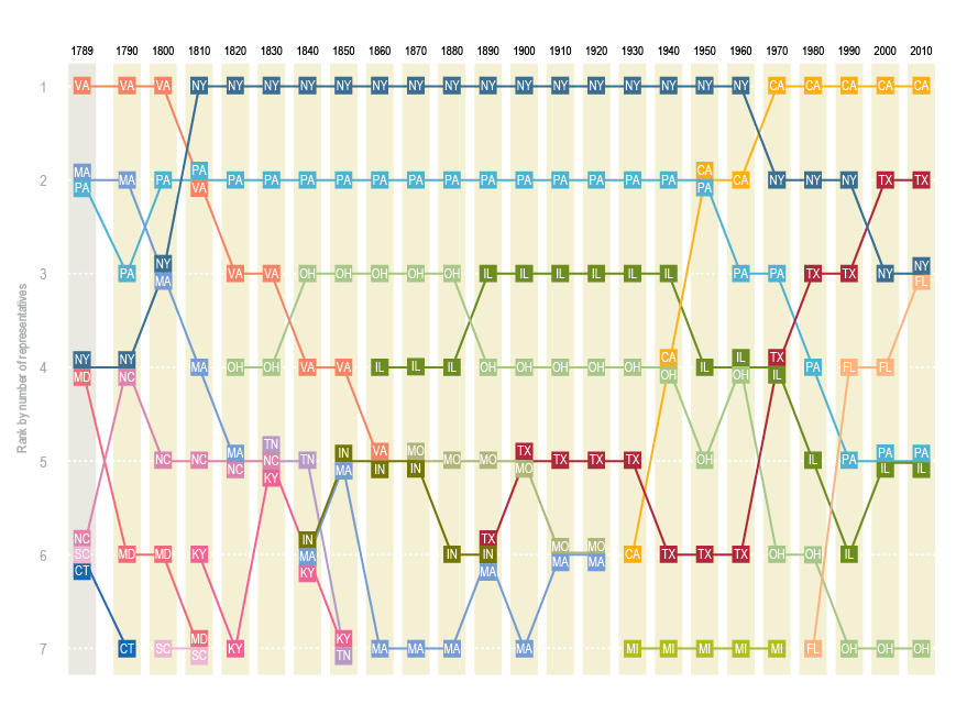
The graph shows the rank of the top seven most populous states after each US census. You can see a few interesting facts such as:
- New York and Pennsylvania have always been among the most populous states.
- California, which became a state in 1850, popped onto the list in 1930 and rapidly became the most populous state.
- Texas, which became a state in 1845, entered the list in 1890 and is now the second most populous state.
- Florida, which became a state in 1845, broke into the top seven in 1980 and currently has the same number of representatives as New York.
- Virginia and Massachusetts were once among the populous states, but have since dropped off the list.
The reason that the US Census Bureau used ranks on the vertical scale is because the number of representatives has changed over the years: from 106 in 1790, to 243 at the time of the Civil War, to the modern value of 435, which was adopted in 1960. It occurred to me that it might be more interesting to see the percentage of the representatives that were apportioned to each state throughout the US history. I also thought the graph might look better if states don't "pop on" and "pop off" the way that Tennessee and Michigan do. I would prefer to see a state's entire history or representation.
With that goal in mind, I downloaded the data from the Census Bureau in CSV format. Instead of computing the ranks of the states for each decade, I grouped the states into quintiles according to their current number of representatives. Thus there are five groups, where each group contains 10 states. The first quintile contains the least populous states (Wyoming, Vermont, and so forth) and the fifth quintile contains the most populous states (California, New York, and so forth). The time series plot of the most populous states follows. The label for Ohio is partially hidden under the label for Georgia.
You can download the complete SAS program that manipulates, rearranges, and plots the data. The program produces plots for all 50 states. I tried different approaches, such as assigning states into quintiles according to the historical average of the representation percentage, but I the graph that I show is the one that compares the best with the US Census graph. The graph is different than a graph that shows the population of each state over time, because this graph shows relative growth rather than absolute growth.
