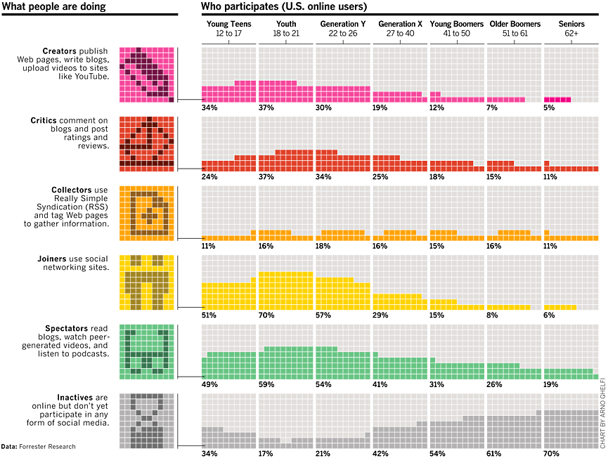
Recently I read a blog that advertised a data visualization competition. Under the heading "What Are We Looking For?" is a link to a 2007 Bloomberg Businessweek graph that visualizes how participation in online social media activities vary across age groups. The graph is reproduced below at a smaller scale:
A few aspects of this chart bothered me, so in the spirit of Kaiser Fung's excellent Junk Charts blog, here are some thought on improving how these data are visualized.
"34%" Is One Number, Not 34
Each cell in the graph consists of a 10 x 10 grid, and the number of colored squares in the grid represents the percentage of a given age group that participate in a given online activity. For example, the cell in the lower left corner has 34 dark gray colored squares to indicate that 34% of young teens do not participate in social media activities online. That's a lot of ink used to represent a single number!
Furthermore, the chart is arranged so that the colored squares across all age groups simulate a line plot. For example, the graph attempts to show that the percentage of "Inactives" varies across age groups. Note the arrangement of the dark gray squares across the first four age groups:
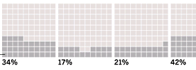
The four "extra" squares in the first cell (34%) are arranged flush to the left. The gap in the second cell (17%) is put in the middle. (By the way, there should be only 17 colored squares in this cell, not 18.) The extra squares in the next two cells are arranged flush right. The effect is that the eye sees a "line" that decreases, reaches a minimum with 18–21 group, and then starts increasing.
This attempt to form a line plot out of colored squares can be deceptive. For example, by pushing all of the extra squares in one age group to the right and all of the colored squares in the adjacent age group to the left, I can bias your eye see local minima where there are none. This technique also fails miserably with nearly constant data such as the orange squares used for the "Collector" group. The eye sees little bumps, whereas the percentages are essentially constant across the age groups.

If You Want a Line Plot...
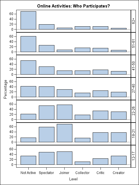
If you have data suitable for a line plot, then create a line plot. Here is a bare-bones strip-out-the-color-and-focus-on-the-data line chart. It shows the data in an undecorated statistical way that the editors at Businessweek would surely reject! However, it does show the data clearly.
The line plot shows that participation in most online social media activities peaks with the college-age students and decreases for older individuals. You can also see that the percentage of "Collectors" is essentially constant across age groups. Lastly, you can see that the "Not Active" category is flipped upside down from the previous category. It shows the percentage of people who are not active, and therefore reaches a minimum with the college-age students and increases for older individuals.
The line plot formulation helps to show the variation among age groups for each level of activity. You can, of course, use the same data to create a graph that shows the variation in activities for each age group. Perhaps the creator of the Businesweek graph did not use a line plot because he was hoping that one chart could serve two purposes.
Asking Different Questions
When I look at these data, I ask myself two questions:
- How does participation in social media differ across age groups?
- Given that someone in an age group participates, what is the popularity of each activity?
On Friday I will use these data to create new graphs that answer these questions, thereby presenting an alternate analysis of these data.
Further Improvements
Do you see features of the Businessweek graph that you think could be improved? Do you think that the original graph has merits that I didn't acknowledge? Post a comment.

3 Comments
Great insights, Rick.
The thing that bothers me about the "line plot simulation" is that the horizontal axis, even though it is meant to be categorical (age groups), seems to imply a time dimension (as time goes on, your participation changes).
That might be okay when charting some activities (such as a chart of who participates in colonoscopies and hip replacements), but I don't want to think that I'm doomed to become a social media introvert in my later years.
Chris
Thanks for the comments. You are right that the line plot is not a plot as time goes on. It is a snapshot of people of different ages at one instant in time (2007). The distribution will change each year, and by the time you're ready for your hip replacement, the distribution will look quite different.
Your comment about the discrete vs. continuous nature of the horizontal axis is very relevant. I chose to make the horizontal axis look continuous because the categories, although discrete, are a binning of a continuous variable. I was thinking that if you want to estimate the percentages for, say, a 26-year-old, you could look halfway between the third and fourth tick mark.
However, since the bins are different widths (the 18-21 bin encompasses four years whereas the 27-40 bin encompasses 14 years), using a continuous axis causes distortion. This was probably not a great choice that I made.
Pingback: How does participation in social media vary with age? - The DO Loop