My son is taking an AP Statistics course in high school this year. AP Statistics is one of the fastest-growing AP courses, so I welcome the chance to see topics and techniques in the course. Last week I was pleased to see that they teach data exploration techniques, such as using an ogive (rhymes with "slow jive") to approximate the cumulative distribution of a set of univariate data. This article shows how you can create an ogive by using SAS procedures.
#StatWisdom: How to create an ogive (rhymes with 'slow jive') Share on XWhat is an ogive?
An ogive is also called a cumulative histogram. You can create an ogive from a histogram by accumulating the frequencies (or relative frequencies) in each histogram bin. The height of an ogive curve at x is found by summing the heights of the histogram bins to the left of x.
A histogram estimates the density of a distribution; the ogive estimates the cumulative distribution. Both are easy to construct by hand. Both are coarse estimates that depend on your choice of a bin widths and anchor position.
Ogives are not used much by professional statisticians because modern computers make it easy to compute and visualize the exact empirical cumulative distribution function (ECDF). However, if you are a student learning to analyze data by hand, an ogive is an easy way to approximate the ECDF from binned data. They are also important if you do not have access to the original data, but you have a histogram that appeared in a published report. (See "How to approximate a distribution from published quantiles.")
Create an ogive from a histogram
To demonstrate the construction of an ogive, let's consider the distribution of the MPG_CITY variable in the Sashelp.Cars data set. This variable contains the reported fuel efficiency (in miles per gallon) for 428 vehicle models. The following call to PROC UNIVARIATE in Base SAS uses the OUTHIST= option in the HISTOGRAM statement to create a data set that contains the frequencies and relative frequencies of each bin. By default, the frequencies are reported for the midpoints of the intervals. To create an ogive you need the endpoints of each bin, so use the ENDPOINTS option as follows:
proc univariate data=sashelp.cars; var mpg_city; histogram mpg_city / grid vscale=proportion ENDPOINTS OUTHIST=OutHist; /* cdfplot mpg_city / vscale=proportion; */ /* optional: create an ECDF plot */ run; |
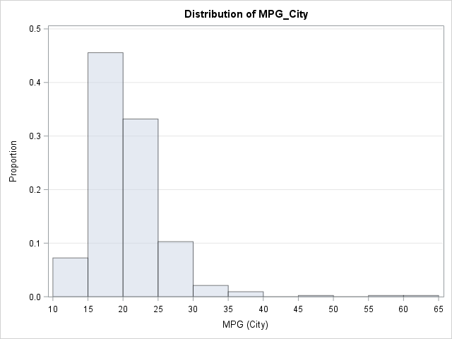
The histogram shows that most vehicles get between 15 and 25 mpg in the city. The distribution is skewed to the right, with a few vehicles getting as much as 59 or 60 mpg. A few gas-guzzling vehicles get less than 15 mpg.
You can construct an ogive from the relative frequencies in the 11 histogram bins. The height of the ogive at x=10 (the leftmost endpoint in the histogram) is zero. The height at x=15 is the height of the first bar. The height at x=20 is the sum of the heights of the first two histogram bars, and so on.
Create an ogive from the output of PROC UNIVARIATE
Each row in the OutHist data set contains a left-hand endpoint and the relative frequency (height) of the bar. However, to construct an ogive, you need to associate the bar height with the right-hand endpoints. This is because at the left-hand endpoint none of the density for the bin has accumulated, and for the right-hand endpoint all of the density has accumulated.
Consequently, to construct an ogive from the OUTHIST= data set, you can do the following:
- Associate zero with the leftmost endpoint of the bins.
- Adjust the counts and proportions in the OutHist data so that they are associated with the right-hand endpoint of each bin. You can use the LAG function to do this.
- Accumulate the relative frequencies in each bin to form the cumulative frequencies.
- Add a new observation to the OutHist data that contains the rightmost endpoint of the bins.
The following SAS DATA step carry out these adjustments:
data Ogive; set outhist end=EOF; ogiveX = _MinPt_; /* left endpoint of bin */ dx = dif(ogiveX); /* compute bin width */ prop = lag(_OBSPCT_); /* move relative frequency to RIGHT endpoint */ if _N_=1 then prop = 0; /* replace missing value by 0 for first obs */ cumProp + prop/100; /* accumulate proportions */ output; if EOF then do; /* append RIGHT endpoint of final bin */ ogiveX = ogiveX + dx; cumProp = 1; output; end; drop dx _:; /* drop variables that begin with underscore */ run; |
The Ogive data set contains all the information that you need to graph an ogive. The following call to PROC SGPLOT uses a VLINE statement, which treats the endpoints of the bins as discrete values. You could also use the SERIES statement, which treats the endpoints as a continuous variable, but might not put a tick mark at each bin endpoint.
title "Cumulative Distribution of Binned Values (Ogive)"; proc sgplot data=Ogive; vline OgiveX / response=cumProp markers; /* series x=_minpt_ y=cumProp / markers; */ xaxis grid label="Miles per Gallon (City)"; yaxis grid values=(0 to 1 by 0.1) label="Cumulative Proportion"; run; |
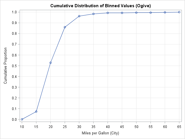
You can use the graph to estimate the percentiles of the data. For example:
- The 20th percentile is approximately 17 because the curve appears to pass through the point (17, 0.20). In other words, about 20% of the vehicles get 17 mpg or less.
- The 50th percentile is approximately 19 because the curve appears to pass through the point (19, 0.50).
- The 90th percentile is approximately 27 because the curve appears to pass through the point (27, 0.90). Only 10% of the vehicles have a fuel efficiency greater than 27 mpg.
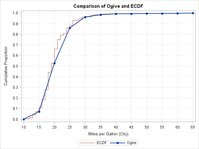
Compare an ogive to an empirical cumulative distribution
You might wonder how well the ogive approximates the empirical CDF. The following graph overlays the ogive and the ECDF for this data. You can see that the two curves agree closely at the ogive values, shown by the markers. However, there is some deviation because the ogive assume a linear accumulation (a uniform distribution) of data values within each histogram bin. Nevertheless, this coarse piecewise linear curve that is based on binned data does a good job of showing the basic shape of the empirical cumulative distribution.

7 Comments
Rick,
very nice. It seems to me the next step is to overlay the ogive on the histogram, in the manner of Proc PARETO. Can that be done?
Interesting idea. The HISTOGRAM statement can't be combined with the SERIES or VLINE statements in PROC SGPLOT, but you can overlay a curve on a histogram by using the GTL.
My daughter is also in AP Statistics. You would think that I could be of more help, but I think I've disappointed her. Early in the semester she needed to create a plot to show whether some data were normally distributed. I used SAS and your 3-panel visualization macro to produce exactly what she needed in about 10 seconds...but then we had to work backwards to produce the same effect in Excel.
I had an opposite experience. A homework question asked to find the probability that a random individual would have height less than 64 inches if the distribution of heights is normal with a mean of 68 inches and a standard deviation of 2.5 inches. I converted the problem to a z-score and looked up the probability in the printed table in the back of the book. My son rolled his eyes, whipped out his TI-84, went to the screen of statistical functions, and computed normalcdf(-1E99, 64, 68, 2.5) = 0.0548 in about five seconds. Boy, did I feel like a fossil!
How to prepare a greater cumulative frequency curve
You can use the CDFPLOT statement in PROC UNIVARIATE to plot the empirical cumulative distribution function.
Pingback: Create a frequency polygon in SAS - The DO Loop