The SG procedures in SAS use aesthetically pleasing default colors, shapes, and styles, but sometimes it is necessary to override the default attributes. The MARKERATTRS= option enables you to override the default colors, symbols, and sizes of markers in scatter plots and other graphs. Similarly, the LINEATTRS= option enables you to override the default line colors, thickness, and pattern (solid, dashed, dotted, and so forth).
Many programmers specify hard-coded values such as MARKERATTRS=(COLOR=red SYMBOL=CircleFilled). However, sometimes it is important for colors and symbols to match the style elements in the current ODS style. For example, you might want to match the colors and symbols that appear in some other graph.
Use ODS style elements to specify marker attributes in #SAS graphs. #DataViz Share on XAn example is shown below. The data set is the Sashelp.Cars data, which contains information on car and trucks. The first scatter plot displays a scatter plot where each marker is colored according to the value of the Origin variable, which has the values "Asia," "Europe," and "USA." The second scatter plot uses the WHERE statement to restrict the display to vehicles that were manufactured in the USA. For simplicity, only the most important statements are shown. You can download the complete SAS program that generates these graphs.
title "Vehicles: All Origins"; proc sgplot data=sashelp.cars; scatter x=wheelbase y=weight / markerattrs=(symbol=CircleFilled) group=origin; run; title "Vehicles: Origin=USA only"; proc sgplot data=sashelp.cars; where origin="USA"; scatter x=wheelbase y=weight / markerattrs=(symbol=CircleFilled); run; |
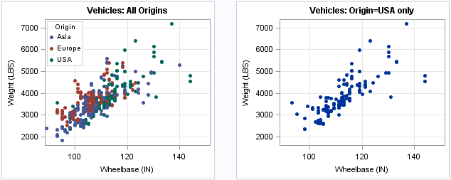
The graphs look the way they do because the SG procedures follow certain rules for displaying grouped versus non-grouped data. The first graph has three groups. The GROUP= option causes the SGPLOT procedure to assign the ODS element GraphData1 to the first group of markers ("Asia"). Similarly, the ODS element GraphData2 is assigned to the second group ("Europe") and the GraphData3 element is assigned to the third group ("USA"). (These names are described in the documentation for ODS style elements.) In the HTMLBlue style, which is the style used for these graphs, each markers is colored a shade of blue, red, or green according to its group membership.
The second plot shows only the "USA" vehicles. Whereas these markers were colored green in the first plot, they are colored blue in the second plot. This shade of blue comes from the GraphDataDefault element. The marker color is GraphDataDefault:ContrastColor, the marker size is GraphDataDefault:MarkerSize, and the marker symbol is GraphDataDefault:MarkerSymbol.
If you are displaying both graphs, you would certainly want the markers in the second graph to use the same shade of green as the "USA" vehicles in the first graph. This shade of green does not have a standard name, so you cannot specify a hard-coded color such as MARKERATTRS=(color=DarkGreen). Instead, use the MARKERATTRS= option to specify the marker attributes in the GraphData3 element, as follows:
proc sgplot data=sashelp.cars; where origin="USA"; scatter x=wheelbase y=weight / markerattrs=GraphData3; run; |
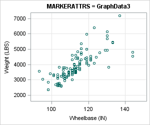
The MARKERATTRS= option tells the scatter plot to use markers that have the color, symbol, and size of the GraphData3 style element. For the default HTMLBlue style, that means dark green and open circles, as shown.
The second plot now looks similar to the "USA" vehicles in the first plot. Using the GraphData3 style changed the color, but the symbol is incorrect. To override an attribute of a style element, specify the attribute in parentheses AFTER the style element. For this example, specify the SYMBOL= option in parentheses, as follows:proc sgplot data=sashelp.cars; where origin="USA"; scatter x=wheelbase y=weight / markerattrs=GraphData3(symbol=CircleFilled); run; |
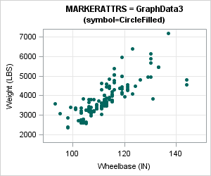
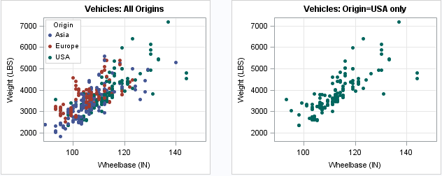
Voila! The task is complete. The second plot now has the same marker attributes as the first plot. ( View the plots side by side.) If you were to change the ODS style from HTMLBlue to some other style, the colors would still match.
Notice that PROC SGPLOT does not support specifying the color by using the name of the style element. For example, the following is invalid in PROC SGPLOT:
scatter x=x y=y / markerattrs=(GraphData3:ContrastColor); /* NOT supported */ |
The Graph Template Language (GTL) supports specifying style elements using the "colon notation," but that syntax is not supported in the SG procedures.
The SAS documentation contains two sections that explain ODS style elements and how to use them in the SG procedures:
- Using Options in SGPLOT to Control Graph Appearance.
- Names of Style Elements. In addition to GraphData1, other useful elements include GraphFit, GraphConfidence, and GraphMissing.
- SAS/STAT users might want to read the documentation for "ODS Styles." The documentation contains graphs that show how the style elements change according to the ODS style.
As indicated above, the same ideas apply to line attributes, region attributes, and so forth. For example, in a SERIES statement you can use LINEATTRS=GraphFit2(thickness=3) to assign attributes of the GraphFit2 style and ovverride the THICKNESS attribute.
Thanks to Sanjay Matange and Dan Heath for several discussions that improved my understanding of ODS style elements and attributes.

10 Comments
Color consistency is crucial for data visualization comprehension and interpretation. Thanks for sharing the ODS styles and graph tips. A post to remember!
Thanks for this tip. You deduced that USA used the third attribute by visual inspection of the grouped graph. Is there a more general (programmatic) way for an arbitrary value of a grouping variable? I assume it would fail if you had more groups than attributes. Is 12 the absolute maximum or could you extend it in a custom style?
I have not found a truly general programmatic method that works for all data sets.
One approach is to use "data attribute maps," which give you complete control over the attributes. A difficulty with coming up with a completely general way is that the GROUP= option assigns colors not only on the NUMBER of groups, but also on the ORDER of the groups. Consequently, another method is to prepend fake data that specifies all groups and their order.
Pingback: What colors does PROC SGPLOT use for markers? - The DO Loop
I don't want any symbol for median point. Which option will helps in removing it.
You can ask questions about SAS graphics at the SAS Support Communities. If you are talking about controlling attributes of box plots, here is a link to the documentation. You might want to use the NOMEDIAN or NOMEAN options.
Could I plot something like this below (scatter plot with gradual color response by a third variable) and add a fourth group variable identified by marker shape?
For example, there will be two groups, circles and triangles, each having graduated color scheme all on the same x-y plot.
scatter x=variable1 y=variable2 / colorresponse=variable3
markerattrs=(symbol=CircleFilled size=7)
colormodel=(CX3288BD CX99D594 CXE6F598 CXFEE08B CXFC8D59 CXD53E4F);
Sure. For details, see the article "Attrs, attrs, everywhere: The interaction between ATTRPRIORITY, CYCLEATTRS, and STYLEATTRS in ODS graphics."
Here is some working code:
Hi,
Is it possible to adjust the size of the marker based on the value on y-axis i.e. if y=10 i use size=2 and if y=5, I use size=1?
Thank you
You can ask SAS programming questions at the SAS Support Communities. You might want to use a bubble plot.