Yesterday, December 7, 1941, a date which will live in infamy...
- Franklin D. Roosevelt
Today is the 70th anniversary of the Japanese attack on Pearl Harbor. The very next day, America declared war.
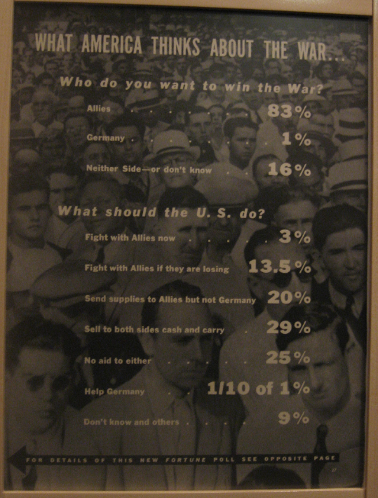
During a visit to the Smithsonian National Museum of American History, I discovered the results of a 1939 poll that shows American opinions about war at the start of the European conflict. (I could not determine from the exhibit whether the poll was taken before or after the invasion of Poland by Germany in September 1939.) Although most Americans (83%) favored the Allies, more than 50% of those surveyed supported either providing no aid to either side (25%) or selling supplies to both sides (29%).
I was also amused by the 13.5% who thought the US should fight with the allies "if they are losing."

In addition to wide range of opinions about who to support in Europe, two statistical aspects of this table jumped out at me:
- Why did the editor print "1/10 of 1%" for the "Help Germany" category? They could have printed 0.1%, or "less than 1%," or even lumped that response into the "others" category. I think the display was an intentional ploy to emphasize how little support there was for helping Germany.
- Why did the editor use 13.5% when the rest of the table is rounded to the nearest percent? The value seems out of place. I suppose the editor did not want to round the value up to 14%, because then the total percentage would be 100.1%. But so what?
Why do you think the editor displayed the survey results as he did? Do you think this data would be better visualized as a graph, or does the table do a better job?

8 Comments
My first thought was: was this a representative poll? My understanding was that a substantial proportion of the US population favoured Germany. Not the majority, but more than 1%. Happily admit though that American history isn't my strong suit...
Most likely largely propaganda, its inherently impossible for German support to have been so low in a country with lots of German immigrants. It's also just generally impossible to get that low of a reception, he'll most peoooe won't know what's going on and prior to 1943 or so we didn't even realize what he was actually doing to the jews. Do remember when the army wrote home because they had found the concentration camps and it shocked them because they didn't know it existed prior to that.
Thank you for writing and providing some historical context.
Notice that unlike today's polls, this one does not mention the "margin of error" (nor the sample size). That may be because the concept of "margin of error" was not accepted until after WWII, famously when the technique accurately predicted that Truman would defeat Dewey in the 1948 presidential race, when most polls/models predicted otherwise. Leslie Kish pioneered the concept. It amazes me that such a fundamental concept was only just "invented" in such recent times.
Unfortunately, I'm afraid that today's popular news readership still doesn't pay much attention to these concepts, and thus accept poll results at face value. This poster, even with its flaws, would probably still have influence over the populace today.
Henry Wallace, FDR's vice president, was a agricultural statistician also a member of the American Statistical Association.
Just managed to read this post Rick. What I found interesting was the actual picture used to represent the American Population. I do not believe that it is in line with the actual demographics at the time. It appears to contain all Men of a certain race, or is my poor eyesight causing me to miss some things?
I found that interesting as well. Who did they sample? Was the population all Americans or just white middle-aged males?
Pingback: Pre, During and Post-war Cynicism and Attitudes | Catch 22