There are several ways to visualize data in a two-way ANOVA model. Most visualizations show a statistical summary of the response variable for each category. However, for small data sets, it can be useful to overlay the raw data. This article shows a simple trick that you can use to combine two categorical variables and plot the raw data for the joint levels of the two categorical variables.
An ANOVA for two-way interactions
Recall that an ANOVA (ANalysis Of VAriance) model is used to understand differences among group means and the variation among and between groups. The documentation for the ROBUSTREG procedure in SAS/STAT contains an example that compares the traditional ANOVA using PROC GLM with a robust ANOVA that uses PROC ROBUSTREG. The response variable is the survival time (Time) for 16 mice who were randomly assigned to different combinations of two successive treatments (T1, T2). (Higher times are better.) The data are shown below:
data recover; input T1 $ T2 $ Time @@; datalines; 0 0 20.2 0 0 23.9 0 0 21.9 0 0 42.4 1 0 27.2 1 0 34.0 1 0 27.4 1 0 28.5 0 1 25.9 0 1 34.5 0 1 25.1 0 1 34.2 1 1 35.0 1 1 33.9 1 1 38.3 1 1 39.9 ; |
The response variable depends on the joint levels of the binary variables T1 and T2. A first attempt to visualize the data in SAS might be to create a box plot of the four combinations of T1 and T2. You can do this by assigning T1 to be the "category" variable and T2 to be a "group" variable in a clustered box plot, as follows:
title "Response for Two Groups"; title2 "Use VBOX Statement with Categories and Groups"; proc sgplot data=recover; vbox Time / category=T1 group=T2; run; |
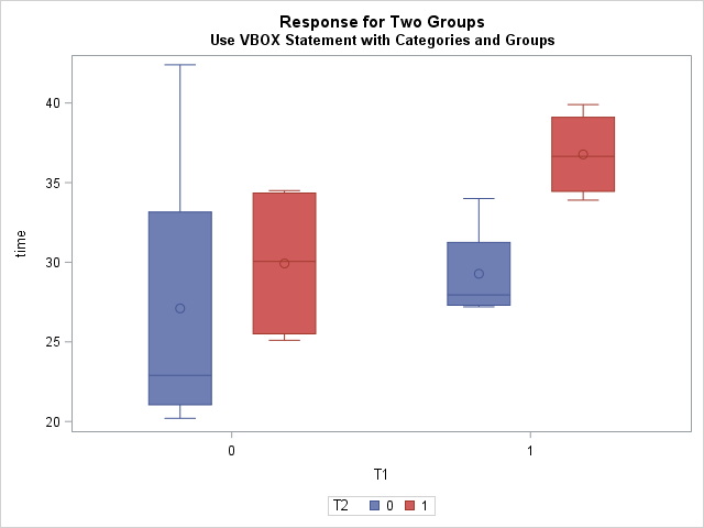
The graph shows the distribution of response for the four joint combinations of T1 and T2. The graph is a little hard to interpret because the category levels are 0/1. The two box plots on the left are for T1=0, which means "Did not receive the T1 treatment." The two box plots on the right are for mice who received the T1 treatment. Within those clusters, the blue boxes indicate the distribution of responses for the mice who did not receive the T2 treatment, whereas the red boxes indicate the response distribution for mice that did receive T2. Both treatments seem to increase the mean survival time for mice, and receiving both treatments seems to give the highest survival times.
Interpreting the graph took a little thought. Also, the colors seem somewhat arbitrary. I think the graph could be improved if the category labels indicate the joint levels. In other words, I'd prefer to see a box plot of the levels of interaction variable T1*T2. If possible, I'd also like to optionally plot the raw response values.
Method 1: Use the EFFECTPLOT statement
The LOGISTIC and GENMOD procedures in SAS/STAT support the EFFECTPLOT statement. Many other SAS regression procedures support the STORE statement, which enables you to save a regression model and then use the PLM procedure (which supports the EFFECTPLOT statement). The EFFECTPLOT statement can create a variety of plots for visualizing regression models, including a box plot of the joint levels for two categorical variables, as shown by the following statements:
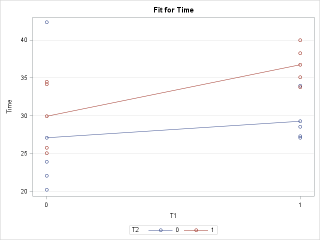
/* Use the EFFECTPLOT statement in PROC GENMOD, or use the STORE statement and PROC PLM */ proc genmod data=recover; class T1 T2; model Time = T1 T2 T1*T2; effectplot box / cluster; effectplot interaction / obs(jitter); /* or use interaction plot to see raw data */ run; |
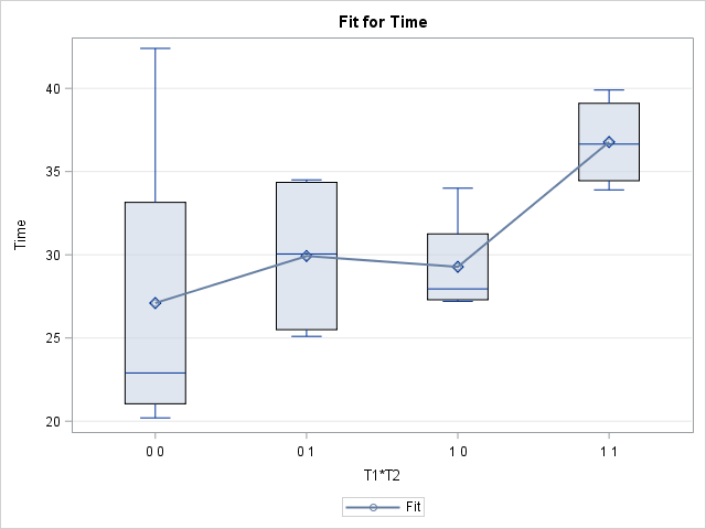
The resulting graph uses box plots to show the schematic distribution of each of the joint levels of the two categorical variables. (The second EFFECTPLOT statement creates an "interaction plot" that shows the raw values and mean responses.) The means of each group are connected, which makes it easier to compare adjacent means. The labels indicate the levels of the T1*T2 interaction variable. I think this graph is an improvement over the previous multi-colored box plot, and I find it easier to read and interpret.
Although the EFFECTPLOT statement makes it easy to create this plot, the EFFECTPLOT statement does not support overlaying raw values on the box plots. (You can, however, see the raw values on the "interaction plot".) The next section shows an alternative way to create the box plots.
Method 2: Concatenate values to form joint levels of categories
You can explicitly form the interaction variable (T1*T2) by using the CATX function to concatenate the T1 and T2 variables, as shown in the following DATA step view. Because the levels are binary-encoded, the resulting levels are '0 0', '0 1', '1 0', and '1 1'. You can define a SAS format to make the joint levels more readable. You can then display the box plots for the interaction variable and, optionally, overlay the raw values:
data recover2 / view=recover2; length Treatment $3; /* specify length of concatenated variable */ set recover; Treatment = catx(' ',T1,T2); /* combine into one group */ run; proc format; /* make the joint levels more readable */ value $ TreatFmt '0 0' = 'Control' '1 0' = 'T1 Only' '0 1' = 'T2 Only' '1 1' = 'T1 and T2'; run; proc sgplot data=recover2 noautolegend; format Treatment $TreatFmt.; vbox Time / category=Treatment; scatter x=Treatment y=Time / jitter markerattrs=(symbol=CircleFilled size=10); xaxis discreteorder=data; run; |
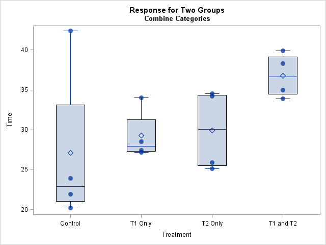
By manually concatenating the two categorical variables to form a new interaction variable, you have complete control over the plot. You can also overlay the raw data, as shown. The raw data indicates that the "Control" group seems to contain an outlier: a mouse who lived longer than would be expected for his treatment. Using PROC ROBUSTREG to compute a robust ANOVA is one way to deal with extreme outliers in the ANOVA setting.
In summary, the EFFECTPLOT statement enables you to quickly create box plots that show the response distribution for joint levels of two categorical variables. However, sometimes you might want more control, such as the ability to format the labels or overlay the raw data. This article shows how to use the CATX function to manually create a new variable that contains the joint categories.
1 Comment
Pingback: Use the EFFECTPLOT statement to visualize binomial regression models in SAS - The DO Loop