When I need to graph a function of two variables, I often choose to use a contour plot. A surface plot is probably easier for many people to understand, but it has several disadvantages when compared to a contour plot.
For example, the following statements in SAS/IML Studio displays a 3-D rotating plot, which you can configure interactively to look like the following image:
/* SAS/IML Studio statements */
x = Define2DGrid( -5, 5, 31, -5, 5, 31 ); /* module is on search path */
hat = sin(sqrt(x[,##]));
RotatingPlot.Create("sin(sqrt(r))", x[,1], x[,2], hat); |
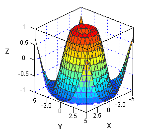
The surface plot is quite useful to an analyst who is using SAS/IML Studio because the plot is interactive. You can use the mouse to rotate it around to view the surface from all different directions. You can interactively change colors and vary how the surface is rendered. (See the chapter "Exploring Data in Three Dimensions" in the SAS/IML Studio User's Guide for more information on graphics in SAS/IML Studio.)
However, a static image of the surface isn't as useful for conveying details of the surface. For example:
- What is the value at the middle of the surface? You can't estimate the value from the surface plot because the orientation of the graph prevents you from seeing some of the surface features.
- What are the (x,y) values that correspond to the highest values of the surface? The lowest values? Again, it is difficult to read this information from the surface plot.
So even though every demonstration of statistical software includes a spinning, glowing, flashing, sparkling, glossy, 3-D surface plot, I actually prefer a contour plot when the goal is to convey information to the viewer. In a surface plot, parts of the surface are often obstructed by other parts. A contour plot does not suffer from that deficiency.
Creating a contour plot in SAS with ODS graphics: The template
I am a devoted user of the SGPLOT procedure for creating ODS statistical graphics. I can create 95% of the graphs that I need by writing a few statements in PROC SGPLOT. However, creating a contour plot is an instance in which I need to use the Graph Template Language (GTL). After I define the template, I can display the plot by using the SGRENDER procedure. This section describes how to define a graph template for a contour plot.
Some people find GTL templates a little scary, but often you can copy an example from the SAS documentation, modify it in one or two places, and then use it. For example, the following template is taken from the documentation for the CONTOURPLOTPARM statement, which explains the details of the template language:
proc template; define statgraph ContourPlotParm; dynamic _X _Y _Z _TITLE; begingraph; entrytitle _TITLE; layout overlay; contourplotparm x=_X y=_Y z=_Z / contourtype=fill nhint=12 colormodel=twocolorramp name="Contour"; continuouslegend "Contour" / title=_Z; endlayout; endgraph; end; run; |
The template describes the layout for a contour plot. Instead of hard-coding the names of variables, as in the documentation example, I've used dynamic variables so that I can reuse the template for a multitude of different data sets. The dynamic variables (and the title) are assigned values when I use the SGRENDER procedure to render the graph.
Creating a contour plot: The rendering
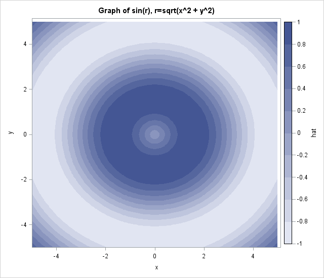
To use the template, I need to have values for the surface on a grid of (x,y) locations. (The CONTOURPARM statement also supports nongridded data; see the GRIDDED= option.) The following DATA step generates values for the function sin(r), where r=sqrt(x2 + y2). This is the same function that is plotted in the surface plot at the beginning of this article.
data hat; do y=-5 to 5 by 0.1; do x=-5 to 5 by 0.1; hat = sin(sqrt(x*x+y*y)); output; end; end; run; |
To create a contour plot of the data, call PROC SGRENDER and supply the name of the template. Use the DYNAMIC statement to specify the names of the variables that are to be displayed:
proc sgrender data=hat template=ContourPlotParm; dynamic _TITLE="Graph of sin(r), r=sqrt(x^2 + y^2)" _X="x" _Y="y" _Z="hat"; run; |
Now that I've defined a GTL template, I can reuse it for other data. When I want to display a contour plot, I only need to call the SGRENDER procedure and provide the name of the data set and the names of the variables, just as I do with the SGPLOT procedure.
Notice that the contour plot overcomes the objections that I raised earlier about the surface plot. You can determine the approximate function value of the center point and the (x,y) values that are associated with the maximum and minimum values of the plot. To find the function value near the center, notice that there are four contours between the middle of the plot and the large dark-blue annular region, which means that the values near the center are in the range [0,0.2]. Furthermore, the highest values of the function appear to occur near a circle in (x,y) space with radius about 1.5. The lowest values of the function appear to occur near a circle in (x,y) space with radius about 4.7.
The CONTOURPLOTPARM statement supports many options that are not used in this example, but I find that this template is a useful one for graphically displaying information about bivariate functions.

7 Comments
This solution is indeed much better than PROC GCONTOUR that requires the specification of patterns. Thanks.
Pingback: Compute a contour (level curve) in SAS - The DO Loop
Pingback: How to pass parameters to a SAS program
Pingback: Create a surface plot in SAS - The DO Loop
Pingback: Nonparametric regression for binary response data in SAS - The DO Loop
Pingback: 3 ways to visualize prediction regions for classification problems - The DO Loop
Pingback: The arithmetic-geometric mean - The DO Loop