If a financial analyst says it is "likely" that a company will be profitable next year, what probability would you ascribe to that statement? If an intelligence report claims that there is "little chance" of a terrorist attack against an embassy, should the ambassador interpret this as a one-in-a-hundred chance, a one-in-ten chance, or some other value?
Analysts often use vague statements like "probably" or "chances are slight" to convey their beliefs that a future event will or will not occur. Government officials and policy-makers who read reports from analysts must interpret and act on these vague statements. If the reader of a report interprets a phrase different from what the writer intended, that can lead to bad decisions.
Assigning probabilities to statements
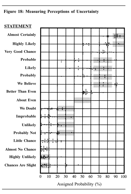
In the book Psychology of Intelligence Analysis (Heuer, 1999), the author presents "the results of an experiment with 23 NATO military officers accustomed to reading intelligence reports. They were given a number of sentences such as: "It is highly unlikely that ...." All the sentences were the same except that the verbal expressions of probability changed. The officers were asked what percentage probability they would attribute to each statement if they read it in an intelligence report."
The results are summarized in the adjacent dot plot from Heuer (Chapter 12), which summarizes how the officers assess the probability of various statements. The graph includes a gray box for some statements. The box is not a statistical box plot. Rather it indicates the probability range according to a nomenclature proposed by Kent (1964), who tried to get the intelligence community to agree that certain phrases would be associated with certain probability ranges.
For some statements (such as "better than even" and "almost no chance") there was general agreement among the officers. For others, there was large variability in the probability estimates. For example, many officers interpreted "probable" as approximately a 75% chance, but quite a few interpreted it as less than 50% chance.
A modern re-visualization
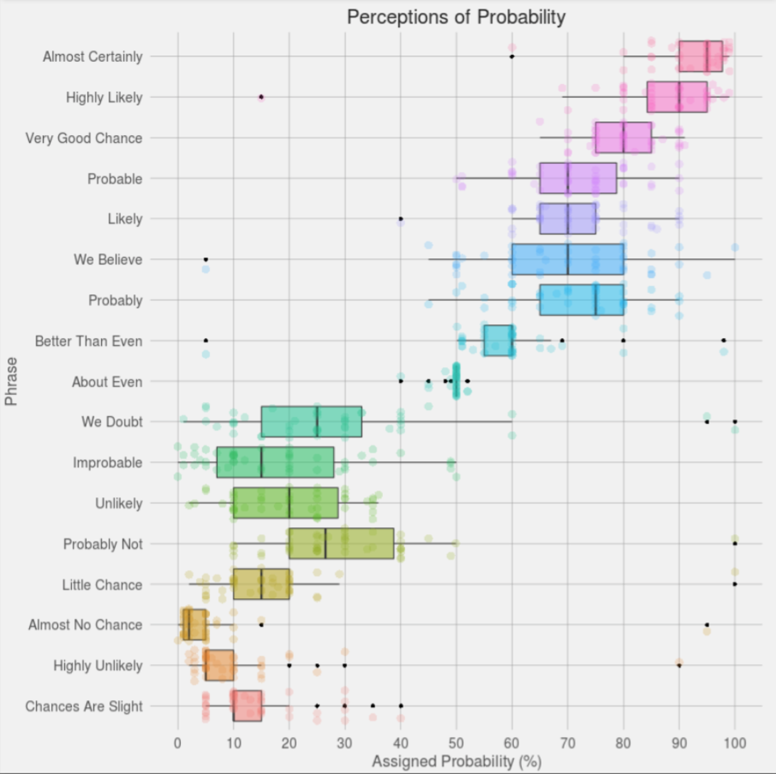
The results of this experiment are interesting on many levels, but I am going to focus on the visualization of the data. I do not have access to the original data, but this experiment was repeated in 2015 when the user "Zonination" got 46 users on Reddit (who were not military experts) to assign probabilities to the statements. His visualization of the resulting data won a 2015 Kantar Information is Beautiful Award. The visualization uses box plots to show the schematic distribution and overlays the 46 individual estimates by using a jittered, semi-transparent, scatter plot. The Zonination plot is shown at the right (click to enlarge). Notice that the "boxes" in this second graph are determined by quantiles of the data, whereas in the first graph they were theoretical ranges.
Creating the graph in SAS
I decided to remake Zonination's plot by using PROC SGPLOT in SAS. I made several modifications that improve the readability and clarity of the plot.
- I sorted the categories by the median probability. The median is a robust estimate of the "consensus probability" for each statement. The sorted categories indicate the relative order of the statements in terms of perceived likelihood. For example, an "unlikely" event is generally perceived as more probable than an event that has "little chance." For details about sorting the variables in SAS, see my article about how to sort variables by a statistic.
- I removed the colors. Zonination's rainbow-colored chart is aesthetically pleasing, but the colors do not add any new information about the data. However, the colors help the eye track horizontally across the graph, so I used alternating bands to visually differentiate adjacent categories. You can create color bands by using the COLORBANDS= option in the YAXIS statement.
- To reduce overplotting of markers, I used systematic jittering instead of random jittering. In random jittering, each vertical position is randomly offset. In systematic (centered) jittering, the markers are arranged so that they are centered on the "spine" of the box plot. Vertical positions are changed only when the markers would otherwise overlap. You can use the JITTER option in the SCATTER statement to systematically jitter marker positions.
- Zonination's plot displays some markers twice, which I find confusing. Outliers are displayed once by the box plot and a second time by the jittered scatter plot. In my version, I suppress the display of outliers by the box plot by using the NOOUTLIERS option in the HBOX statement.
You can download the SAS code that creates the data, sorts the variables by median, and creates the plot. The following call to PROC SGPLOT shows the HBOX and SCATTER statements that create the plot:
title "Perceptions of Probability"; proc sgplot data=Long noautolegend; hbox _Value_ / category=_Label_ nooutliers nomean nocaps; scatter x=_Value_ y=_Label_ / jitter transparency=0.5 markerattrs=GraphData2(symbol=circlefilled size=4); yaxis reverse discreteorder=data labelpos=top labelattrs=(weight=bold) colorbands=even colorbandsattrs=(color=gray transparency=0.9) offsetmin=0.0294 offsetmax=0.0294; /* half of 1/k, where k=number of catgories */ xaxis grid values=(0 to 100 by 10); label _Value_ = "Assigned Probability (%)" _label_="Statement"; run; |
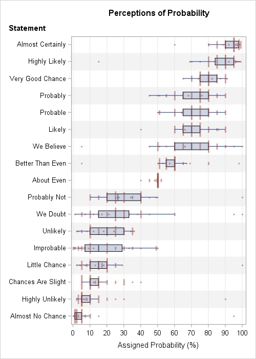
The graph indicates that some responders either didn't understand the task or intentionally gave ridiculous answers. Of the 17 categories, nine contain extreme outliers, such as assigning certainty (100%) to the phrases "probably not," "we doubt," and "little chance." However, the extreme outliers do not affect the statistical conclusions about the distribution of probabilities because box plots (which use quartiles) are robust to outliers.
The SAS graph, which uses systematic jittering, reveals a fact about the data that was hidden in the graphs that used random jittering. Namely, most of the data values are multiples of 5%. Although a few people responded with values such as 88.7%, 1%, or 3%, most values (about 80%) are rounded to the nearest 5%. For the phrases "likely" and "we believe," 44 of 46 responses (96%) were a multiple of 5%. In contrast, the phrase "almost no chance" had only 18 of 46 responses (39%) were multiples of 5% because many responses were 1%, 2%, or 3%.
Like the military officers in the original study, there is considerable variation in the way that the Reddit users assign a probability to certain phrases. It is interesting that some phrases (for example, "We believe," "Likely," and "Probable") have the same median value but wildly different interquartile ranges. For clarity, speakers/writers should use phrases that have small variation or (even better!) provide their own assessment of probability.
Does something about this perception study surprise you? Do you have an opinion about the best way to visualize these data? Leave a comment.

4 Comments
This reminded me of the Jeffreys scale for interpreting Bayes factors, including terms like "barely worth mentioning" for a Bayes factor of 1 to sqrt(10). These are more akin to odds ratios, but it's another effort to give a kind of warmth to a dimensionless number.
Pingback: How to download and convert CSV files for use in SAS - The SAS Dummy
I would put the phrases on the X axis and associated probabilities on the Y - we usually link the Y axis to the dependent variable. I like the idea of systematic jitter - it revealed an interesting pattern of reasoning in 5%.
Pingback: 10 tips for creating effective statistical graphics - The DO Loop