Who was the oldest person elected president of the United States? How about the youngest? Who was the oldest when he left office? Let's look at some data.
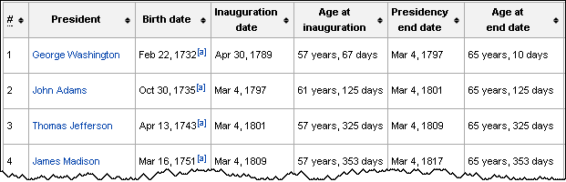
Wikipedia has a page that presents a table of the presidents of the US by age. It lists the dates for which each president entered and left office, including those who died or resigned. It also provides the ages for each president on those dates. However, the table is hard to scan. I decided to import the data into SAS and create a graphic that visualizes the relevant data for all presidents.
Ages of US presidents. Who was oldest? Youngest? #DataViz Share on XReading the president data into SAS
The first step is to load the data into a SAS data set. There are two SAS tricks that you can use to read the data:
- You don't have to recode the dates in the table. You can use the ANYDTDTE informat to read dates such as "Feb 22, 1732" and "Mar 4, 1797."
- You don't have to read the ages into SAS. If you have the president's birth date, SAS can use YRDIF function to compute the president's age at any subsequent date.
You can download the SAS file that reads the dates and computes each president's age upon entering and leaving office.
A graph that shows the ages of presidents
I was interested in showing the age of each president when he began and left the presidency. I thought about creating a HIGHLOW plot of age versus the president's number (Washington=1 to Trump=45), but I wanted to also show the approximate years that each president served. Consequently, I decided to use a VECTOR plot with scatter plot overlays.

The adjacent graph (click to enlarge) show an arrow for each president. The filled marker at the base of each arrow indicates the date and age at which each president assumed the office. The length of the arrow indicates how long each president served. (Most arrows represent four or eight years.) The open marker at the tip of each arrow indicates the date and age at which each president left office.
The graph displays the names of certain presidents. People who became president before turning 50 are shown along the bottom of the graph. The people who became president after the age of 65 are also shown. Notice that William Harrison (age 68) only lived a month past his inauguration. He and Garfield are mere blips on the graph. In contrast, the long arrow of FDR's 12-year presidency in the 1930s is easy to spot.
Oldest and youngest presidents
What can we learn from the graph?
- You might have heard the claim that Donald Trump will be the oldest person to be inaugurated. The graph shows that Trump will be older than Ronald Reagan was at his 1980 inauguration. However, the graph also shows that Ronald Reagan served two terms, so Reagan was older than Trump at his second inauguration. Reagan was almost 78 when he left office, which makes him the oldest person to serve as president!
- Who was the youngest president? Many people might guess John F. Kennedy. True, he was the youngest to be elected presidents, but the graph shows that Teddy Roosevelt was about nine months younger when he assumed the office after McKinley's assassination.
- On several occasions the incoming president was almost exactly the same age as the outgoing president. For example, in 2001 Bill Clinton (age 54.4 years) was succeeded by George W. Bush (age 54.5 years). Bush's arrow appears to be a continuation of Clinton's.
- In contrast, can you find the biggest age gap between an outgoing president and his successor? Hint: It was a 26-year difference in age!
Do you think you can create a better graph that shows the ages of US presidents? Download the data and post your best ideas!

7 Comments
Rick,
How about this one.
Great! Thanks for playing!
KSharp's version has the benefit of not having overlaying vectors. Otherwise, both are excellent! Love these!
Pingback: Zodiac signs of US Presidents - The SAS Dummy
Posted a Gantt chart-like take on Presidents' ages here (code below):
https://communities.sas.com/t5/SAS-GRAPH-and-ODS-Graphics/Fun-w-ODS-Graphics-Gantt-chart-like-take-on-Presidents-ages/m-p/312117
It's OK, but I like Rick's vector version better - presents all the information nicely in a historical context.
title;
proc format; * Kludge since Trump's term TBD;
picture trump 74.1-74.9="?" other='99.9';
data presidents2;
set presidents;
if AgeAtEndDate=. then AgeAtEndDate=AgeAtInauguration+4; * Default to 4-year term;
format AgeAtInauguration AgeAtEndDate trump.;
label InaugurationDate="Inaugurated" PresidencyEndDate="End Date";
ods graphics on / imagemap height=11.25in width=11.25in;
proc sgplot data=presidents2 noautolegend;
highlow y=President low=AgeAtInauguration high=AgeAtEndDate /
lowlabel=AgeAtInauguration highlabel=AgeAtEndDate lineattrs=(thickness=4pt);
yaxis grid reverse display=(nolabel noticks);
yaxistable InaugurationDate PresidencyEndDate;
xaxis grid values=(40 to 80 by 5) valuesformat=z2.
label="Age of US Presidents at Beginning and End of Term";
Pingback: A graph for Trump - our oldest president - SAS Learning Post
Pingback: How to turn your graphs up to 11 - SAS Learning Post