Rick Wicklin showed us how to visualize the ages of US Presidents at the time of their inaugurations. That's a pretty relevant thing to do, as the age of the incoming president can indirectly influence aspects of the president's term, thanks to health and generational factors.
As part of his post, Rick supplied the complete data set for US Presidents and their birthdays. He challenged his readers to create their own interesting visualizations, and that's what I'm going to do here. I'm going to show you the distribution of US Presidents by their astrological signs.
Now, you might think that "your sign" is not as relevant of a factor as Age, and I certainly hope that you're correct about that. But past presidents have sought the advice of astrologers, and zodiac signs can influence the counsel such astrologers might offer. (Famously, Richard Nixon took advice from celebrity psychic Jeane Dixon. First Lady Nancy Reagan also sought her advice, and we know that Mrs. Reagan in turn influenced President Reagan.)
Like any good analyst, I mostly reused existing work to produce my results. First, I used the DATA step that Rick provided to create the data set of presidents and birthdays. Next, I reused my own work to create a SAS format that displays a zodiac sign for each date. And finally, I wrote write a tiny bit of PROC FREQ code to create my table and frequency plot.
data signs; /* So this column appears first */ retain President; length sign 8; /* SIGN. format created earlier with PROC FORMAT */ format sign sign.; set presidents (keep=President BirthDate InaugurationDate); /* convert birthday to our normalized SIGN date */ sign = mdy(month(birthdate),day(birthdate),2000); run; ods graphics on; proc freq data=signs order=freq; tables sign / plots=freqplot; run; |
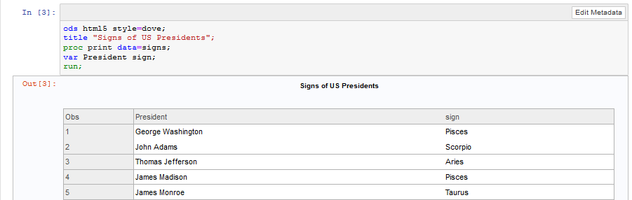
I did all of this work in SAS University Edition using the Jupyter Notebook interface. (Editor's note: SAS OnDemand for Academics has since replaced University Edition as our primary free software to learn SAS.) Here's a glimpse of what it looks like:
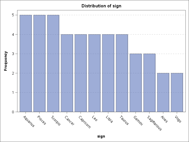
And here's the distribution you've all been waiting to see. When he takes office, Donald Trump will join George H. W. Bush and JFK in the Gemini column.
I've shared the Jupyter Notebook file as a public gist on GitHub. You can download and import into your own instance if you have SAS and Jupyter Notebook working together. (Having trouble rendering the notebook file? Try looking at it through the nbviewer service. That usually works.)

2 Comments
Pingback: A graph for Trump - our oldest president - SAS Learning Post
I wonder if the trend suggested by this visualization represents a relative-age effect. In developmental/school-age sports and academics, relatively older members of age-based cohorts (those born earlier in the year) enjoy a significant developmental advantage, the effects of which can persist into adulthood. In sports, the effect is weaker at the highest professional levels, but in politics?