A kernel density estimate (KDE) is a nonparametric estimate for the density of a data sample. A KDE can help an analyst determine how to model the data: Does the KDE look like a normal curve? Like a mixture of normals? Is there evidence of outliers in the data?
In SAS software, there are two procedures that generate kernel density estimates. PROC UNIVARIATE can create a KDE for univariate data; PROC KDE can create KDEs for univariate and bivariate data and supports several options to choose the kernel bandwidth.
The KDE is a finite mixture distribution. It is a weighted sum of small density "bumps" that are centered at each data point. The shape of the bumps are determined by the choice of a kernel function. The width of the bumps are determined by the bandwidth.
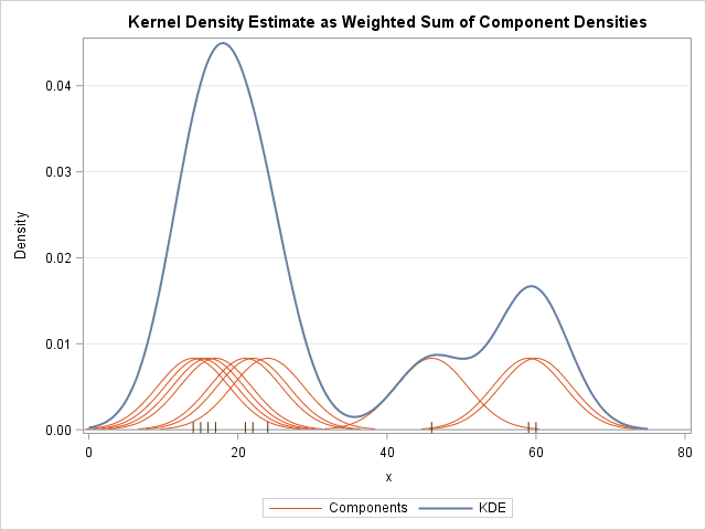
In textbooks and lecture notes about kernel density estimation, you often see a graph similar to the one at the left. The graph shows the kernel density estimate (in blue) for a sample of 10 data values. The data values are shown in the fringe plot along the X axis. The orange curves are the component densities. Each orange curve is a scaled version of a normal density curve centered at a datum.
This article shows how to create this graph in SAS. You can use the same principles to draw the component densities for other finite mixture models.
The kernel bandwidth
The first step is to decide on a bandwidth for the component densities. The following statements define the data and use PROC UNIVARIATE to compute the bandwidth by using the Sheather-Jones plug-in method:
data sample; input x @@; datalines; 46 60 24 15 17 14 21 59 22 16 ; proc univariate data=sample; histogram x / kernel(c=SJPI); run; |
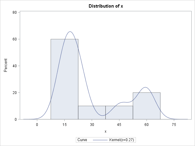
The procedure create a histogram with a KDE overlay. The legend of the graph gives a standardized kernel bandwidth of c=0.27, but that is not the bandwidth you want. As explained in the documentation, the kernel bandwidth is derived from the normalized bandwidth by the formula λ = c IQR n-1/5, where IQR is the interquartile range and n is the number of nonmissing observations. For this data, IQR = 30 and n=10, so λ ≈ 5. To save you from having to compute these values, the SAS log displays the following NOTE:
NOTE: The normal kernel estimate for c=0.2661 has a bandwidth of 5.0377 |
The UNIVARIATE procedure can use several different kernel shapes. By default, the procedure uses a normal kernel. The rest of this article assumes a normal kernel function, although generalizing to other kernel shapes is straightforward.
Compute the component densities
Because the kernel function is centered at each datum, one way to visualize the component densities is to evaluate the kernel function on a symmetric interval about x=0 and then translate that component for every data point. In the following SAS/IML program, the vector w contains evenly spaced points in the interval [-3λ, 3λ], where λ is the bandwidth of the kernel function. (This interval contains 99.7% of the area under the normal curve with standard deviation λ.) The vector k is the normal density function evaluated on that interval, scaled by 1/n where n is the number of nonmissing observations. The quantity 1/n is the mixing probability for each component; the KDE is obtained by summing these components.
The program creates an output data set called component that contains three numerical variables. The ID variable is an ID variable that identifies which observation is being used. The z variable is a translated copy of the w variable. The k variable does not change because every component has the same shape and bandwidth.
proc iml; use sample; read all var {x}; close; n = countn(x); mixProb = 1/n; lambda = 5; /* bandwidth from PROC UNIVARIATE */ w = do(-3*lambda, 3*lambda, 6*lambda/100); /* evenly spaced; 3 std dev */ k = mixProb * pdf("Normal", w, 0, lambda); /* kernel = normal pdf centered at 0 */ ID= .; z = .; create component var {ID z k}; /* create the variables */ do i = 1 to n; ID = j(ncol(w), 1, i); /* ID var */ z = x[i] + w; /* center kernel at x[i] */ append; end; close component; |
Compute the kernel density estimate
The next step is to sum the component densities to create the KDE. The easy way to get the KDE in a data set is to use the OUTKERNEL= option on the HISTOGRAM statement in PROC UNIVARIATE. Alternatively, you can create the full KDE in SAS/IML, as shown below.
The range of the data is [14, 60]. You can extend that range by the half-width of the kernel components, which is 15. Consequently the following statements use the interval [0, 75] as a convenient interval on which to sum the density components. The actual summation is easy in SAS/IML because you can pass a vector of positions to the PDF function in Base SAS.
The sum of the kernel components is written to a data set called KDE.
/* finite mixture density is weighted sum of kernels at x[i] */ a = 0; b = 75; /* endpoints of interval [a,b] */ t = do(a, b, (b-a)/200); kde = 0*t; do i = 1 to n; kde = kde + pdf("Normal", t, x[i], lambda) * mixProb; end; create KDE var {t kde}; append; close; quit; |
Visualize the KDE
You can merge the original data, the individual components, and the KDE curve into a single SAS data set called All. Use the SGPLOT procedures to overlay the three elements. The individual components are plotted by using the SERIES plot with a GROUP= option. A second SERIES plot graphs the KDE curve. A FRINGE statement plots the positions of each datum as a hash mark. The plot is shown at the top of this article.
data All; merge sample component KDE; run; title "Kernel Density Estimate as Weighted Sum of Component Densities"; proc sgplot data=All noautolegend; series x=z y=k / group=ID lineattrs=GraphFit2(thickness=1); /* components */ series x=t y=kde /lineattrs=GraphFit; /* KDE curve */ fringe x; /* individual observations */ refline 0 / axis=y; xaxis label="x"; yaxis label="Density" grid; run; |
You can use the same technique to visualize other finite mixture models. However, the FMM procedure creates these plots automatically, so you might never need to create such a plot if you use PROC FMM. The main difference for a general finite mixture model is that the component distributions can be from different families and usually have different parameters. Therefore you will need to maintain a vector of families and parameters. Also, the mixing probabilities usually vary between components.
In summary, the techniques in this article are useful to teachers and presenters who want to visually demonstrate how choosing a kernel shape and bandwidth gives rise to the kernel density estimate.
