Somewhere in my past I encountered a panel of histograms for small random samples of normal data. I can't remember the source, but it might have been from John Tukey or William Cleveland. The point of the panel was to emphasize that (because of sampling variation) a small random sample might have a distribution that looks quite different from the distribution of the population. The diversity of shapes in the panel was surprising, and it made a big impact on me. About half the histograms exhibited shapes that looked nothing like the familiar bell shape in textbooks.
A small random sample might look quite different than the population #StatWisdom Share on XIn this article I recreate the panel. In the following SAS DATA step I create 20 samples, each of size N. I think the original panel showed samples of size N=15 or N=20. I've used N=15, but you can change the value of the macro variable to explore other sample sizes. If you change the random number seed to 0 and rerun the program, you will get a different panel every time. The SGPANEL procedure creates a 4 x 5 panel of the resulting histograms. Click to enlarge.
%let N = 15; data Normal; call streaminit(93779); do ID = 1 to 20; do i = 1 to &N; x = rand("Normal"); output; end; end; run; title "Random Normal Samples of Size &N"; proc sgpanel data=Normal; panelby ID / rows=4 columns=5 onepanel; histogram x; run; |
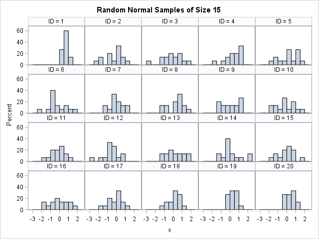
Each sample is drawn from the standard normal distribution, but the panel of histogram reveals a diversity of shapes. About half of the ID values display the typical histogram for normal data: a peak near x=0 and a range of [-3, 3]. However, the other ID values look less typical. The histograms for ID=1, 19, and 20 seem to have fewer negative values than you might expect. The distribution is very flat (almost uniform) for ID=3, 9, 13, and 16.
Because histograms are created by binning the data, they are not always the best way to visualize a sample distribution. You can create normal quantile-quantile (Q-Q) plots to compare the empirical quantiles for the simulated data to the theoretical quantiles for normally distributed data. The following statements use PROC RANK to create the normal Q-Q plots, as explained in a previous article about how to create Q-Q plots in SAS:
proc rank data=Normal normal=blom out=QQ; by ID; var x; ranks Quantile; run; title "Q-Q Plots for Random Normal Samples of Size &N"; proc sgpanel data=QQ noautolegend; panelby ID / rows=4 columns=5 onepanel; scatter x=Quantile y=x; lineparm x=0 y=0 slope=1; colaxis label="Normal Quantiles"; run; |
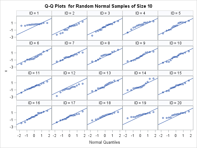
The Q-Q plots show that the sample distributions are well-modeled by a standard normal distribution, although the deviation in the lower tail is apparent for ID=1, 19, and 20. This panel shows why it is important to use Q-Q plots to investigate the distribution of samples: the bins used to create histograms can make us see shapes that are not really there. The SAS documentation includes a section on how to interpret Q-Q plots.
In conclusion, small random normal samples can display a diversity of shapes. Statisticians understand this sampling variation and routinely caution that "the standard errors are large" for statistics that are computed on a small sample. However, viewing a panel of histograms makes the concept of sampling variation more real and less abstract.

2 Comments
Pingback: Goodness-of-fit tests: A cautionary tale for large and small samples - The DO Loop
Great example!