My son is in high school and plans to take the ACT, a standardized test to assess college aptitude and readiness. My wife asked, "What is a good score for the ACT?" I didn't know, but I did a quick internet search and discovered a tabulation of scores for the 1.66 million students who took the ACT in 2012. The data were presented for four "content areas," namely English, mathematics, reading, and science. A score is a number between 1 and 36. The four content areas are combined to create a composite score.
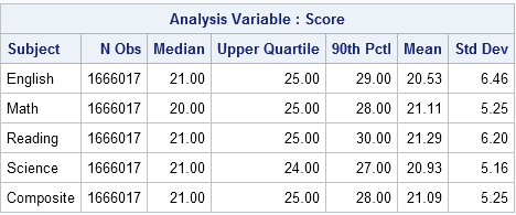
What is a good score on the ACT test? Compare your score to the population. #Statistics Share on XTo answer my wife's question, I used PROC MEANS in SAS to compute the following table, which contains summary statistics for ACT scores for the four content areas and for the composite scores. You can see that an average score for the ACT is about 20 or 21. A score of 25 of more will land you in the top quartile (25%) of students. To be in the top decile (10%), you need a score in the high 20s, or even 30.
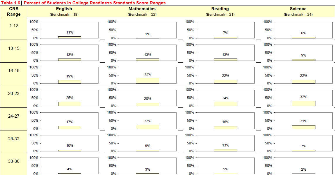
The data were in a report that included a graph that tried to show the distribution of scores. However, I did not find the graph to be very effective. I thought I'd use SAS to visualize the distribution of ACT scores in a form that might be clearer. You can download the data and SAS program that I used to create the plots.
For a first attempt, I used PROC SGPANEL to create a panel with four bar graphs, one for each subject area. The published graph aggregated scores into bins, so I did the same. You can apply a custom SAS format and use PROC FREQ to aggregate the scores. The following graph contains the same information as the published graph, but shows the distribution of scores more clearly by using a single bar chart for each subject area:
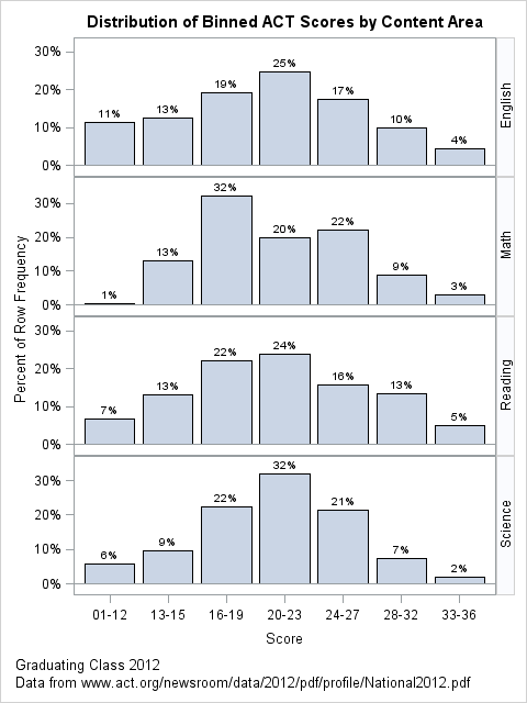
The panel displays four graphs. The first row shows the distribution of aggregated scores for the English content area. About 25% of student scores are in the range 20–23. Only 14% of students scored 28 or higher. The distributions of reading scores is similar.
The distribution of math scores (the graph in the second row) is more interesting. This seems to be a bimodal distribution. About 45% of students have scores less than 20. About one quarter of students score in the 24–27 range. It is curious that almost no one scores lower than 13 in math, although low scores exist in the other content areas.
The bar charts for reading and science occupy the third and fourth rows, respectively. The most obvious feature is that the distribution of science scores is narrow, with only 9% of students scoring 28 or better.
An alternative visualization of ACT scores
The aggregation of scores into bins is not necessary. You can also plot the distribution of the raw scores, as shown below.
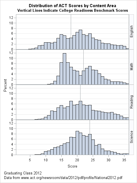
I like this variation. The 36 bins show the exact distribution of the scores. You can easily see the bimodal nature of the math scores. You can see that the reading and English scores have a relatively large standard deviation, with many students scoring very high or very low, especially when compared to the science scores.
By drawing a histogram, you can also add "benchmark scores" or other reference values to the distributions. According to the ACT report (p. 3): "A benchmark score is the minimum score needed on an ACT subject-area test to indicate a 50% chance of obtaining a B or higher or about a 75% chance of obtaining a C or higher in the corresponding credit-bearing college courses, which include English Composition, Algebra, Social Science and Biology."
By adding the benchmark scores, you can visually estimate what proportion of the ACT students are likely to get at least a B in each subject area, thus making a connection between ACT scores and college performance. For English, about two thirds of students have at least a 50% chance of getting a B or higher. The benchmark score for English is relatively low compared to the median. In contrast, the benchmarks for math and reading are about the same as the median scores in those subject areas, indicating that about half of the students have a 50% chance of getting a B or higher. Apparently college-level Biology is difficult for students because the benchmark score for science (24) is relatively high. Only 30% of students that take the ACT have a science score greater than or equal to the benchmark.
Which visualization do you prefer? Or maybe you have a different idea that you'd like to try? Leave a comment.

2 Comments
Good Read! Very interesting to know. Personally I like the 2nd distribution more. For me, the more bins the better visualization of the distribution.
Pingback: Visualize SAT scores in North Carolina - The DO Loop