Sometimes different communities use the same name for different objects. To a soldier, "boots" are rugged, heavy, high-top foot coverings. To a soccer (football) player, "boots" are lightweight cleats. So it is with the term "waterfall plot." To researchers in the medical field, a "waterfall plot" is a sorted bar chart of patients in a clinical trial. I have written about how to create a waterfall plot for a clinical trial in SAS. However, to people in finance and business, a "waterfall chart" is a hanging bar chart that shows the cumulative contributions of a response across several sources. This second kind of waterfall chart is also called a cascade plot or a progressive bar chart. This article describes how to create a cascade chart in SAS.
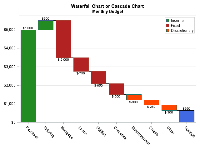
A typical cascade chart is shown to the left. It shows a monthly budget for a hypothetical individual. The response variable is money, and this cascade chart shows positive or negative contributions from various sources. Income (colored green) includes his take-home pay from his job, and some money he makes by tutoring. Fixed expenses (colored in red) include his mortgage, student or car loans, various utilities, and groceries. Discretionary expenses (colored orange) include entertainment, clothes, gifts, and his daily trip to Starbucks. At the end of the month, the budget shows leftover money that is earmarked as savings.
How to create a cascade chart (waterfall chart) in SAS
The cascade chart is easy to create in SAS by using the WATERFALL statement in the SGPLOT procedure. You need to specify the categories (in the order that you want them to appear) and the contribution (positive or negative) from each category. Optionally, you can specify a categorical variable that will be used to assign colors to the bars. You do not specify data for the last category; it is computed automatically. The following DATA step creates the data. The values of the TYPE variable are used to color the bars in the cascade chart:
data Budget; length Name $13 Type $13; format Amount dollar.; input Name $13. Amount Type $; datalines; Paycheck 5000 Income Tutoring 500 Income Mortgage -2000 Fixed Loans -750 Fixed Utilities -650 Fixed Groceries -600 Fixed Entertainment -300 Discretionary Charity -250 Discretionary Other -300 Discretionary ; title "Waterfall Chart or Cascade Chart"; title2 "Monthly Budget"; proc sgplot data=Budget; styleattrs datacolors=(ForestGreen FireBrick OrangeRed); waterfall category=Name response=Amount / colorgroup=Type datalabel finalbartickvalue="Savings" finalbarattrs=(color=RoyalBlue); keylegend / location=inside down=3 opaque; xaxis display=(nolabel); yaxis grid display=(nolabel) offsetmin=0; run; |
Each statement is explained below:
- The STYLEATTRS statement is optional. If it is omitted, then the bars are colored according to the current ODS style. For this example, I wanted green to denote positive cash flow (credits) and red/orange to denote negative flow (debits).
- The WATERFALL statement specifies the variables for the plot. The CATEGORY= option specifies the categorical variable for the X axis, whereas the RESPONSE= option specifies the numerical variable to plot on the Y axis. The COLORGROUP= option specifies a categorical variable that is used to assign colors to the bars. The FINALBARTICKVALUE= option enables you to assign a name to the final bar, which shows the final cumulative sum.
- The KEYLEGEND statement is optional. It is used to place the legend in a convenient location.
- The XAXIS and YAXIS statements are optional. They enable you to specify attributes of the plot axes.
How to interpret a cascade chart
The cascade chart enables you to see how a cumulative total is decomposed into constituent parts. The cascade chart is most useful when you want to show both positive and negative values.
Notice that the bottom of the bar for the second category is level with the top of the bar for the first category. Similarly, the base for the third bar is level with the cumulative contributions from the first two categories. In general, the baseline for the kth bar is placed at the cumulative sum of the first (k-1) categories. Positive quantities result in a bar that increases from the baseline; negative quantities result in bars that point down.
If all of the quantities are positive, then the cascade chart is similar to a stacked bar chart. For example, you could plot the time (response) that it takes to write a book, broken down by various stages: research, first draft, editing, revising, and so forth. The stacked bar chart shows each category as a slice of whole, but it has two drawbacks: it is hard to label small cells and it cannot handle negative values. The cascade chart resolves both of these issues by horizontally displacing the cells.
The categories in the cascade chart are displayed in the order that they appear in the data set. It is up to you to group them in a meaningful way. In this example, I put positive quantities (income) first. This practice gives the chart its name because the chart vaguely resembles a cascade of water down a geological outcrop.
If the categories are ordered, then the chart might have several up-and-down segments. For example, if you are plotting the profit/loss for a sequence of years, the chart might move up during prosperous times and move down during economically challenging conditions.
If you are comparing the response categories to each other, a basic bar chart is probably what you want. But if you are trying to show how a total value is the cumulative sum of contributions from several categories, then the cascade chart is a useful visualization technique.
