My friend Chris posted an analysis of the distribution of birthdays for 236 of his Facebook friends. He noted that more of his friends have birthdays in April than in September. The numbers were 28 for April, but only 25 for September. As I reported in my post on "the most likely birthday in the US," September is supposedly the king of birthday months, as judged by the analysis of birth records at the National Center for Health Statistics (NCHS) (Martin, et al., 2006).
Does Chris's analysis prove that the government researchers are wrong? Has he exposed a sinister government conspiracy? No, but I'd like to use his analysis to discuss two essential principles of statistics:
- When you have a sample, you should always ask yourself "What is the population from which this sample is drawn?"
- Samples exhibit variability. Small samples are more variable than larger samples.
I could also discuss a third principal, the distinction between "different" and "significantly different," but I'll leave that discussion for another time.
What is the population?
The NCHS report was about birth rates for children born in the US in the late 1990s and early 2000s. Unless Chris's Facebook friends are tweeners and teenagers (insert inappropriate joke here), I think we can assume that Chris's sample is from a different population than the population in the report by Martin, et al.
Chris's data are probably from a population such as "people born between 1930 and 1970" and it is conceivable that the distribution of birthdays in this population is different than the distribution of US birth at the turn of the millennium. For instance, the Great Depression, World War II, and the post-war Baby Boom might have influenced the distribution of birthdays. Furthermore, Chris's friends might not be US-born. Birth rates for countries in the southern hemisphere might be different than those reported for US births by the NCHS. If Chris has a lot of friends from Australian and New Zealand, that could skew the distribution of birthdays.
Sampling variation
A more likely explanation is probably plain ol' sampling variation. It is well known that small samples have more variability than larger samples. If I select at random 10 children born in 2002, I might end up with two children born in April and none born in September. Chris has 236 friends who share their birthday information. With a sample this large, you can get a distribution of birthdays that is probably close to the distribution of birthdays in the population, but you still might get a few more April birthdays than expected, given the population distribution.
An analysis of birthdays at a large US software company
One way to deal with sampling variation is to use a larger sample. It might be a while before Chris has thousands of Facebook friends, and I don't want to wait, so I'll use the birthdays of 3,061 employees who work at a major US-based software company. I wrote a SAS program to collate the birthday information. The following statements use the FREQ procedure to analyze and plot the distribution of birthdays by month:
proc freq data=Birthdays; tables Month / plots=FreqPlot(scale=percent); run; |
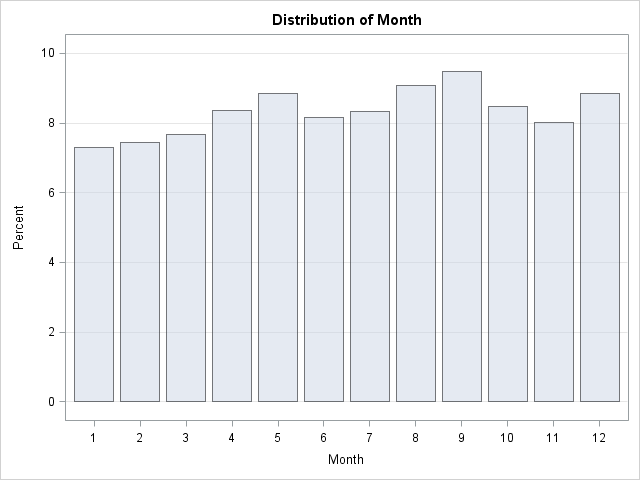
The image shows that September birthdays occur most frequently in the sample of 3,061 employees, but it also shows an apparent "bump" in the April–May. The difference between these peak months is small, about 1%, so a random sample with, say, 263 observations can easily contain more spring birthdays than autumn birthdays.
With more work, you can analyze the birthdays by week and fit a periodic smoother to the weekly frequencies of birthdays. This is shown in the following graph:
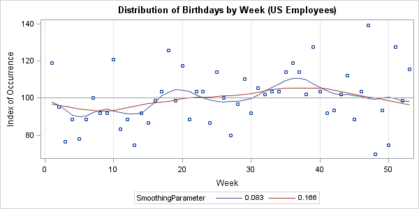
The two curves smooth the scatter plot based on a local weighted fit of 12 (blue-gray) or six (red) nearest neighbors. The red curve shows an annual seasonality of fewer births in the winter and more in the late summer and early fall. The blue-gray curve shows that the data might have a smaller cycle with a minor peak near weeks 18–20, in addition to the major peak near weeks 36–38. Both of these curves are consistent with the NCHS report, although the data are not drawn from the same population.
Notice the variability from week to week in this graph. Even with a sample of 3,061, the proportion of birthdays per week varies by ±30%, whereas the 4 million birth records from 2002 show a much smaller week-to-week-variability. For the 2002 data, it was easy to "eyeball" a curve that fit the data. For the birthdays of employees, I would be hard-pressed to predict what a smoothing curve might look like.
If anyone else wants to analyze the 3,061 birthdays, you can download the data as a set of comma-separated values.

4 Comments
The median age of my Facebook friends (those who share their birth year, so N=106) is 43. However, the youngest is 16 (friend of the family, so don't get creeped out), and the oldest shows up as 100.9 (one of my lying friends, I think, or else she looks really good for her age).
If instead I calculate age based on when they graduated from high school (tricky! Assuming most people graduate at age 18), then N=185, Median=44.35, Min=16, Max=69.
Pingback: What’s our sign? - The SAS Dummy
Thanks for uploading the data. I downloaded it for use in my class tonight. My daughter and I were discussing your blog. She was born in September but her daughter was born in April and the next one is due in February. We counted back nine months and figured everyone is home for Christmas to New Years - military, business travelers, students - add that to a lot of alcohol and good cheer and it equals a baby boom nine months later.
A question for your class to think about: how would you test Dr. De Mars' hypothesis? Can you think of data you could collect and analyze that could determine whether birthdays in September are a result of holiday celebrations? Maybe human females are more fertile in cold weather. What data could you collect that could confirm or rule out that effect?