The Junk Chart blog discusses a potential problem that can arise in grouped bar charts when the two groups have vastly different ranges.
One possible solution (which is discussed at the Junk Chart sister blog, Numbers Rule Your World) is to present the data back-back in what is sometimes called a "butterfly plot."
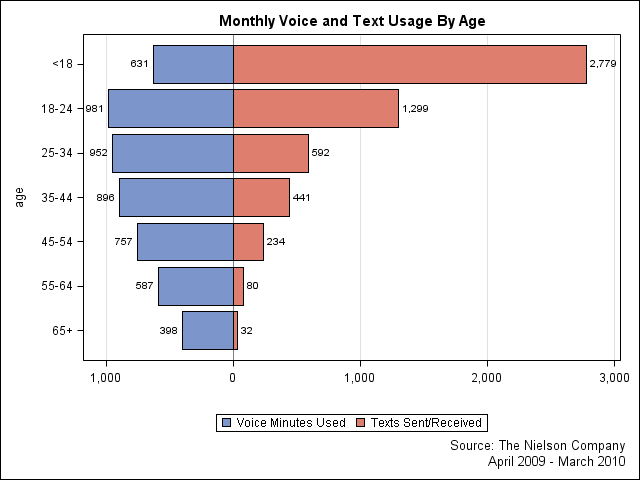
Here is the data presented as a butterfly plot by using the SGPLOT procedure:
The graph was created by using the following SAS program. The details of the program are described in Susan Schwartz's 2008 SAS Global Forum paper on the SG procedures in SAS 9.2.
data VoiceText; input age $ 1-5 voice text; label voice="Voice Minutes Used" text ="Texts Sent/Received"; voice= -1 * voice; datalines; <18 631 2779 18-24 981 1299 25-34 952 592 35-44 896 441 45-54 757 234 55-64 587 80 65+ 398 32 ; run; proc format; picture positive low-<0="000,000" 0<-high="000,000"; run; title "Monthly Voice and Text Usage By Age"; footnote justify=right "Source: The Nielson Company"; footnote2 justify=right "April 2009 - March 2010"; proc sgplot data=VoiceText; format voice text positive.; hbar age / response=voice datalabel; hbar age / response=text datalabel; xaxis label="" grid; yaxis discreteorder=data; run; |
