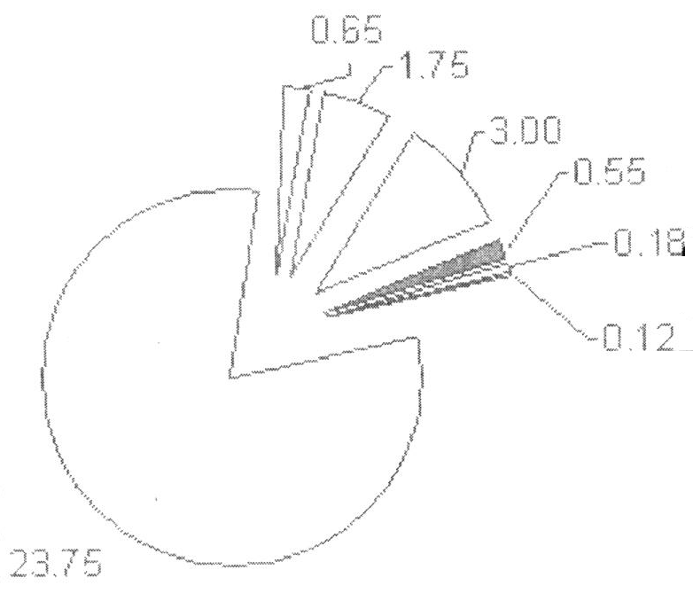
North Carolina is a state that requires yearly inspections of motor vehicles. An inspection checks for safety features (lights, brakes, tires,....) as well as checking vehicle emissions to ensure that vehicles meet air pollution standards. I recently had a car inspected and noticed a pie chart on the inspection's summary sheet. A scanned version of the pie chart is shown at the left.
Three aspects of the pie chart bothered me. First, there is no title or legend that tells you what is being plotted. Second, some of the slivers in the pie chart are very thin and hard to see. Third, I and other
members of the #OneLessPie club are always looking for ways to visualize data without using pie charts.
At first I thought the chart had something to do with my vehicle's emissions. Maybe different kinds of exhaust gasses? However, I found the same values in a table elsewhere on the form and learned that the values represent dollars. The cost of the inspection is $30, and these values represent the amounts that are given to various agencies, as shown in the following SAS data set:
data NCInspection;
input Cost Agency $24.;
format cost dollar6.2;
datalines;
23.75 Inspection Station
 3.00 Emissions Program
 1.75 Telecommunication
 0.65 Division of Air Quality
 0.55 Highway Fund
 0.18 Volunteer Rescue/EMS
 0.12 Rescue Squad Relief
; |
The Rescue Squad Relief money is
"to financially assist any rescue or EMS worker" who has been injured or killed on the job. The
Volunteer Rescue/EMS fund is to provide equipment for volunteer firefighters and rescue squads.
After seeing the information in a table, I wondered why additional ink was wasted creating a pie chart. There are only seven numbers. It seems like a table is an adequate way to show how the $30 is distributed. However, it turns out that the NC General Assembly has mandated that the information must appear as a table and
"shall be shown graphically in the form of a pie chart on the inspection receipt." Wow! A pie chart mandated by a state legislature! Maybe my #OneLessPie friends should start a letter-writing campaign!
Although the pie chart is mandated, it might be fun to examine alternative visualizations. Here are a few ideas:
- A cascade chart is a great way to show the contributions of each component to the full amount. See my previous article about how to create a cascade chart in SAS.
- A bar chart is a standard way to visualize data in a pie chart.
- A stacked bar chart is an alternative that takes up less space, but labeling those small slivers will be a challenge.
Let's see what each alternative looks like in SAS. I'll create the examples in color, although any graph on the NC inspection statement would have to be printed in black and white. The following statements use the SGPLOT procedure to create a cascade chart:
title "NC Inspection Amounts";
title2 "Cascade Chart (Waterfall Chart)";
proc sgplot data=NCInspection;
  waterfall category=Agency response=Cost / datalabel finalbartickvalue="Total Cost";
  xaxis display=(nolabel);
  yaxis grid display=(nolabel) offsetmin=0;
run; |
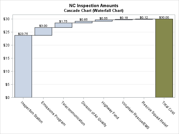
I like this chart. (Click to enlarge.) It shows relative sizes for each categories, as well as the exact values. However, because the cascade chart is not used very much in the media, I think that it is not the best choice for a general audience.
A second possibility is a classic bar chart, which is familiar to everyone. However, because the scale of the largest category ($23.75) is almost eight time larger than the next largest category ($3.00), the small bars will be hard to see. One variation on the bar chart is to
use a broken axis to make the smaller values more visible. In SAS 9.4m2 you can use the
RANGES= option on the XAXIS statement to create a broken axis, as follows:
title "Bar Chart with Broken Axis";
proc sgplot data=NCInspection;
  hbar Agency / response=Cost categoryorder=respdesc datalabel ;
  xaxis grid offsetmin=0 ranges=(0-3.8 21.2-24) values=(0 to 24) display=(nolabel);
  yaxis display=(nolabel);
run; |
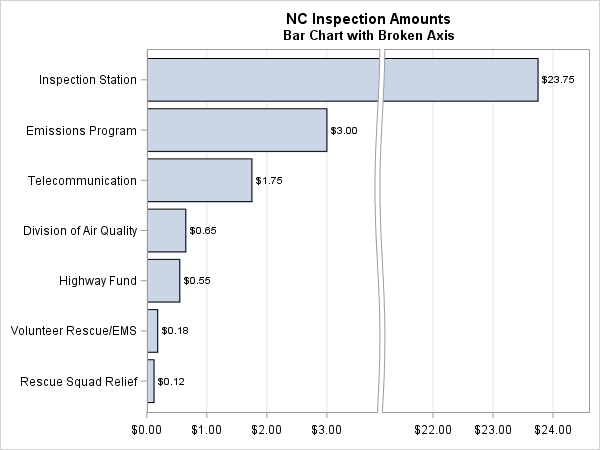
In general, I am not a fan of using a broken axis because it changes the area of the "broken" bars, but it isn't a terrible choice for these data. Nevertheless, the "broken axis" might confuse some people, so a standard bar chart (not shown) is probably a better choice. (For a technical audience you could consider using a logarithmic scale, but obviously that is not an option when the graph is intended for the general public.)
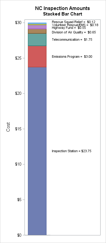
A third alternative is a stacked bar chart. This chart type is very familiar, but those small bars will be hard to label. After trying several variations, I finally settled on using the following options for creating a stacked bar chart:
- The stacked bar chart requires two categorical variables: one for the X axis and one for the stacking groups. Thus you need to create a fake category if you want only a single stacked bar chart.
- Although the new SEGLABEL option in the VBAR and VBARPARM statements in SAS 9.4m2 supports placing labels inside bars, the small bars are too thin to use this feature. Instead, you can use the VBARPARM statement to create the stacked bars and the YAXISTABLE statement to display labels for the bars. You need to use VBARPARM instead of VBAR because only certain plot types can be combined with others by using the SGPLOT procedure.
- The heights of the labels have to be customized for these data. For many data sets, you can set the heights at the midpoints of the bars, but you need to adjust the heights for these data so that the text does not overlap.
data Inspect / view=Inspect;
length Label $32.;
set NCInspection;
FakeGroup = 1;                /* fake group for category */
Label = trim(Agency) || " = " || putn(Cost, "Dollar6.2"); /* concatenate */
cumCost + Cost;
if _N_ <= 3 then                         /* customize placement of labels */
   LabelHeight = cumCost - Cost/2;       /* midpoint */
else if _N_ <= 5 then
   LabelHeight = cumCost - Cost + 0.15;  /* bottom + epsilon*/
else if _N_ = 6 then
   LabelHeight = cumCost - Cost;         /* bottom */
else LabelHeight = cumCost + 0.12;       /* top */
run;

ods graphics / width=350px height=800px;
title2 "Stacked Bar Chart";
proc sgplot data=Inspect noautolegend;
  vbarparm category=FakeGroup response=Cost / barwidth=1
       group=Agency grouporder=data groupdisplay=stack;
  yaxistable Label / Y=LabelHeight location=inside nolabel;
  yaxis offsetmin=0 values=(0 to 30 by 5);
  xaxis offsetmin=0.05 offsetmax=0.05 display=(nolabel noticks novalues);
run; |
If the pie chart were not mandated by law, which graph would you like to see on every vehicle inspection form in North Carolina? Do you think that you can create a better visualization? Leave a comment.

5 Comments
Rick, thanks for another great article.
I quite like the waterfall approach. I placed the thick mark values on the X2 axis, so the text is closer to the DATALABEL values.
title "NC Inspection Amounts";
title2 "Cascade Chart (Waterfall Chart)";
proc sgplot data=NCInspection;
waterfall category=Agency response=Cost / datalabel finalbartickvalue="Total Cost" x2axis;
x2axis display=(nolabel) colorbands=odd ;
yaxis grid display=(nolabel) offsetmin=0;
run;
What do you think?
Intriguing. Maybe also include BARWIDTH=1 in the WATERFALL options?
I purchased a vehicle from a used car lot and I believe I was given a falsified inspection. Is there anything I can do?
I suggest that you ask someone who is qualified to give legal advice.
Good to explore alternatives, but I can't imagine ever using a broken axis or a log axis with bars. Bars work by encoding the value as perceived length and both of those treatments (along with non-zero baselines) defeat that encoding.
I don't see that I can include images here, but a couple other alternatives:
1) simple (unexploded) pie chart with two labels, "Inspection Station, $23.75" and "State Fees, $6.25" along with an inset bar chart with the fees.
2) table with a de-emphasized bar chart behind it to add glance-ability