While at JSM 2014 in Boston, a statistician asked me whether it was possible to create a "customized bin plot" in SAS. When I asked for more information, she told me that she has a large data set. She wants to visualize the data, but a scatter plot is not very useful because of severe overplotting. I suggested several visualization options:
- Use transparency in the scatter plot to accommodate the overplotting
- Use the KDE procedure to create a two-dimensional density plot
- Create a rectangular bin plot, which is a heat map of the observation counts for each rectangle in a grid
- Create a hexagonal bin plot, which is a heat map of the observation counts for a set of hexagons
Unfortunately, she rejected these standard visualizations. She and her colleagues had decided that they needed a new type of binned plot that is constructed as follows:
- Divide the X and Y variables into quantiles. This creates a nonuniform grid in (X,Y) space. Each vertical strip and each horizontal strip contain about the same number of points. In particular, she wanted to use deciles, so that each strip contains about 10% of the total number of observations.
- The resulting grid has rectangles that vary in size, but you can still count the number of points in each rectangular bin.
- For each bin, put a marker at the mean X and mean Y value of the observations within the bin.
This is exactly the sort of computation that SAS/IML is intended for: a custom algorithm for multivariate data that is not built into any SAS procedure. From previous blog posts, I already have many of the building blocks for this algorithm:
- You can use the QNTL call to split the data into quantiles.
- You can use the BIN function to determine which observations are in each rectangular bin.
- You can use the UNIQUE-LOC trick to compute the mean position of the observations in each bin.
- You can use the SCATTER call to create an ODS scatter plot of the mean values .
The following program reads the Sashelp.bweight data and loads the birth weight of 50,000 babies and the relative weight gain of their mothers. The subsequent SAS/IML statements carry out the algorithm that the statistician requested:
proc iml;
use sashelp.bweight;                     /* read birthweight data */
   read all var {momwtgain weight} into Z;
close;

start bin2D(u, cutX, cutY);         /* define 2-D bin function */
   bX = bin(u[,1], cutX);           /* bins in X direction: 1,2,...,kx */
   bY = bin(u[,2], cutY);           /* bins in Y direction: 1,2,...,ky */
   bin = bX + (ncol(cutX)-1)*(bY-1);      /* assign bins 1,2,...,kx*ky */
   return(bin);
finish;

k = 10;                             /* divide vars into deciles  */
prob = (1:k-1)/k;                   /* vector 0.1, 0.2,..., 0.9  */
call qntl(qX, Z[,1], prob);         /* empirical quantiles for X */
call qntl(qY, Z[,2], prob);         /*    ...and Y               */

/* divide 2-D data into the k*k bins specified by the quantiles  */
cutX = .M || qX` || .P;
cutY = .M || qY` || .P;
b = bin2D(Z, cutX, cutY);          /* bin numbers 1-k^2*/

u = unique(b);                     /* which bins are occupied?   */
means = j(ncol(u), 2, .);          /* allocate matrix for means  */
count = j(ncol(u), 1, .);          /* allocate matrix for counts */
do i = 1 to ncol(u);               /* for each bin:              */
   idx = loc(b = u[i]);            /*   find obs in the i_th bin */
   count[i] = ncol(idx);           /*   how many obs in bin?     */
   means[i,] = mean( Z[idx,] );    /*   mean position within bin */
end;

title "Scatter Plot of Mean Values in Each Bin";
call scatter(means[,1], means[,2]) xvalues=qX` yvalues=qY` grid={x y}; |
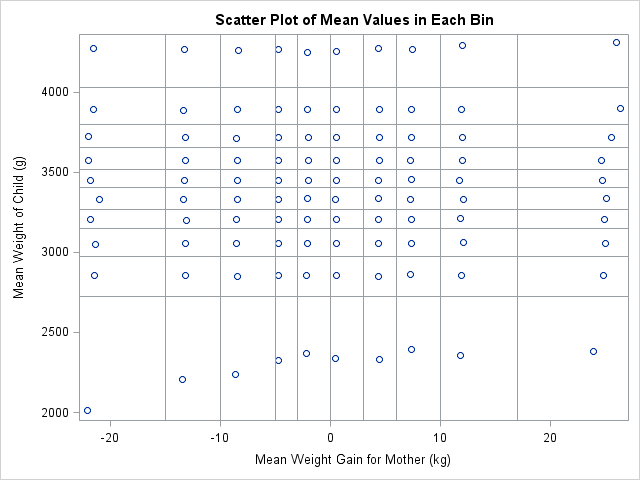
The scatter plot shows the location of the mean value for each of the 100 bins. For most bins, the markers are not centered in the rectangle, but are offset, which indicates that the distribution of points within the rectangles is not uniform. For example the mean values in the fourth vertical column are all far to the left in their bins.
Sometimes you cannot predict the advantages and disadvantages of a new graph type until you begin using it with real data. For this quantile bin plot, there is one glaring weakness: the graph does not indicate how many observations are in each bin. The next section addresses this weakness.
Improving the quantile bin plot
For these data, the number of points in the bins vary greatly. One bin contains only 184 observations (0.3% of the 50,000 observations) whereas another has 972 observations (1.9%). The median number of observations in a bin is 465. Yet none of that information is available on the graph.
It seems like it would be useful to know how many observations are in each bin. Even if the exact numbers are not needed, it would be nice to know which bins have more observations than others. I propose adding a fourth requirements for the quantile bin plot: a way to visualize the number of points in each bin.
Possible approaches include representing size by using the area of the mean marker. Another would be to overlay the scatter plot on a heat map of the counts. I implemented both of these methods. You can download the SAS program that creates all the graphs in this article.
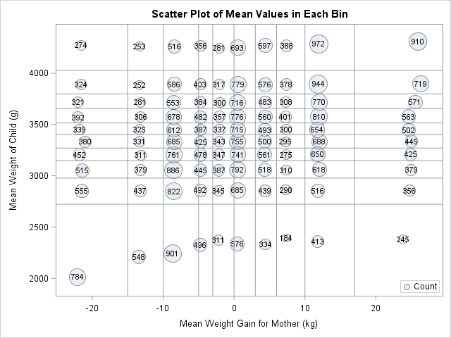
In SAS software, you can use the BUBBLE statement in the SGPLOT procedure to create markers whose areas are proportional to the bin counts. This is shown to the left. (Click to enlarge.) I also used data labels to indicate the exact count. Notice that the area of the smallest bubble (located about halfway across the bottom row) is about five times smaller than the area of the largest bubble (located near the upper right corner). If you have SAS 9.4m2, you can even use the new COLORRESPONSE= and COLORMODEL= options to draw each bubble in a color that reflects its count (not shown).
I think this bubble plot is an improvement over the original design. You can quickly see the bin counts in two ways, which is an advantage. However, this bubble plot makes it harder to determine the mean within each bin, which is a disadvantage. I don't how important the mean positions are to the person who proposed this graph.
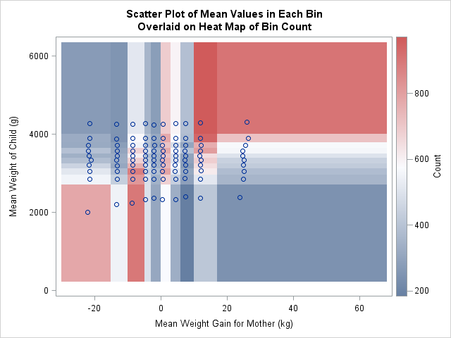
Another visualization option is to overlay the scatter plot of mean positions on a heat map of the counts in each bin. This is shown to the left. Notice that this graph shows the full range of the data, whereas the range for the scatter plots was determined only by the mean values. This plot indicates that the bin counts are positively correlated. The bins in the upper left and lower right have fewer observations than the bins in the lower left and upper right. The graph also shows that the third, sixth, and ninth vertical strips contain more observations than the other strips. This is because many of the original maternal weights were binned to the nearest 5 pounds. Histograms and other bin plots often show artifacts when applied to data that are themselves binned.
I'd like some feedback on this design. Can you think of an application for this plot? Do you like the design choices I made? Download the SAS program and modify it to plot your own data. Leave a comment to let me know what you think.

2 Comments
Pingback: Binning data by quantiles? Beware of rounded data - The DO Loop
Pingback: The essential guide to binning in SAS - The DO Loop