In a previous blog post I showed how to order a set of variables by a statistic. After reshaping data, you can create a graph that contains box plots for many variables. Ordering the variables by some statistic (mean, median, variance,...) helps to differentiate and distinguish the variables.
You can use this as an exploratory technique. Suppose that you are given a new set of data that has 100 variables. Before you begin to analyze these variables, it is useful to visualize their distributions. Are the data normal or skewed? Are there outliers for some variables? You could use PROC UNIVARIATE to create 100 histograms and 100 sets of descriptive statistics, but it would be tedious to slog through hundreds of pages of outputs, and difficult to use the histograms to compare the variables.
In contrast, you can fit 100 box plots on a single graph. The resulting graph enables you to see all 100 distributions at a glance and to compare the distributions to each other. If the variables are measured on vastly different scales, you might want to standardize the variables so that the box plots are comparable in scale.
Creating 100 variables
As an example, I will simulate 100 variables with 1,000 observations in each variable. The following SAS/IML statements loop over each column of a matrix X. The SAMPLE function randomly chooses a distribution (normal, lognormal, exponential, or uniform) for the data in the column. I use the RANDFUN function to generate the data for each column. The 100 variables are then written to a SAS data set and given the names X1–X100.
/* create 100 variables with random data from a set of distributions */
proc iml;
N = 1000;  p = 100;
distrib = {"Normal" "Lognormal" "Exponential" "Uniform"};
call randseed(1);

/* each column of X is from a random distribution */
X = j(N,p);
do i = 1 to p;
   X[,i] = randfun(N, sample(distrib,1));
end;

varNames = "x1":("x"+strip(char(p)));
create ManyVars from X[colname=varNames]; append from X; close;
quit; |
Visualizing the 100 distributions
Suppose that you are asked to visualize the distributions in the ManyVars data set. Previously I showed how to use Base SAS to standardize the variables, reshape the data, and create the box plots. The following statement show how to implement the technique by using SAS/IML software. For no particular reason, I order these variables by the third quartile, rather than by the median:
proc iml;
use ManyVars;
read all var _NUM_ into X[colname=varNames];
close ManyVars;
N = nrow(X);

MinX = X[><, ]; MaxX = X[<>, ];
X = (X-MinX)/ (MaxX-MinX);       /* standardize vars into [0,1] */
call qntl(q3, X, 0.75);          /* compute 3rd quartile */

r = rank(q3);                    /* sort variables by that statistic */
temp = X;        X[,r] = temp;
temp = varNames; varNames[,r] = temp;

_Value_ = shapecol(X,0,1);      /* convert from wide form to long form */
varName = shapecol(repeat(varNames, N),0,1);

title "Variables ordered by Q3";          /* plot the distributions */
ods graphics / width =2400 height=600;
call box(_Value_) category=varName
other="xaxis discreteorder=data display=(nolabel);"; |
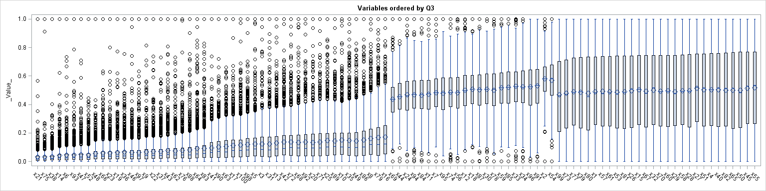
The result is shown above; click to enlarge. You can see the four different distributional shapes, although you have to look closely to differentiate the lognormal variables (which end with variable X83) and the exponential variables (which begin with variable X41). The changes in shape between the normal data (X69) and the uniform data (X99) are apparent. Also, notice that the skewed distributions have mean larger than the median, whereas for the symmetric distributions the sample means and the medians are approximately equal. The graph provides a quick-and-dirty view of the data, which is always useful when you encounter new data.
I standardized the variables into the interval [0,1], but other standardizations are possible. For example, to standardize the variable to mean zero and unit variance, use the statement X = (X-mean(X))/ std(X).
The SAS/IML program is remarkable for its compactness, especially when compared to the Base SAS implementation. Three statements are used to standardize the data, but I could have inlined the computations into a single statement. One statement is used to compute the quantiles. Reordering the variables is accomplished by using "the rank trick". The SHAPECOL function makes it easy to convert the data from wide form to long form. Finally, the BOX call makes it easy to create the box plot without even leaving the SAS/IML environment. These statements could be easily encapsulated into a single SAS/IML module that could be reused to visualize other data sets.
I think the visualization technique is powerful, although it is certainly not a panacea. When confronted with new data, this technique can help you to quickly learn about the distribution of the variables.
What do you think? Would you use this visualization as one step in an exploratory analysis? What are some of the strengths and weaknesses of this technique? Leave a comment.

6 Comments
i think you will have to compare the boxplot to overlayed density curves to make your case.
For my readers who use R, Bob Rudis (@hrbrmstr) just posted a version of this method implemented in R. Thanks, Bob!
I like this a LOT. Don't have IML, but can figure out how to do it with Base SAS. (And actually, it was the Rob Rudis (hrbmstr) R implementation that led me here to the original source.)
However, I think this EDA technique would be even better if rotated 90 degrees.
(1) the variable names/labels, which often don't have concise but meaningless labels like x1-x55, are easier to read if they are written out horizontally, left-to-right.
(2) my impression (unsupported by any Google search for evidence) is that the human brain more easily compares left-side symmetry than up-down symmetry.
Yes, sideways box plots are better for long labels. To do it in SAS/IML add TYPE="HBox" to the CALL BOX statement. In Base SAS, just use the HBOX statement instead of the VBOX statement.
I really liked it.
You and your books are SUPER.
Pingback: Popular posts from The DO Loop in 2014 - The DO Loop