On Kaiser Fung's Junk Charts blog, he showed a bar chart that was "published by Teach for America, touting its diversity." Kaiser objected to the chart because the bar lengths did not accurately depict the proportions of the Teach for America corps members.
The chart bothers me for another reason: I think if you create a graph that purports to demonstrate racial diversity, your graph should provide as reference the national percentages of each racial group. In general, if you claim that your organization does something better than a benchmark, you should include the benchmark values. (For mutual fund companies, comparing performance to a benchmark index is not just a good idea, it is the law.)
It turns out that the U.S. Census Bureau does not count "Latino" as a racial or ethnic group, but I used data and information from the 2010 US census to estimate the racial distribution of the US population. The following data and graphs compare the diversity of Teach for America to the national percentages:
title "Teach for America Diversity versus US Average"; data TeachAmerica; input Race $28. Corps USPop; label Diff="Difference between Corps and US Percentages" RelDiff="Relative Difference between Corps and US"; Diff = Corps - USPop; /* O-E = observed - expected */ RelDiff = Diff / USPop; /* relative diff: (O-E)/E */ datalines; Causasian 62 56 African American 13 13 Latino 10 16 Asian American 6 5 Multi-Ethnic 5 6 Other 4 3 Native American or Hawaiian 0.5 1.1 ; proc sgplot data=TeachAmerica; /* standard dot plot with reference */ scatter y=Race x=USPop / markerattrs=(symbol=Diamond) legendlabel="US"; scatter y=Race x=Corps / markerattrs=(symbol=CircleFilled) legendlabel="Corps"; yaxis grid; run; proc sgplot data=TeachAmerica; /* plot differences from US population */ scatter y=Race x=Diff / markerattrs=(symbol=CircleFilled); refline 0 / axis=x; yaxis grid; run; |
Two graphs are created, but only one is shown. The first graph (not shown) is a dot plot of the Teach for America percentages overlaid on a dot plot of the US percentages for each race. This essentially reproduces the Teach for America bar chart, but adds the reference percentages. I use a dot plot instead of a bar chart so that the reference percentages are easier to see.
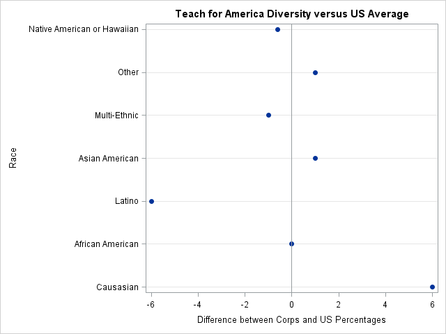
However, as I've said recently, when you are comparing two groups, you should strongly consider creating a graph of the difference between the two groups. The differences are shown in the adjacent figure. (Click to enlarge.) The graph shows that there is not much difference between the diversity of Teach for America and the US population. Five of the seven racial groups are within a percentage point of the national average. Latinos are underrepresented in the Teach for America corps, whereas Caucasians are overrepresented.
The graph tells a more complete story than the Teach for America article, which claims "a higher level of diversity in our corps" than US colleges. Although the Teach for America corps is not overrepresented in all minority groups compared to the US population, they should be commended for closely matching the diversity of the US population. The graph also sends a message: although Teach for America has done a great job with diversity, they need to continue to work on recruiting Latino teachers.
When visualizing differences, sometimes it is useful to compute relative differences. Caucasians are a large ethnic group, so although a deviation of 6 percentage points is large in absolute terms, it is small in relative terms. To create this graph by using PROG SGPLOT, specify the RelDiff variable instead of the Diff variable.
It is worth noting that SAS software makes it easy to graph and analyze data like these. The TABLES statement in the FREQ procedure supports a TESTP= option that enables you to specify proportions for a chi-square test for proportions. You can also request a DeviationPlot, which shows the relative differences between the observed proportions and the specified proportions. To use PROC FREQ, you should convert the percentages into frequencies. The Teach for America Web site says that there were 11,000 teachers in the program in 2013, so I will use that number to convert the percentages into frequencies.
data Teach; set TeachAmerica; N = 11000 * Corps / 100; /* approx number of people in corps for each group */ run; proc freq data=Teach order=data; weight N; tables Race / chisq testp=(.56 .13 .16 .05 .06 .03 .011) plots(type=dotplot)=(DeviationPlot FreqPlot(scale=percent)); run; |
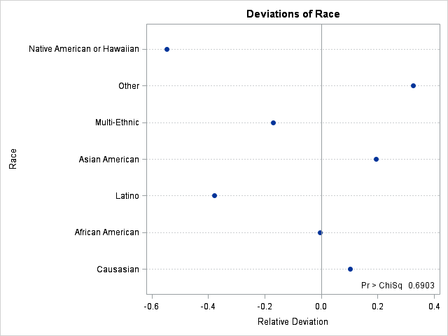
The graph shows that the Native American and Latino groups are underrepresented on a relative basis, whereas the "Other" group is overrepresented. On a relative scale, Caucasians are only slightly overrepresented. The chi-square table (not shown) indicates that Teach for America proportions are not equal to the national proportions. The chi-square p-value is tiny, and is included in the lower right corner of the graph.
In summary, if you claim that certain quantities are as good as or better than some benchmark, include the benchmark as part of your graph. Even better, graph the difference between your quantities and the benchmark. SAS software provides tools to construct the graphs by hand, or as part of a statistical test for proportions.

1 Comment
I like the idea of measuring the differences using statistical tests rather than the absolute numbers. However, if you wanted to show the absolute numbers a bit more clearly, add xaxis min=0 max=100; to your first scatter plot (not shown) to see the percentages laid out on the 0-100 percent scale.