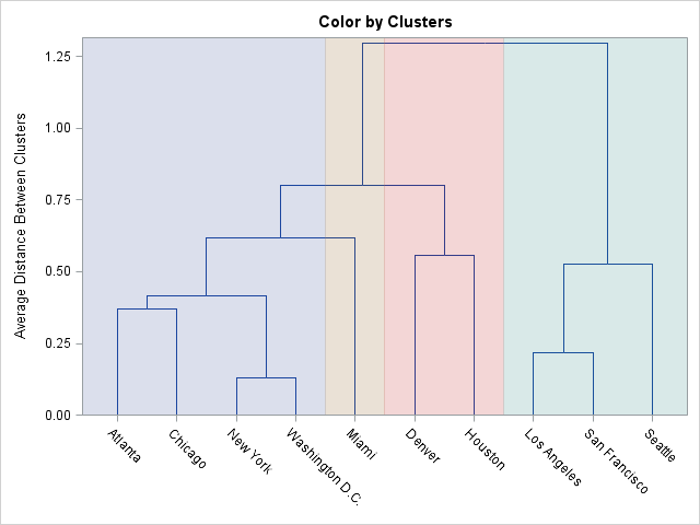
The CLUSTER procedure in SAS/STAT software creates a dendrogram automatically. The black-and-white dendrogram is nice, but plain. A SAS customer wanted to know whether it is possible to add color to the dendrogram to emphasize certain clusters. For example, the plot at the left emphasizes a four-cluster scenario for clustering cities based on the distances between cities. The question is, how can you construct such a colored dendrogram?
One solution, which was proposed by my colleague Warren Kuhfeld, is to use the output of the PROC CLUSTER procedure in conjunction with the Graphics Template Language (GTL) to overlay a dendrogram and a block plot. A block plot is simply a series of colored strips that span the length of a graph. You can create a block plot by using the GTL BLOCKPLOT statement.
To demonstrate how to construct a basic version of the colored dendrogram, let's start with the output from the CLUSTER procedure when applied to the Sashelp.Mileages data set, which contains distances between 10 major US cities:
proc cluster data=Sashelp.Mileages(type=distance) method=average pseudo out=Tree; id City; run; |
From the procedure output, you can see that the City variable is used to construct the horizontal axis. To overlay a block plot, you can create a simple data set that identifies each city with a colored block. The following DATA step specifies the cities in alphabetical order, along with their "cluster number." This information is merged with a sorted version of the Tree data set. The Tree2 data set contains the information needed to construct the colored dendrogram:
data Clusters; input City $ 1-15 Cluster; datalines; Atlanta 1 Chicago 1 Denver 3 Houston 3 Los Angeles 4 Miami 2 New York 1 San Francisco 4 Seattle 4 Washington D.C. 1 ; proc sort data=tree; by city; run; data tree2; merge Tree Clusters; by City; run; |
Now that the data are properly prepared, you can define a GTL template that overlays a dendrogram and a block plot. The SGRENDER procedure is used to create the graph that is shown at the beginning of this article:
proc template; define statgraph Dendrogram; begingraph; entrytitle "Color by Clusters"; layout overlay / yaxisopts=(discreteopts=(tickvaluefitpolicy=none)); dendrogram nodeid=_name_ parentid=_parent_ clusterheight=_height_; blockplot x=City block=Cluster / datatransparency=0.75 display=(fill); endlayout; endgraph; end; run; proc sgrender data=tree2 template=dendrogram; run; |
This graphical technique enables you to emphasize the grouping of the cities into four clusters. If you want to emphasize a different number of clusters, you need to re-create the Clusters data set, re-merge the data, and call PROC SGRENDER again. This can be tedious, so Warren Kuhfeld wrote a macro that automates this process. The result is the %ClusterGroups macro, which is available for download from support.sas.com. The macro enables you to create colored dendrograms easily. For example, after running the CLUSTER procedure, the following statement creates the colored dendrogram in this article:
%clustergroups(nclusters=4, data=Tree, id=City) |
The macro takes care of generating the auxiliary data set, merging it with the output from PROC CLUSTER, writing the GTL template, and calling PROC SGRENDER. You can specify the number of clusters that you want to emphasize, and it computes the appropriate range for the colored blocks.
Give it a try and let me know what you think. I'll pass on your comments to Warren Kuhfeld, who deserves all the credit.

7 Comments
Hi Rick,
The ClusterGroups macro is awesome!
I came across the Sample Note last month just before teaching a SAS predictive modeling course which was fortuitous. Attendees really liked the enhanced visibility of the clusters through the colorization. Thanks for promoting this great macro and please pass on my thanks to Warren. Certainly makes it easier to identify the clusters than reading the table!
Cheers,
Michelle
Just a picky detail: the correct spelling is dendrogram. The root is dendron, Greek for tree, perhaps otherwise most familiar in the plant name rhododendron or the adjective dendritic.
Thanks for catching this. Although both terms are used, I agree with you that dendrogram should be preferred.
Hi Rick
Do you have any program regarding doing k means clustering with SAS iml ?
I do not. I recommend PROC FASTCLUS.
Hi,
..is it possible to start the nice coloring at a given height ?
..so that the number of crossings at the start-height of coloring with the vertical lines of the dendrogram-bars
equals the number of different colors chosen ,i.e. the number of clusters chosen ?
The block plot draws colors from the bottom to the top of the plot, so to start the coloring at some other height you would need to switch to a different statement. I suggest you try using the POLYGONPLOT statement to draw the rectangles. You would have to calculate the start-height for each cluster.