Last week I discussed how to fit a Poisson distribution to data. The technique, which involves using the GENMOD procedure, produces a table of some goodness-of-fit statistics, but I find it useful to also produce a graph that indicates the goodness of fit.
For continuous distributions, the quantile-quantile (Q-Q) plot is a useful diagnostic plot for checking whether a model distribution fits the data. As I mentioned in a previous article, you can create a discrete Q-Q plot, but it suffers from overplotting and is not usually used for discrete distributions.
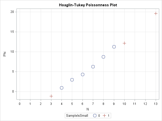
So what can you use instead? One option is to use the Poisonness plot introduced by Hoaglin and Tukey (1985) and shown in the following image. If a Poisson model fits the data, then the points on this plot will fall along a straight line, so the plot is similar in usage to the familiar Q-Q plot. The Poissonness plot is outlined by Martinez and Martinez (2002), Computational Statistics Handbook with MATLAB, and the SAS/IML program in this article is based on their MATLAB code.
The Poissonness plot is also described by Michael Friendly in his excellent book, Visualizing Categorical Data, which is a "must have" book for any statsitician who models categorical data. Friendly provides a POISPLOT macro that creates the Poissonness plot. For other discrete distributions, Friendly provides the DISTPLOT macro, which provides diagnostic plots for fitting Poisson, Binomial, Negative Binomial, Geometric, or Log Series distributions to data.
Preparing the data
To introduce the Poissonness plot, I'll use the same data as in my previous post: the number of emails that I received during half-hour periods for one weekday at work:
/* number of emails received in each half-hour period 8:00am - 5:00pm on a weekday. */ data MyData; input N @@; datalines; 7 7 13 9 8 8 9 9 5 6 6 9 5 10 4 5 3 8 4 ; |
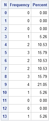
The question is whether the data can be described by a Poisson model. Equivalently, did I receive emails at a constant rate? To begin the analysis, it is useful to introduce zero counts for the categories (such as 11 and 12) that did not appear in the data. This can be accomplished by the following steps:
/* create a data set that contains all categories of interest */ data AllCat / view=AllCat; do N = 0 to 13; output; end; run; /* merge all categories with the observed data */ data Table; set AllCat MyData(in=_w); w = _w; /* create weight variable: 0 or 1 */ run; /* tabulate counts */ proc freq data=Table; weight w / zeros; /* include obs with 0 weight */ tables N / out=FreqOut nocum; /* SPARSE option is on b/c of ZEROS option */ run; |
Creating a Poissonness plot
The simplest form of the Poissonness plot graphs the quantity φ(fk) = log(k! fk/F) against the category k, where fk is the observed frequency for category k and F is the total number of observations. For my data, k=0,1,...,13 and F=19. Hoaglin and Tukey also suggest using a different symbol for any category that has only one observation because φ has more variablitity for categories with a small number of counts.
The following SAS/IML prorgam does the following:
- defines a helper function, SafeLog, that returns the natural log of positive quantities and returns missing values for non-positive quantities
- defines a module that returns the Hoaglin-Tukey φ function and also returns a variable that indicates whether a category has only one observation
- calls the module and writes the results to a SAS data set
/* algorithm from Martinez and Martinez (2002), p. 127 */ proc iml; /* if Y>0, return the natural log of Y, otherwise return a missing value https://blogs.sas.com/content/iml/2011/04/27/log-transformations-how-to-handle-negative-data-values/ */ start SafeLog(Y); logY = j(nrow(Y),1,.); /* allocate missing */ idx = loc(Y > 0); /* find indices where Y > 0 */ if ncol(idx) > 0 then logY[idx] = log(Y[idx]); return(logY); finish; /* return the Hoaglin-Tukey (1985) phi function for a table of counts. */ /* args: output output input input */ start Poissonness(phi, SampleIsSmall, k, Freq); phi = SafeLog(fact(k) # Freq / sum(Freq) ); SampleIsSmall = choose(Freq=1, 1, 0); /* indicator variable, Freq=1 */ finish; use FreqOut; read all var {N Count}; close FreqOut; run Poissonness(phi, SampleIsSmall, N, Count); create Poissonness var{"N" "Count" "Phi" "SampleIsSmall"}; append; close Poissonness; |
The following call to SGPLOT creates the Poissonness plot. Notice that I am changing the default ODS style (for SAS 9.3) because I want to classify the points according the value of the indicator variable SampleIsSmall. I want the markers that correspond to small samples to have a differnt color and a different symbol than the other markers. Therefore I use the HTMLBLUECML style, where the "CML" means that Colors, Markers, and Lines all change to reflect group membership.
ods html style=htmlbluecml; /* SAS 9.3 */ proc sgplot data=Poissonness; scatter x=N y=Phi / group=SampleIsSmall markerattrs=(size=10pt); xaxis grid type=discrete; yaxis grid; title "Hoaglin-Tukey Poissonness Plot"; run; |
The plot is shown at the top of this article. Notice that the points on this graph fall near a straight line, which indicates that the Poisson distribution is a good model for these data.
A Modified Poissonness plot
Hoaglin and Tukey (1985) suggest a small modfication to the φ function that adjusts the position of categories with small counts. If you prefer, use the following modified SAS/IML routine. The corresponding plot is only slightly different for these data and is not shown.
/* return the modified Hoaglin-Tukey (1985) phi function for a table of counts. */ /* args: output output input input */ start Poissonness(phi, SampleIsSmall, k, Freq); Total = sum(Freq); pHat = Freq / Total; correction = Freq - 0.67 - 0.8*pHat; FreqStar = choose(Freq=0, ., choose(Freq=1, 1/constant("E"), correction)); phi = SafeLog(fact(k) # FreqStar / Total); SampleIsSmall = choose(Freq=1, 1, 0); /* indicator variable, Freq=1 */ finish; |

7 Comments
Hi Rick, like this blog post - very useful.
Is it possible that you have a typo in your code? I believe instead of 'Table' you want to read
'FreqOut' on this line:
use Table; read all var {N Count}; close Table;
Thank you! It is corrected.
This could be useful, but I tried it with some other numbers and it doesn't seem to perform very well. For instance, if you use your numbers and add an additional 10 "13"s to the end of the datalines string it still produces a very straight line. If you generate a random list of 100 numbers using rand('poisson',2) you can get a bunch of very non-straight lines, and only occasionally a nice straight line. If you generate a random list of 100 numbers using rand('poisson',10) you generally seem to get a straight line that starts curving upwards towards the higher end.
I understand that 100 isn't a lot, but I would have hoped it would perform much better than the much shorter 13-heavy list, and especially with a mean of 2 you still get non-"poissonness" fairly frequently even with 1000 observations...
Those are interesting observations. Thanks for your thoughts and experiments. I've verified that Friendly's %POIPLOT macro produces results that are similar to my implementation, so the "problem" does not seem to be my implementation.
I agree with you that the Poissonness plot *by itself* might not adequately indicate the quality of the fit. Here are a few other thoughts:
A) Diagnostic plots such as this and Q-Q plots are visual guides, not definitive tests.
B) If you make a normal Q-Q plot from truly normal data by using RAND("Normal"), you will see the same things with respect to a straight line in the middle but "curves" in the tails. That is the result of sample variation.
C) In the previous article, I proposed three steps to fitting a Poisson model to data: A GENMOD model, a density overlay on a bar chart, and a Q-Q or Poissonness plot. When you do steps 1 and 2 it is clear that a Poisson model does not fit your data with the extra 13s.
The conclusion I draw from your investigation is that we shouldn't use the Poissonness plot in isolation. Like all tests, it can give false positives and false negatives.
Pingback: Fitting a Poisson distribution to data in SAS - The DO Loop
Pingback: How to order categories in a two-way table with PROC FREQ - The DO Loop
Pingback: Tabulate counts when there are unobserved categories - The DO Loop