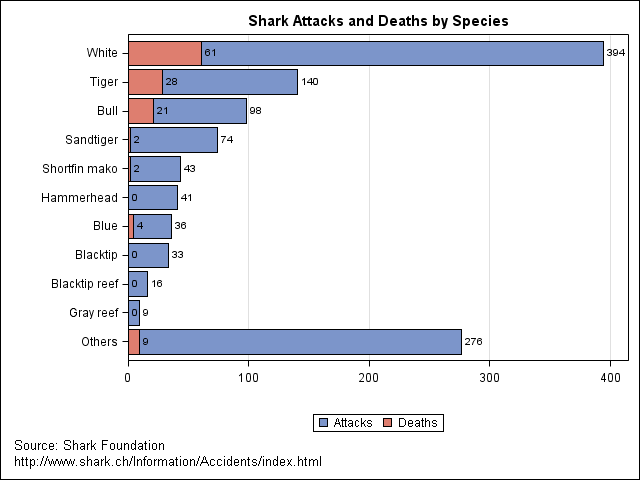
The Junk Chart blog discusses problems with a chart which (poorly) presents statistics on the prevalence of shark attacks by different species.
Here is the same data presented by overlaying two bar charts by using the SGPLOT procedure. I think this approach works well because the number of deaths is always fewer than the number of attacks, and the visual juxtaposition of deaths and attacks gives the viewer an impression of the relative risk of each shark killing someone during an attack.

The graph was created by using the following SAS program.
data Sharks; input Species $14. Attacks Deaths; label Attacks="Attacks" Deaths="Deaths"; datalines; White 394 61 Tiger 140 28 Bull 98 21 Sandtiger 74 2 Hammerhead 41 0 Blacktip 33 0 Blue 36 4 Blacktip reef 16 0 Shortfin mako 43 2 Gray reef 9 0 ; run; proc sort data=Sharks; by descending Attacks; run; data Others; Species="Others"; Attacks=276; Deaths=9; output; run; data Sharks; set Sharks Others; run; title 'Shark Attacks and Deaths by Species'; footnote justify=left 'Source: Shark Foundation'; footnote2 justify=left 'http://www.shark.ch/Information/Accidents/index.html'; proc sgplot data=Sharks; hbar Species / response=Attacks datalabel; hbar Species / response=Deaths datalabel; xaxis label=" " grid; yaxis label=" " discreteorder=data; run; |


3 Comments
Um, so are you going surfing with the white sharks?
Does "white" refer to "great white" sharks?
And wow, very interesting data to look at. Good idea!
Yes. Interesting to see how many great white attacks there are.
Duunnn dunnn... Duuuunnnn duun... Duuunnnnnnnn dun dun dun dun dun dun dun dun dun dun dunnnnnnnnnnn dunnnn