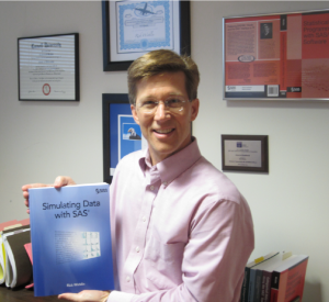
In my constant effort to keep pace with Chris Hemedinger, I am pleased to announce the availability of my new book, Simulating Data with SAS. Chris started a tradition for SAS Press authors to post a photo of themselves with their new book. Thanks to everyone who helped with the production of the book.
I have posted an overview of the book's purpose on the SAS Bookshelf blog.
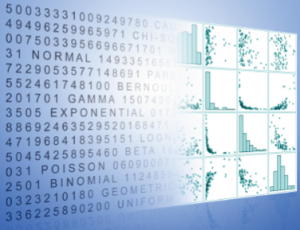
One interesting aspect of the book is the cover, which is not discussed in the book. I have attached an image of the cover graphic below.
I have question for you, readers. What, if anything, does the book's cover graphic mean to you? Do you like it? Hate it? Not understand it? Think you have a better idea for a cover image? There are no wrong answers, so post whatever comes to mind. Funny, snarky, intellectual, critical, factual—all opinions are welcome!
But please remember: You can't judge a book by its cover!


3 Comments
Looks like "Converting numbers to pictures for faster processing of information using the high band width human visual perception system". Or, maybe just my bias for graphs showing up here. Love the scatter plot matrix.
I've got the book and have started reading it. It's good! Simulation is quite important.
It looks like the transformation of marginals. I may have cheated by reading the book...