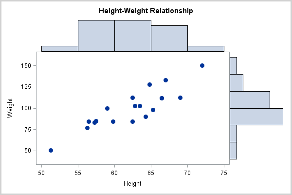
Many people know that the SGPLOT procedure in SAS 9.2 can create a large number of interesting graphs. Some people also know how to create a panel of graphs (all of the same type) by using the SGPANEL procedure. But did you know that you can also create a panel of graphs of different types in SAS by writing a template that describes how to layout each plot within the panel? Even better, there is a gallery of pre-written templates so that for many situations you don't have to write (or even understand) the Graph Template Language (GTL). You can simply copy a pre-written template!
This blog post shows how to create a scatter plot with marginal histograms in SAS by copying a pre-written template. You can download the SAS program and use the template in your own work.
Galleries of Statistical Graphics
When I want to create a plot that is somewhat complicated, the first thing I do is to look in the SAS/GRAPH Graphics Gallery. In particular, I use the galleries for the ODS Statistical Graphics (SG) procedures:
- Graphics gallery for the SGPLOT procedure: create one plot
- Graphics gallery for the SGPANEL procedure: create a panel of plots, each of the same plot type
- Graphics gallery for the SGRENDER procedure: use with the GTL to layout multiple plots of different types, or to produce nonstandard plots
- Graphics gallery for the SGSCATTER procedure: create a panel of scatter plots
The graph that I want to produce is in the PROC SGRENDER gallery (Sample 35172), which links to a SAS Knowledge Base article on how to use the Graph Template Language (GTL) to produce a distribution plot.
How to Create a Scatter Plot with Marginal Histograms
Using the SAS Knowledge Base article as a guide, the following steps create a scatter plot with marginal histograms (download the program):
- Click on the Full Code tab to display the SAS program that generates the graph.
- Copy the first call to the TEMPLATE procedure into your SAS session:
proc template;
  define statgraph scatterhist;
  ...
run;
- Modify the example code, if necessary, to fit your needs. For example, I made the following changes:
- I don't want transparent markers for my scatter plot, so I set datatransparency=0 on the SCATTERPLOT statement. (You can use transparency to help deal with overplotting in scatter plots.) Optionally, you can use a parameter to specify at run time whether to use semi-transparent markers.
- I don't want the text "NOBS = number of points" to appear in the upper right portion of the plot, so I replace that text with an empty string.
- Run the PROC TEMPLATE code to create the template.
- Copy the PROC SGRENDER code at the end of the program and modify it to run on your data. For example, the following statements call PROC SGRENDER to produce a scatter plot with marginal histograms on the Height and Weight variables in the SasHelp.Class data set:
/** create panel of plots using the ScatterHist template **/
ods graphics;
proc sgrender data=SasHelp.Class template=scatterhist;
  dynamic YVAR="Weight" XVAR="Height"
          TITLE="Height-Weight Relationship";
run;
The SGRENDER procedure uses the ScatterHist template to layout the scatter plot and histograms, as shown below:

In this example, I modified the GTL template in a minor way, but I also could have used the template as it is. You can learn more about the Graph Template Language if you decide to modify templates or to write your own templates. I also recommend the book Statistical Graphics in SAS: An Introduction to the Graph Template Language and the Statistical Graphics Procedures by my colleague, Warren Kuhfeld.

3 Comments
Rick,
I'm so glad to see you highlight this content. It is one of our greatest untapped gems. I have an upcoming meeting to discuss updates and more content, so keep an eye on this growing resource.
-Renee
I am very new to SAS, so please pardon the simplicity of this question. Thanks to your clear instructions, I have successfully executed the code with my own data. Right now I have one scatter-histo-plot for all the data - students in 6-10th grade , but I would like to have separate plots for each grade. Is there a simple way to do this? Ideally I'd have one image with five separate plots. Thank you!
Welcome to SAS! I think you want to use the BY statement. Almost every SAS procedure has a BY statement, including SGRENDER. If you have a variable called GRADE with the values 6,7,...,10, use PROC SORT to sort the data BY GRADE. Then in the SGRENDER procedure, include the statement
BY GRADE;
Since you are new, let me tell you about the SAS support communities. These are places for anyone to discuss "how do I do..." in SAS. There is a community for "SAS/GRAPH and ODS Graphics" that can help you with additional questions like this. There are also other forums on the DATA step, statistical procedures, and so forth. Enjoy!