
SAS® Scripting Wrapper for Analytics Transfer (SWAT), a powerful Python interface, enables you to integrate your Python code with SAS® Cloud Analytic Services (CAS). Using SWAT, you can execute CAS analytic actions, including feature engineering, machine learning modeling, and model testing, and then analyze the results locally.
This article demonstrates how you can predict the survival rates of Titanic passengers with a combination of both Python and CAS using SWAT. You can then see how well the models performed with some visual statistics.
Prerequisites

To get started, you will need the following:
- 64-bit Python 2.7 or Python 3.4+
- SAS® Viya®
- Jupyter Notebook
- SWAT (if needed, see the Installation page in the documentation)
After you install and configure these resources, start a Jupyter Notebook session to get started!
Step 1. Initialize the Python packages
Before you can build models and test how they perform, you need to initialize the different Python libraries that you will use throughout this demonstration.
Submit the following code and insert the specific values for your environment where needed:
# Import SAS SWAT Library
import swat

# Import OS for Local File Paths
import os
for dirname, _, filenames in os.walk('Desktop/'):
     for filename in filenames:
     print(os.path.join(dirname, filename))

# Import Numpy Library for Linear Algebra
import numpy as np
from numpy import trapz

# Import Pandas Library for Panda Dataframe
import pandas as pd

# Import Seaborn & Matplotlib for Data Visualization
import seaborn as sns
%matplotlib inline
from matplotlib import pyplot as plt
from matplotlib import style
Step 2. Create the connection between Python and CAS
After you import the libraries, now you want to connect to CAS by using the SWAT package. In this demonstration, SSL is enabled in the SAS Viya environment and the SSL certificate is stored locally. If you have any connection errors, see Encryption (SSL).
Use the command below to create a connection to CAS:
# Create a Connection to CAS
conn = swat.CAS("ServerName.sas.com", PORT "UserID", "Password")
This command confirms the connection status:
# Verify the Connection to CAS
connection_status = conn.serverstatus()
connection_status
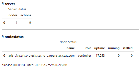
If the connection to CAS is working (if it is, you would see information similar to the above status), you can begin to import and explore the data.
Step 3. Import data into CAS
To gather the data needed for this analysis, run the following code in SAS and save the data locally.
This example saves the data locally in the Documents folder. With a CAS action, you can import this data on to the Viya CAS server.
# Import Titanic Data on to Viya CAS Server
titanic_cas = conn.read_csv(r"C:\Users\krstob\Documents\Titanic\titanic.csv",
casout = dict(name="titanic", replace=True))
Step 4. Explore the data loaded in CAS
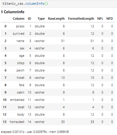
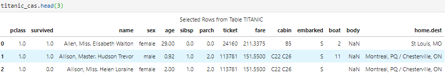
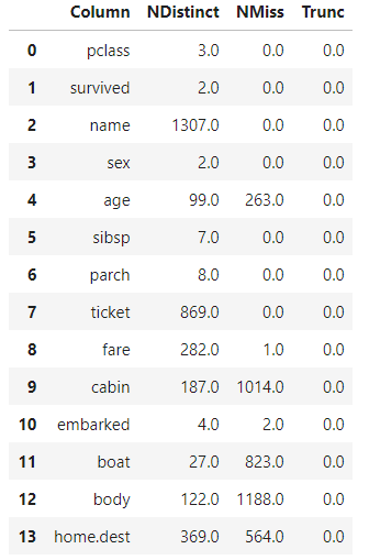
Now that the data is loaded into CAS memory, use the SWAT interface to interact with the data set. Using CAS actions, you can look at the shape, column information, records, and descriptions of the data. A machine learning engineer should review data before loading the data locally, in order to dive deeper on certain features.
If any of the SWAT syntax looks familiar to you, it is because SWAT is integrated with pandas. Here is a high-level look at the data:
- The shape (rows, columns):

- The column information:
- The first three records:
- An in-depth feature description:
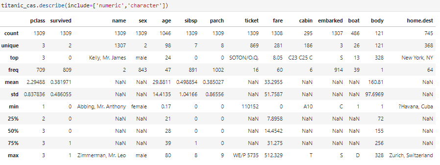
Take a moment to think about this data set. If you were just using a combination of pandas and scikit-learn, you would need a good amount of data preprocessing. There are missing entries, character features that need to be converted to numeric, and data that needs to be distributed correctly for efficient and accurate processing.
Luckily, when SWAT is integrated with CAS, CAS does a lot of this work for you. CAS machine learning modeling can easily import character variables, impute missing values, normalize the data, partition the data, and much more.
The next step is to take a closer look at some of the data features.
Step 5. Explore the data locally
There is great information here from CAS about your 14 features. You know the data types, means, unique values, standard deviation, and others. Now, bring the data back locally into essentially a pandas data frame and create some graphs on what you believe might be variables to predict on.
# Use the CAS To_Frame Action to Bring the CAS Table Locally into a Data Frame
titanic_pandas_df = titanic_cas.to_frame()
With data loaded locally, examine the numerical distributions:
# How Is the Data Distributed? (Numerical)
distribution_plot = titanic_pandas_df.drop('survived', axis=1).hist(bins = 15, figsize = (12,12), alpha = 0.75)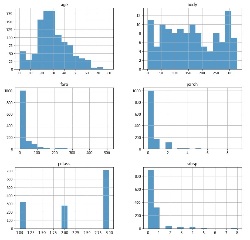
The pclass variable represents the passenger class (first class, second class, third class). Does the passenger class have any effect on the survival rate? To look more into this, you can plot histograms that compare pclass, age, and the number who survived.
# For Seaborne Facet Grids, Create an Empty 3 by 2 Graph to Place Data On
pclass_survived = sns.FacetGrid(titanic_pandas_df, col='survived', row = 'pclass', height = 2.5, aspect = 3)

# Overlay a Histogram of Y(Age) = Survived
pclass_survived.map(plt.hist, 'age', alpha = 0.75, bins = 25)

# Add a Legend for Readability
pclass_survived.add_legend()
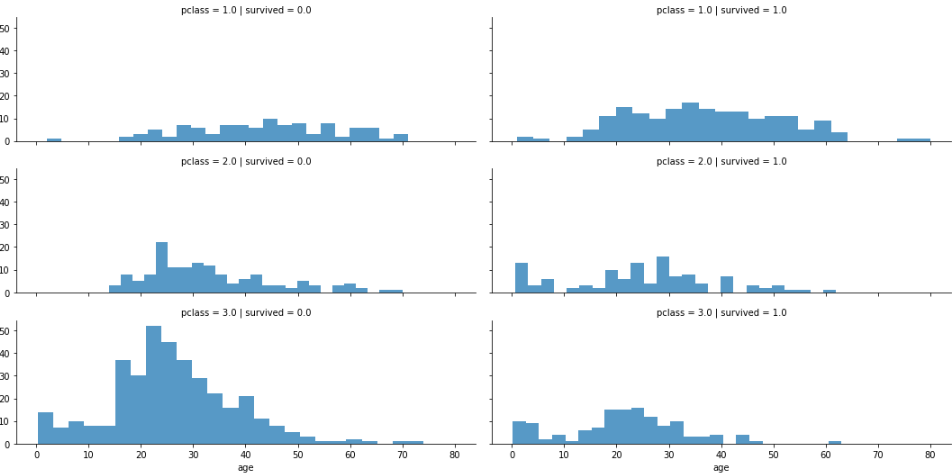
Note: 1 = survived, 0 = did not survive
As this graph suggests, the higher the class, the better the chance that someone survived. There is also a low survival rate for the approximately 18–35 age range for the lower class. This information is great, because you can build new features later that focus on pclass.
Another common predictor feature is someone’s sex. Were women and children saved first in the case of the Titanic crash? The following code creates graphs to help answer this question:
# Create a Graph Canvas - One for Female Survival Rate - One for Male
Survived = 'Survived'
Not_Survived = 'Not Survived'
fig,axes = plt.subplots(nrows=1, ncols=2, figsize=(10,4))

# Initialize Women and Male Variables to the Data Set Value
Women = titanic_pandas_df[titanic_pandas_df['sex'] == 'female']
Male = titanic_pandas_df[titanic_pandas_df['sex'] == 'male']

# For the First Graph, Plot the Amount of Women Who Survived Dependent on Their Age
Female_vs_Male = sns.distplot(Women[Women['survived']==1].age.dropna(),
               bins=25, label = Survived, ax = axes[0], kde = False)

# For the First Graph, Layer the Amount of Women Who Did Not Survive Dependent on Their Age
Female_vs_Male = sns.distplot(Women[Women['survived']==0].age.dropna(),
               bins=25, label = Not_Survived, ax = axes[0], kde = False)

# Display a Legend for the First Graph
Female_vs_Male.legend()
Female_vs_Male.set_title('Females')

# For the Second Graph, Plot the Amount of Men Who Survived Dependent on Their Age
Female_vs_Male = sns.distplot(Male[Male['survived']==1].age.dropna(),
               bins=25, label = Survived, ax = axes[1], kde = False)

# For the Second Graph, Layer the Amount of Men Who Did Not Survive Dependent on Their Age
Female_vs_Male = sns.distplot(Male[Male['survived']==0].age.dropna(),
                bins=25, label = Not_Survived, ax = axes[1], kde = False)

# Display a Legend for the Second Graph
Female_vs_Male.legend()
Female_vs_Male.set_title('Men')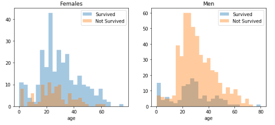
This graph confirms that both women and children had a better chance at survival.
These feature graphs are nice visuals, but a correlation matrix is another great way to compare numerical features and the correlation to survival rate:
# Heatmap Correlation Matrix That Compares Numerical Values and Survived
Heatmap_Matrix = sns.heatmap(
              titanic_pandas_df[["survived","sibsp","parch","age","fare"]].corr(),
              annot = True,
              fmt = ".3f",
              cmap = "coolwarm",
              center = 0,
              linewidths = 0.1
)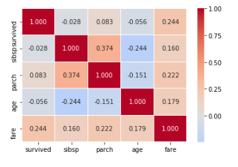
The heat map shows that the fare, surprisingly, has a significant correlation with survival rate (or seems to, at least). Keep this in mind when you build the models.
You now have great knowledge of the features in this data set. Age, fare, and sex do affect someone’s survival chances. For a general machine learning problem, you would typically explore each feature in more detail, but, for now, it is time to move on to some feature engineering in CAS.
Step 6. Check for missing values
Now that you have a general idea about which features are important, you should clean up any missing values quickly by using CAS. By default, CAS replaces any missing values with the mean, but there are many other modes to choose from.
For this test case, you can keep the default because the data set is quite small. Use the CAS impute action to perform a data matrix (variable) imputation that fills in missing values.
First, check to see how many missing values are in the data set:
# Check for Missing Values
titanic_cas.distinct()
Both fare and age are important numeric variables that have missing values, so run the impute action with SWAT to fill in any missing values:
# Impute Missing Values (Replace with Substituted Values [By Default w/ the Mean])
conn.dataPreprocess.impute(
     table            = 'titanic',
     inputs          = ['age','fare'],
     copyAllVars = True,
     casOut        = dict(name = 'titanic', replace = True)
)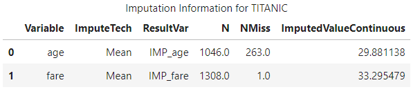
And, just like that, CAS takes care of the missing numeric values and creates a new variable, IMP_variable. This action would have taken more time to do with pandas or scikit-learn, so CAS was a nice time saver.
Step 7. Load the data locally to create new features
You now have great, clean data that you can model in CAS. Sometimes, though, for a machine learning problem, you want to create your own custom features.
It is easy to do that by using a data frame locally, so bring the data back to your local machine to create some custom features.
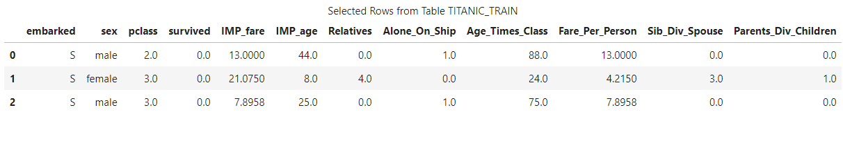
Using the to_frame() CAS action, convert the CAS data set into a local data frame. Keep only the variables needed for modeling:
<u></u><span style="font-size: 14px;"># Use the CAS To_Frame Action to bring the CAS Table Locally into a Data Frame</span>
titanic_pandas_df = titanic_cas.to_frame()

# Remove Some Features That Are Not Needed for Predictive Modeling
titanic_pandas_df = titanic_pandas_df[['embarked',
     'parch',
     'sex',
     'pclass',
     'sibsp',
     'survived',
     'IMP_fare',
     'IMP_age']
]
After the predictive features are available locally, confirm that the CAS statistical imputation worked:
# Check How Many Values Are Null by Using the isnull() Function
total_missing = titanic_pandas_df.isnull().sum().sort_values(ascending=False)
total_missing.head(5)

# Find the Total Values
total = titanic_pandas_df.notnull().sum().sort_values(ascending=False)
total.head(5)

# Find the Percentage of Missing Values per Variable
Percent = titanic_pandas_df.isnull().sum()/titanic_pandas_df.isnull().count()*100
Percent.sort_values(ascending=False).head(5)

# Round to One Decimal Place for Less Storage
Percent_Rounded = (round(Percent,1)).sort_values(ascending=False)

# Plot the Missing Data [Total Missing, Percentage Missing] with a Concatenation of Two Columns
Missing_Data = pd.concat([total, total_missing, Percent_Rounded], axis = 1,
                                            keys=['Non Missing Values', 'Total Missing Values', '% Missing'], sort=True)
Missing_Data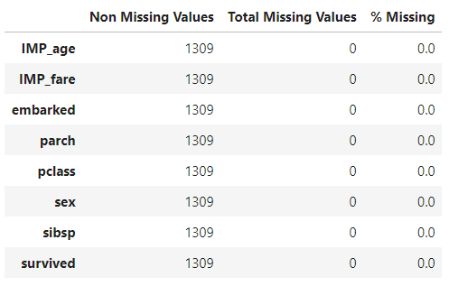
As you can see from the output above, all features are clean, and no values are missing! Now you can create some new features.
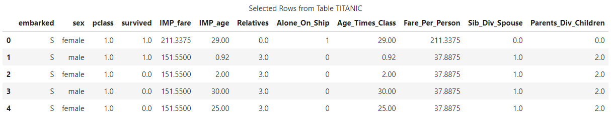
Step 8. Create new features
With machine learning, there are times when you want to create your own features that combine useful information to create a more accurate model. This action can help with overfitting, memory usage, or many other reasons.
This demo shows how to build four new features:
- Relatives
- Alone_on_Ship
- Age_Times_Class
- Fare_Per_Person
Relatives and Alone_on_Ship
The sibsp feature is the number of siblings and spouses, and the parch variable is the number of parents and children. So, you can combine these two for a Relatives feature that indicates how many people someone had on the ship in total. If a passenger traveled completely alone, you can flag that by creating the categorical variable Alone_on_Ship:
# Create a Relatives Variable / Alone on Ship
data = [titanic_pandas_df]
for dataset in data:
     dataset['Relatives'] = dataset['sibsp'] + dataset['parch']
     dataset.loc[dataset['Relatives'] > 0, 'Alone_On_Ship'] = 0
     dataset.loc[dataset['Relatives'] == 0, 'Alone_On_Ship'] = 1
     dataset['Alone_On_Ship'] = dataset['Alone_On_Ship'].astype(int)
Age_Times_Class
As discussed earlier in this demo, both age and class had an effect on survivability. So, create a new Age_Times_Class feature that combines a person’s age and class:
data = [titanic_pandas_df]

# For Loop That Creates a New Variable, Age_Times_Class
for dataset in data:
     dataset['Age_Times_Class']= dataset['IMP_age'] * dataset['pclass']
Fare_Per_Person
The Fare_Per_Person variable is created by dividing the IMP_fare variable (cleaned by CAS) by the Relatives variable and then adding 1, which accounts for the passenger:
# Set the Training & Testing Data for Efficiency
data = [titanic_pandas_df]

# For Loop Through Both Data Sets That Creates a New Variable, Fare_Per_Person
for dataset in data:
     dataset['Fare_Per_Person'] = dataset['IMP_fare']/(dataset['Relatives']+1)
     dataset['Sib_Div_Spouse'] = dataset['sibsp']
     dataset['Parents_Div_Children'] = dataset['parch']

# Drop the Parent Variable
titanic_pandas_df = titanic_pandas_df.drop(['parch'], axis=1)

# Drop the Siblings Variable
titanic_pandas_df = titanic_pandas_df.drop(['sibsp'], axis=1)
With these new features that you created with Python, here is how the data set looks:
# Look at How the Data Is Distributed
titanic_pandas_df.head(5)
Step 9. Load the data back into CAS for model training
Now you can make some models! Load the clean data back into CAS and start training:
# Upload the Data Set
titanic_cas = conn.upload_frame(titanic_pandas_df, casout = dict(name='titanic', replace='True'))
These code examples display the tables that the data is in:
# The Data Frame Type of the CAS Data
type(titanic_train_cas)
# The Data Frame Type of the Local Data
type(titanic_train_pd)
As you can see, the Titanic CAS table has a CASTable data frame and the local table has a SAS data frame.
Here is a final look at the data that you are going to train:
If you were training a model using scikit-learn, it would not really achieve great results without more preparation. Most of the values are in float format, and there are a few categorical variables. Luckily, CAS can handle these issues when it builds the models.
Step 10. Create a testing and training set
One of the awesome things about CAS machine learning is that you do not have to manually separate the data set. Instead, you can run a partitioning function and then model and test based on these parameters. To do this, you need to load the Sampling action set. Then, you can call the srs action, which can quickly partition a data table.
# Partitioning the Data
conn.loadActionSet('sampling')
conn.sampling.srs(
     table = 'titanic',
     samppct = 80,
     partind = True,
     output = dict(casout = dict(name = 'titanic', replace = True), copyVars = 'ALL')
)
This code partitions the data and adds a unique identifier to the data row to indicate whether it is testing or training. The unique identifier is _PartInd_. When a data row has this identifier equal to 0, it is part of the testing set. Similarly, when it is equal to 1, the data row is part of the training set.
Step 11. Build various models with CAS
One of my favorite parts about machine learning with CAS is how simple building a model is. With looping, you can dynamically change the targets, inputs, and nominal variables. If you are trying to build an extremely accurate model, it would be a great solution.
Building a model with CAS requires you to do a few things:
- Load the action set (in this demo, a forest model, decision tree, and gradient boosting model)
- Set your model variables (targets, inputs, and nominals)
- Train the model
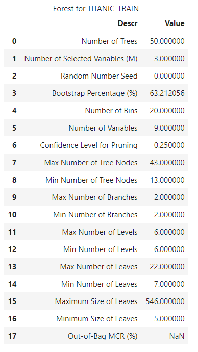
Forest Model
What does the data look like with a forest model? Here is the relevant code:
# Load the decisionTree CAS Action Set
conn.loadActionSet('decisionTree')

# Set Out Target for Predictive Modeling
target = 'survived'

# Set Inputs to Use to Predict Survived (Numerical Variable Inputs)
inputs = ['sex', 'pclass', 'Alone_On_Ship',
                'Age_Times_Class', 'Relatives', 'IMP_age',
                'IMP_fare', 'Fare_Per_Person', 'embarked']

# Set Nominal Variables to Use in Model (Categorial Variable Inputs)
nominals = ['sex', 'pclass', 'Alone_On_Ship', 'embarked', 'survived']

# Train the Forest Model
conn.decisionTree.forestTrain(
     table = dict(name = 'titanic', where = '_PartInd_ = 1'),
     target = target,
     inputs = inputs,
     nominals = nominals,
     casOut = dict(name = 'titanic_forest_model', replace = True)
)
Why does the input table have a WHERE clause? That is because you are looking at rows that contain the training flag, which was created with the srs action.
After running that block of code, you also get a response from CAS detailing how the model was trained, including great parameters like Number of Trees, Confidence Level for Pruning, and Max Number of Tree Nodes. If you wanted to do hyper-parameter tuning, this output shows you what the model currently looks like before you even adjust how it executes.
Decision Tree Model
The code to train a decision tree model is similar to the forest model example:
# Train the Decision Tree Model
conn.decisionTree.forestTrain(
     table = dict(name = 'titanic', where = '_PartInd_ = 1'),
     target = target,
     inputs = inputs,
     nominals = nominals,
     casOut = dict(name = 'titanic_decisiontree_model', replace = True)
)
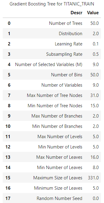
Gradient Boosting Model
Lastly, you can build a gradient boosting model in this way:
# Train the Gradient Boosting Model
conn.decisionTree.gbtreeTrain(
     table = dict(name = 'titanic', where = '_PartInd_ = 1'),
     target = target,
     inputs = inputs,
     nominals = nominals,
     casOut = dict(name = 'titanic_gradient_model', replace = True)
)
Step 12. Score the models
How do you score the models with CAS? CAS has a score function for each model that is built. This function generates a new table that contains how the model performed on each data input.
Here is how to score the three models:
titanic_forest_score = conn.decisionTree.forestScore(
     table = dict(name = 'titanic', where = '_PartInd_ = 0'),
     model = 'titanic_forest_model',
     casout = dict(name='titanic_forest_score', replace = True),
     copyVars = target,
     encodename = True,
     assessonerow = True
)

titanic_decisiontree_score = conn.decisionTree.dtreeScore(
     table = dict(name = 'titanic', where = '_PartInd_ = 0'),
     model = 'titanic_decisiontree_model',
     casout = dict(name='titanic_decisiontree_score', replace = True),
     copyVars = target,
     encodename = True,
     assessonerow = True
)

titanic_gradient_score = conn.decisionTree.gbtreeScore(
     table = dict(name = 'titanic', where = '_PartInd_ = 0'),
     model = 'titanic_gradient_model',
     casout = dict(name='titanic_gradient_score', replace = True),
     copyVars = target,
     encodename = True,
     assessonerow = True
)
When the scoring function is running, it creates the new variables P_survived1, which is the prediction for whether a passenger survived or not, and P_survived0, which is the prediction for whether the passenger did not survive. With this scoring function, you can see how accurately a model could correctly classify passengers on the testing set.
If you dive deeper into the Python object, this scoring function is set as equal to, so you can actually see the misclassification rate!
For example, examine how the forest model did by running this code:
titanic_forest_score
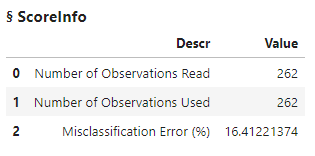
The scoring function read in all of the model-tested set and told you the misclassification error. By calculating [1 – Misclassification Error], you can see that the model was approximately 85% accurate. For barely exploring the data and testing and training on a small data set, this score is good. These scores can be misleading though, as they do not tell the entire story. Do you have more false positives or false negatives? When it comes to predicting human survival, those parameters are important to investigate.
To analyze that, load the percentile CAS action set. This action set provides actions for calculating percentiles and box plot values. In your case, it also assesses models. With this information, CAS has an assess function to determine a final assessment of how the model did.
conn.loadActionSet('percentile')
prediction = 'P_survived1'

titanic_forest_assessed = conn.percentile.assess(
     table = 'titanic_forest_score',
     inputs = prediction,
     casout = dict(name = 'titanic_forest_assessed', replace = True),
     response = target,
     event = '1'
)

titanic_decissiontree_assessed = conn.percentile.assess(
     table = 'titanic_decisiontree_score',
     inputs = prediction,
     casout = dict(name = 'titanic_decissiontree_assessed', replace = True),
     response = target,
     event = '1'
)

titanic_gradient_assessed = conn.percentile.assess(
     table = 'titanic_gradient_score',
     inputs = prediction,
     casout = dict(name = 'titanic_gradient_assessed', replace = True),
     response = target,
     event = '1'
)
This CAS action returns three types of assessments: lift-related assessments, ROC-related assessments, and concordance statistics. Python is great at graphing data, so now you can move the data locally and see how it did with the new assessments.
Step 13. Analyze the results locally
You can plot the receiver operating characteristic (ROC) curve and the cumulative lift to determine how the models performed. Using the ROC curve, you can then calculate the area under the ROC curve (AUC) to see overall how well the models predicted the survival rate.
What exactly is a ROC curve or lift?
- A ROC curve is determined by plotting the true positive rate (TPR) against the false positive rate. The true positive rate is the proportional observations that were correctly predicted to be positive. The false positive rate is the proportional observations that were incorrectly predicted to be positive.
- A lift chart is derived from a gains chart. The X axis acts as a percentile, but the Y axis is the ratio of the gains value of our model and the gains value of a model that is choosing passengers randomly. That is, it details how many times the model is better than the random choice of cases.
Before you can plot these tables locally, you need to create a connection to them. CAS created some new assessed tables, so create a connection to these CAS tables for analysis:
# Assess Forest
titanic_assess_ROC_Forest = conn.CASTable('titanic_forest_assessed_ROC')
titanic_assess_Lift_Forest = conn.CASTable('titanic_forest_assessed')

titanic_ROC_pandas_Forest = titanic_assess_ROC_Forest.to_frame()
titanic_Lift_pandas_Forest = titanic_assess_Lift_Forest.to_frame()

# Assess Decision Tree
titanic_assess_ROC_DT = conn.CASTable('titanic_decisiontree_assessed_ROC')
titanic_assess_Lift_DT = conn.CASTable('titanic_decisiontree_assessed')

titanic_ROC_pandas_DT = titanic_assess_ROC_DT.to_frame()
titanic_Lift_pandas_DT = titanic_assess_Lift_DT.to_frame()

# Assess GB
titanic_assess_ROC_gb = conn.CASTable('titanic_gradient_assessed_ROC')
titanic_assess_Lift_gb = conn.CASTable('titanic_gradient_assessed')

titanic_ROC_pandas_gb = titanic_assess_ROC_gb.to_frame()
titanic_Lift_pandas_gb = titanic_assess_Lift_gb.to_frame()
Now that there is a connection to these tables, you can use the Matplotlib library to plot the ROC curve. Plot each model on this graph to see which model performed the best:
# Plot ROC Locally
plt.figure(figsize = (10,10))
plt.plot(1-titanic_ROC_pandas_Forest['_Specificity_'],
             titanic_ROC_pandas_Forest['_Sensitivity_'], 'bo-', linewidth = 3)
plt.plot(1-titanic_ROC_pandas_DT['_Specificity_'],
            titanic_ROC_pandas_DT['_Sensitivity_'], 'ro-', linewidth = 3)
plt.plot(1-titanic_ROC_pandas_gb['_Specificity_'],
             titanic_ROC_pandas_gb['_Sensitivity_'], 'go-', linewidth = 3)
plt.plot(pd.Series(range(0,11,1))/10, pd.Series(range(0,11,1))/10, 'k--')
plt.xlabel('False Positive Rate (1 - Specificity)')
plt.ylabel('True Positive Rate (Sensitivity)')
plt.legend(['Forest', 'Decision Tree', 'Gradient Boosting'])
plt.show()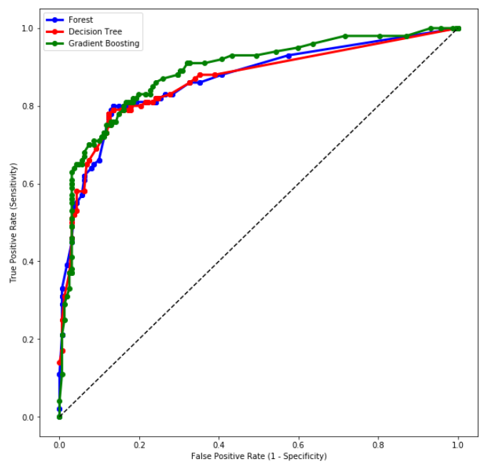
You can also take the depth and cumulative lift scores from the assessed data set and plot that information:
# Plot Lift Locally
plt.figure(figsize = (10,10))
plt.plot(titanic_Lift_pandas_Forest['_Depth_'], titanic_Lift_pandas_Forest['_CumLift_'], 'bo-', linewidth = 3)
plt.plot(titanic_Lift_pandas_DT['_Depth_'], titanic_Lift_pandas_DT['_CumLift_'], 'ro-', linewidth = 3)
plt.plot(titanic_Lift_pandas_gb['_Depth_'], titanic_Lift_pandas_gb['_CumLift_'], 'go-', linewidth = 3)
plt.xlabel('Depth')
plt.ylabel('Cumulative Lift')
plt.title('Cumulative Lift Curve')
plt.legend(['Forest', 'Decision Tree', 'Gradient Boosting'])
plt.show()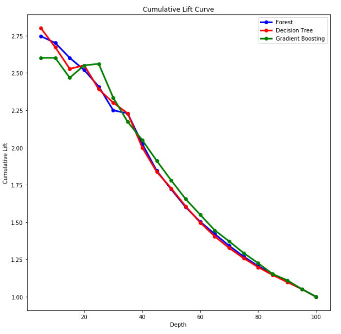
Although these curves work well for exploring the model success and perhaps how you can better tune the data, typically most people just want to see overall how well the model performed. To get a general idea, you can integrate the ROC curve to get this overview. This area is equal to the probability that a classifier will rank a randomly chosen positive instance higher than a randomly chosen negative instance.
# Forest Scores
x_forest = np.array([titanic_ROC_pandas_Forest['_Specificity_']])
y_forest  = np.array([titanic_ROC_pandas_Forest['_Sensitivity_']])

# Decision Tree Scores
x_dt = np.array([titanic_ROC_pandas_DT['_Specificity_']])
y_dt  = np.array([titanic_ROC_pandas_DT['_Sensitivity_']])

# GB Scores
x_gb = np.array([titanic_ROC_pandas_gb['_Specificity_']])
y_gb  = np.array([titanic_ROC_pandas_gb['_Sensitivity_']])

# Calculate Area Under Curve (Integrate)
area_forest = trapz(y_forest ,x_forest)
area_dt = trapz(y_dt ,x_dt)
area_gb = trapz(y_gb ,x_gb)

# Table For Model Scores
Model_Results = pd.DataFrame({
'Model': ['Forest', 'Decision Tree', 'Gradient Boosting'],
'Score': [area_forest, area_dt, area_gb]})

Model_Results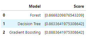
With the AUC ROC score, you can now see how well the model performs at distinguishing between positive and negative outcomes.
Conclusion
Any machine learning engineer should take time to further investigate integrating SAS Viya with their normal programming environment. When it works through the SWAT Python interface, CAS excels at quickly building and scoring a model. You can do this even with large data sets, because the data is stored in CAS memory. If you want to go further in-depth with using ensemble methods, I would recommend using SAS® Model Studio on SAS Viya, or perhaps one of the many great open-source libraries, like scikit-learn on Python.
The ability of CAS to quickly clean, model, and score a prediction is quite impressive. If you would like to take a further look at what SWAT and CAS can do, check out the different action sets that can be completed.
If you would like some more information about SWAT and SAS® Viya®, see these resources:
- SWAT Documentation
- SAS® Viya®
- How SAS Viya uses REST APIs to integrate with Python
Would you like to see SWAT machine learning work with a larger data set, or perhaps use SWAT to build a neural network? Please leave a comment!

1 Comment
Enjoyed.